Red Hat blog
Command Line Heroes is more than a podcast—we have developed a broad creative ecosystem to support and enhance the audio experience. One of these branches of production is the artwork that accompanies the show. We produce episodic artwork to help Command Line Heroes stand out on podcast platforms, and to promote the podcast online and at events. It’s taken a creative team with diverse skill sets to build the Command Line Heroes web and event experiences—and we think it gets better every season.
In this series, we’re going to take you behind the curtain with Red Hat’s Open Studio to learn more about our process, how this program comes to life—and point out some easter eggs you might have missed.

Season 3 of Command Line Heroes is all about programming languages
Karen Crowson, Designer: This season’s artwork is based on a map, with different lands that stand for each language. The idea initially came from the thought that spoken languages differ depending on where you are in the world, and how each of these places are different culturally and historically.
If you look at the history of programming languages, they’re also affected by their place in time and the story of their creation. This lent itself to creating lands that depicted each programming language as if it were a place, and taking what we had learned about it to build up its characteristics. We extended the idea of the map to video games, and how progressing through level you travel to new places. Each land has elements from its language as well as a central element. In the images, these are the languages’ libraries and entries.
What's the connection to last season’s art?
Nick Burns, Art Director: Since each season of Command Line Heroes tackles a new overarching theme, we’ve challenged ourselves to take a fresh approach to the way we visually compliment these stories. Last season, we explored deep dives into topics around modern development. Our visual language focused on dissecting these topics through exploded views. We introduced bold, unexpected colors and leaned into animation to help explore each episode’s artwork.
This season, we shifted from focusing on singular, expanded objects, to broader environments and worlds to represent each language we cover. Through continuing our bold color approach, we were able to smoothly shift into this new style and concept.
Each episode has unique art. Can you explain how each tableau has easter eggs inspired by the episode’s content?
Karen: When I started to research the languages we cover this season, I looked into whatever I could about the way it codes and its history. Some things we touched on in the podcast, and others I discovered during my own deep dives into some dark, extensive rabbit holes.
Each story had something that lent itself to a visual reference, but not all were straightforward. For example, the Bash artwork was tough to figure out. Bash is a shell language, and we had to think outside the box to metaphorically depict it. As a team, we worked through multiple ideas for each language on how to represent these languages, their stories, and create depictive environments. A lot of this relied on both static and animated artwork to accompany the audio.
Season Three, Episode One: Python’s Tale
Our first episode this season covered the story of Python: A "benevolent dictator for life" stepped down and changed the course of the Python language forever. Here’s how the designers decided to illustrate this story.

What elements are taken directly from the language?
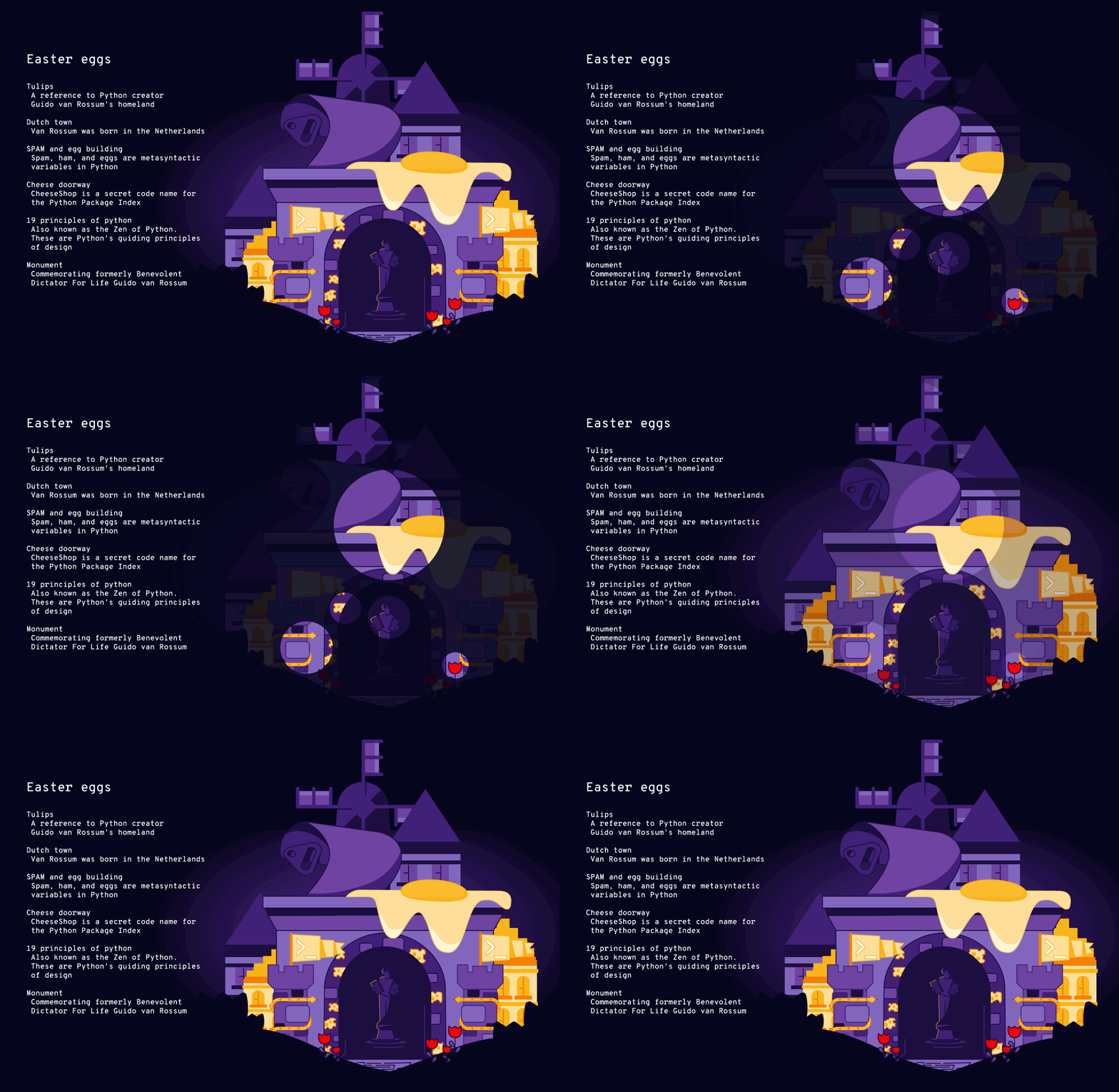
Karen: None of the code is depicted in the art work, but if you look very closely at the central statue of Python creator Guido von Rossum, you can see he is holding two pillars. These pillars are the 19 design principles of Python.
What was your biggest influence for this episode’s art?
Karen: We chose to depict the Netherlands, von Rossum’s homeland, and that shaped the overall environment. We used tulips, traditional danish homes, and a windmill to establish the setting.
Python also refers a lot back to “Monty Python,” which the language was named after. It was hard to not be influenced by it. Spam and eggs, for example, are metasyntactic variables in the language, and its package index is the “cheese house.” These are taken from Monty Python skits.
How did you get from an abstract language to the images used for the episode?
Karen: Python has such a rich visual history that we didn't look too much at the code. Instead, we relied on its backstory and its philosophy. This language is all about community.
We thought of King Arthur and the knights of the round table—as at the end that’s sort of how Python was governed of when Guido stepped down. We wanted to take that and make a monument to him, to his homeland, bring in medieval elements, and give credit to the British spirit.
Was it immediately obvious how you’d animate this artwork?
Eric Kramer, Animator: We talked a lot about board and video games when coming up with the map concept, so that helped dictate the kinds of influences and transitions we wanted to use. The artwork also plays off of this idea, so it all fit together really well and made it easy to animate. All of the details Karen included in the artwork enhanced what was possible with our animations. There were so many little things to add a bit of animation to, that made it all really come to life.
Next time, we’ll dive into the process for Episode 2’s artwork. We explored introductory languages like BASIC, Ruby, and more. We’ll also hear from the web development team about their role in getting the artwork to a place where you all get to enjoy it. Stay tuned.
