Sometimes, signing up for a service or setting up a new account can be stressful, even with the convenience of online-everything. As a user, you may second guess yourself in the process: Did I miss an important step? Was I supposed to click that button? This uncertainty is understandable. You need to get something done, but there are a few things standing in your way. And if the user interface (UI) isn’t designed well or the copy isn’t clear, then it’s safe to say the experience may not be all that pleasant.
Thankfully, setup processes don’t always have to be nerve-wracking. By putting extra effort into the user experience (UX), you may just be able to transform an intricate process into a few easy clicks. Let’s take a look at some UX design and copy best practices—and a real-life Red Hat use case—that will hopefully help you make your next product setup process a bit easier for users.
UX design and microcopy working together
If you’ve ever experienced a really good (or really bad) software product, you might be familiar with UX design. UX designers design the interaction between people and products, especially the UI. You probably see the work of UX designers every day when you scroll through your social media news feeds or check your email. Each button, menu, screen, and other elements are usually carefully researched, designed, developed, and tested.
Words are another element of design. They help connect your users with your product and your brand, whether it be via button text, error messaging, menu labels, or other forms of on-screen copy. These words also help guide users so that they’re able to use the product easily (and have some fun while doing so). Many UX professionals call the interface copy “UX copy” or “microcopy.”
Whatever you call it, it’s important to make sure your design and microcopy work together. When designers and UX writers team up, they have the power to create an intuitive and useful human-machine interaction.
Creating a setup process
Creating a setup process is no exception to this collaboration. A diversified team—complete with researchers, designers, writers, and engineers—gives you a better chance at tackling usability challenges from all angles and perspectives.
You might be tempted to jump right in and start building, but you should first take a step back and ask yourself the following questions:
-
Who will be going through this process?
-
Why are they going through this process?
-
What is their goal?
Over here on Red Hat’s User Experience Design (UXD) team, we asked ourselves these same questions when designing a recent setup process. Here’s what our user case looked like:
We’re designing a process for users to access their Red Hat subscriptions after they’ve purchased them through their IBM account. To access their purchased Red Hat subscriptions, users need to link their order with their Red Hat account. This is a multi-step process.
-
Who will be going through the process? Red Hat users who purchased Red Hat subscriptions through their IBM accounts.
-
Why are they going through the process? To access their Red Hat subscriptions.
-
What is their goal? To complete the linking process successfully so that they can access their Red Hat subscriptions.
After planning out this information, it’s time to get started.
UX design best practices
The look, feel, and function of a setup process relies heavily on design. There are tons of design best practices out there, but here are our top three:
-
Align with your brand.
-
Help users minimize and overcome potential errors.
-
Aim for reusability across products.
Align with your brand.
Get to know your company’s brand standards and existing designs across different areas of your products. Also, chat with other designers to see what they’ve created in the past, and try to stick to a unified approach.
This was an initial challenge we faced with our own setup process design. We needed to align two separate brands—Red Hat and IBM—so that users would feel they were in the correct path and not dropped into an unfamiliar environment. Collaborating with others, referring to previous designs, and implementing a few rounds of feedback helped us create the brand consistency we were looking for.
Help users minimize and overcome potential errors.
Let’s recall that second-guessing phenomenon from earlier: Did I miss an important step? Was I supposed to click that button? No matter how great your design is, chances are, your users might still need help. Make sure they have easy access to assistance without having to leave the setup process and dig around for Customer Support’s number.
In our design, neither Red Hat nor IBM could take sole ownership of the entire linking process. So we needed to be clear at specific points in the UI which company users should contact for help if they got stuck. We added buttons and hyperlinks so that help would be available in the click of a button.
Aim for reusability across products.
No matter how big or small your product portfolio is, you want to establish a sense of unity across all areas. Design systems can be a useful resource here. With a design system, you don’t have to create everything from scratch. Flexible, reusable patterns may save you time and maintain consistency across designs from various groups.
We did a little extra work to establish some reusability with our project. Because we were creating a login screen and subsequent setup screens, our first instinct was to align with past single sign-on (SSO) designs. Even though they weren’t built using PatternFly (Red Hat’s open source design system), we didn’t want to break consistency with past designs.
However, when the opportunity to use PatternFly presented itself, we jumped on it. This meant we needed to recreate the initial design using PatternFly, but we were able to crank through without missing any deadlines. Now we have a flexible, reusable pattern that future partners can use—also, it can potentially help other teams use PatternFly for their future designs.
Moral of the story: Sometimes as a designer, you might need to challenge yourself for the sake of your users’ experience and design longevity. In our case, it was worth it!
UX writing best practices
The UX design best practices actually ring true for UX writing, too—brand alignment, easy access to help, and reusability. But there are a few others that you also want to keep in mind when you’re writing microcopy:
-
Lead with the benefit.
-
Be specific.
-
Cut out the excess.
In our project, copy was written by other teams before it arrived to us for revision. Here’s how we put those writing best practices to good use.
Lead with the benefit.
“Lead with the benefit” means just that—focus on what a user is trying to achieve, and start your lines of copy with that goal. Users typically don’t read microcopy in its entirety, and they tend to focus on the first part of a line or sentence. By delivering the user value first, you have a better chance at getting their attention and convincing them to take a specific action (like starting a setup process).
Originally, the first screen in our process kicked off with this copy:
Link your IBM order with your Red Hat account.
For existing Red Hat account holders, please log in to the account you would like to link with your IBM order. If you do not have a Red Hat account, please create an account.

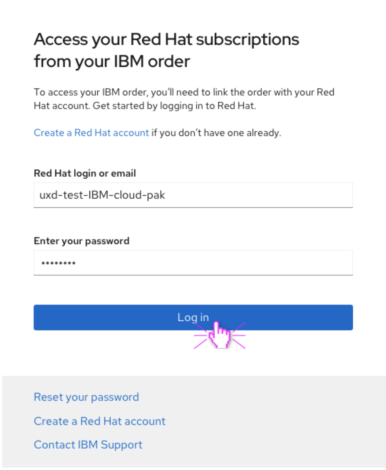
When revising, we asked ourselves, What does the user want? Well, the user is coming from IBM to the Red Hat setup process to link their order. But what they really want isn’t to link their order—they want to access the Red Hat subscriptions they purchased. So we changed the headline to focus on that goal, and then we mentioned the linking process in the body text.
Access your Red Hat subscriptions from your IBM order.
To access your Red Hat subscriptions, you’ll need to link your IBM order with your Red Hat account. Get started by logging in to Red Hat. Create a Red Hat account if you don’t have one already.

When a user arrives on this screen, they’ll know exactly why they should go through the process: to access what they bought.
Be specific.
You don’t often have a lot of room for words in your UI, so be choosey. Opt for specific words that clearly communicate exactly what the user has to know, and eliminate all ambiguity.
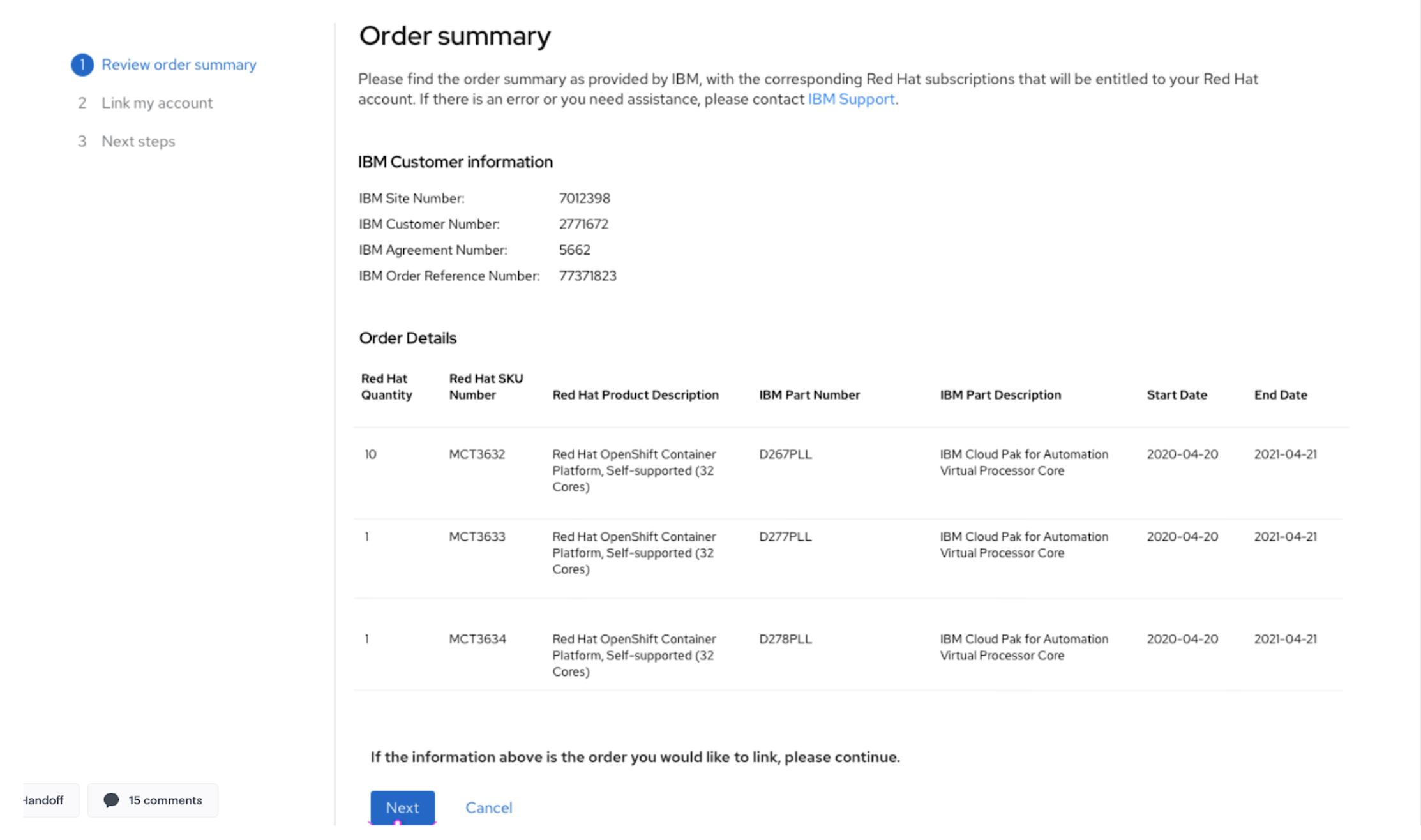
Our order summary page needed revising so that it clearly told users what they needed to do before proceeding. This was the original copy:
Order summary
Please find the order summary as provided by IBM, with the corresponding Red Hat subscriptions that will be entitled to your Red Hat account. If there is an error or you need assistance, please contact IBM Support. [image of order summary] If the information shown above is the order you would like to link, please continue.

With that copy, a user might be left wondering, Where do I find the order summary? What do I do with it after I find it? How do I continue?
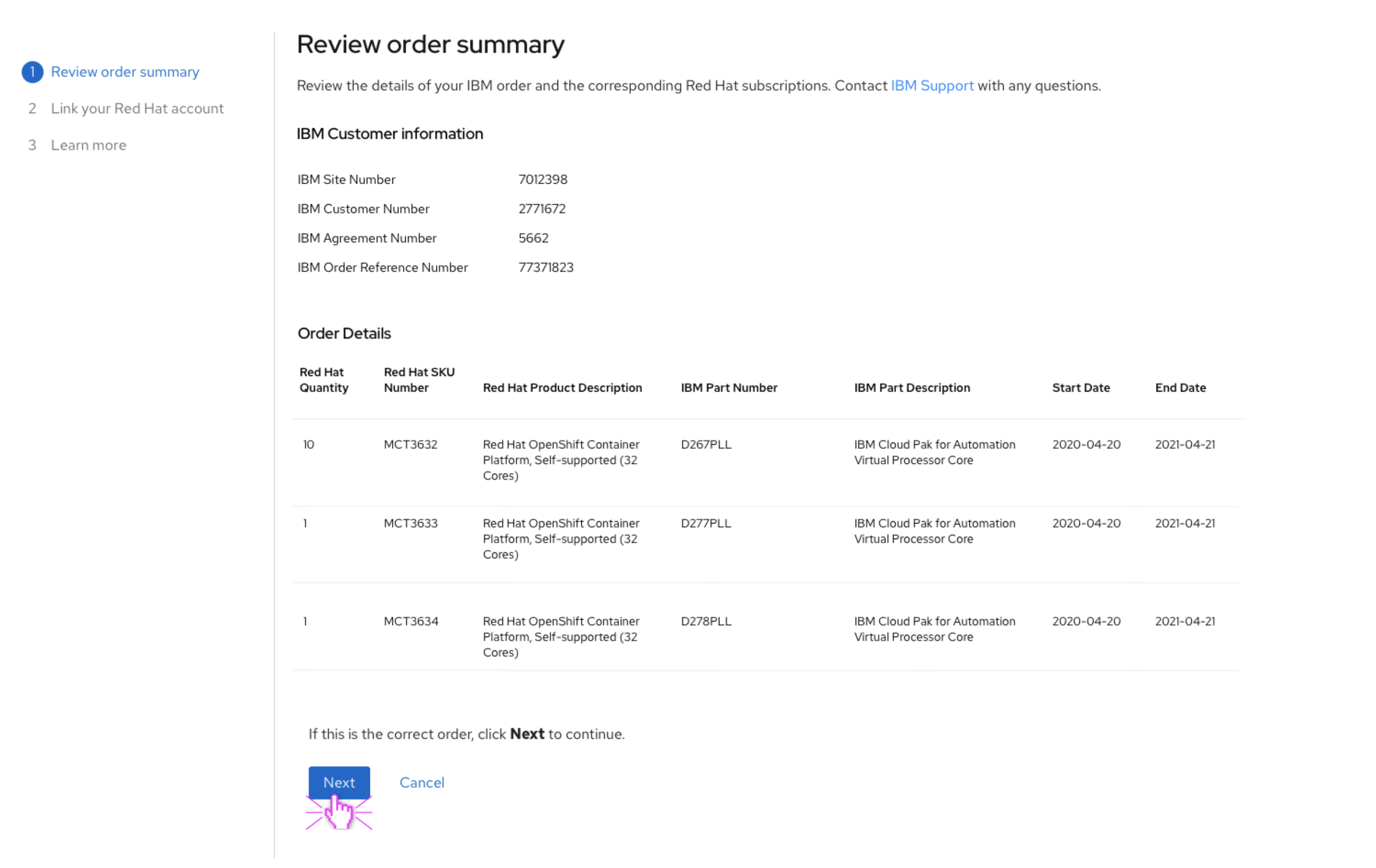
We changed the page title into something actionable and made the copy more specific:
Review order summary
Review the details of your IBM order and the corresponding Red Hat subscriptions. Contact IBM Support with any questions. [image of order summary] If this is the correct order, click Next to continue.

Now a user knows what to do and how to continue to the next step.
Cut out the excess.
Concision is a bit of a balancing act with microcopy. Yes, you should be concise, but cutting out too many words can sometimes do more harm than good. The trick is to cut out “fluff”—aka, extra words that aren’t needed to communicate the main points. These words can clutter the UI and distract users.
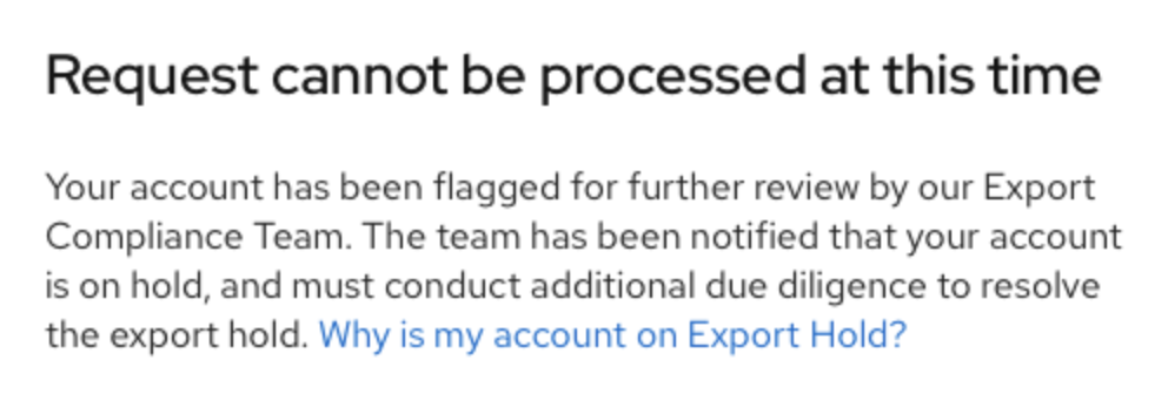
One of our screens told the user their request couldn’t be processed. However, it initially had some extra words that weren’t adding any value:
Request cannot be processed at this time
Your account has been flagged for further review by our Export Compliance Team. The team has been notified that your account is on hold, and must conduct additional due diligence to resolve the export hold. Why is my account on Export Hold?

That message communicates three things to the user:
-
Your request cannot be processed at this time.
-
Your account has been flagged for further review.
-
Your account is on export hold.
That’s a lot! But it doesn’t mean we need all those words. We stripped away the excess to deliver what the user needs to know: what happened, why, and what their next steps are. Here’s what we landed on:
Request cannot be processed at this time
Your account is on hold for further review by our Export Compliance Team. Once the hold is resolved, we’ll be in touch. Why is my account on Export Hold?

This can be a stressful situation for a user—the process didn’t go as planned, and they can’t access their subscriptions right away. So we cut to the chase while still being friendly and conversational.
Putting the user first
When you’re designing something in a UI, think of the user as the final judge. In each of those design and writing best practices, you’re stepping into a user’s shoes and considering how things can be easier for them. Setup processes might never bring complete excitement to everyone, but they can be a nice opportunity to connect with users and help them easily and painlessly reach their final destination. Good UX is a great place to start.
________
Browse through our design patterns and microcopy guidelines on the PatternFly website.
About the authors
Abigael Donahue strives to make software more human, approachable, and accessible. As a content strategist, she combines her creative side with her technical and analytical skills to create growth strategies, content community, and seamless user experiences—while writing and editing along the way.
Russ Blackburn is a Raleigh, NC based Senior User Experience Designer with more than twenty years of experience in advertising and B2C marketing. He has a full range of graphic design experience from highly complex e-commerce websites to simple, elegant print promotions.
Browse by channel
Automation
The latest on IT automation that spans tech, teams, and environments
Artificial intelligence
Explore the platforms and partners building a faster path for AI
Open hybrid cloud
Explore how we build a more flexible future with hybrid cloud
Security
Explore how we reduce risks across environments and technologies
Edge computing
Updates on the solutions that simplify infrastructure at the edge
Infrastructure
Stay up to date on the world’s leading enterprise Linux platform
Applications
The latest on our solutions to the toughest application challenges
Original shows
Entertaining stories from the makers and leaders in enterprise tech
Products
- Red Hat Enterprise Linux
- Red Hat OpenShift
- Red Hat Ansible Automation Platform
- Cloud services
- See all products
Tools
- Training and certification
- My account
- Developer resources
- Customer support
- Red Hat value calculator
- Red Hat Ecosystem Catalog
- Find a partner
Try, buy, & sell
Communicate
About Red Hat
We’re the world’s leading provider of enterprise open source solutions—including Linux, cloud, container, and Kubernetes. We deliver hardened solutions that make it easier for enterprises to work across platforms and environments, from the core datacenter to the network edge.
Select a language
Red Hat legal and privacy links
- About Red Hat
- Jobs
- Events
- Locations
- Contact Red Hat
- Red Hat Blog
- Diversity, equity, and inclusion
- Cool Stuff Store
- Red Hat Summit


