Symbols are important. People care about them.
Their power comes from the number of people who can look at them and take away more or less the same idea. Sometimes that’s just a name. But sometimes there is more; a story, shared values, a common purpose, a way to be.
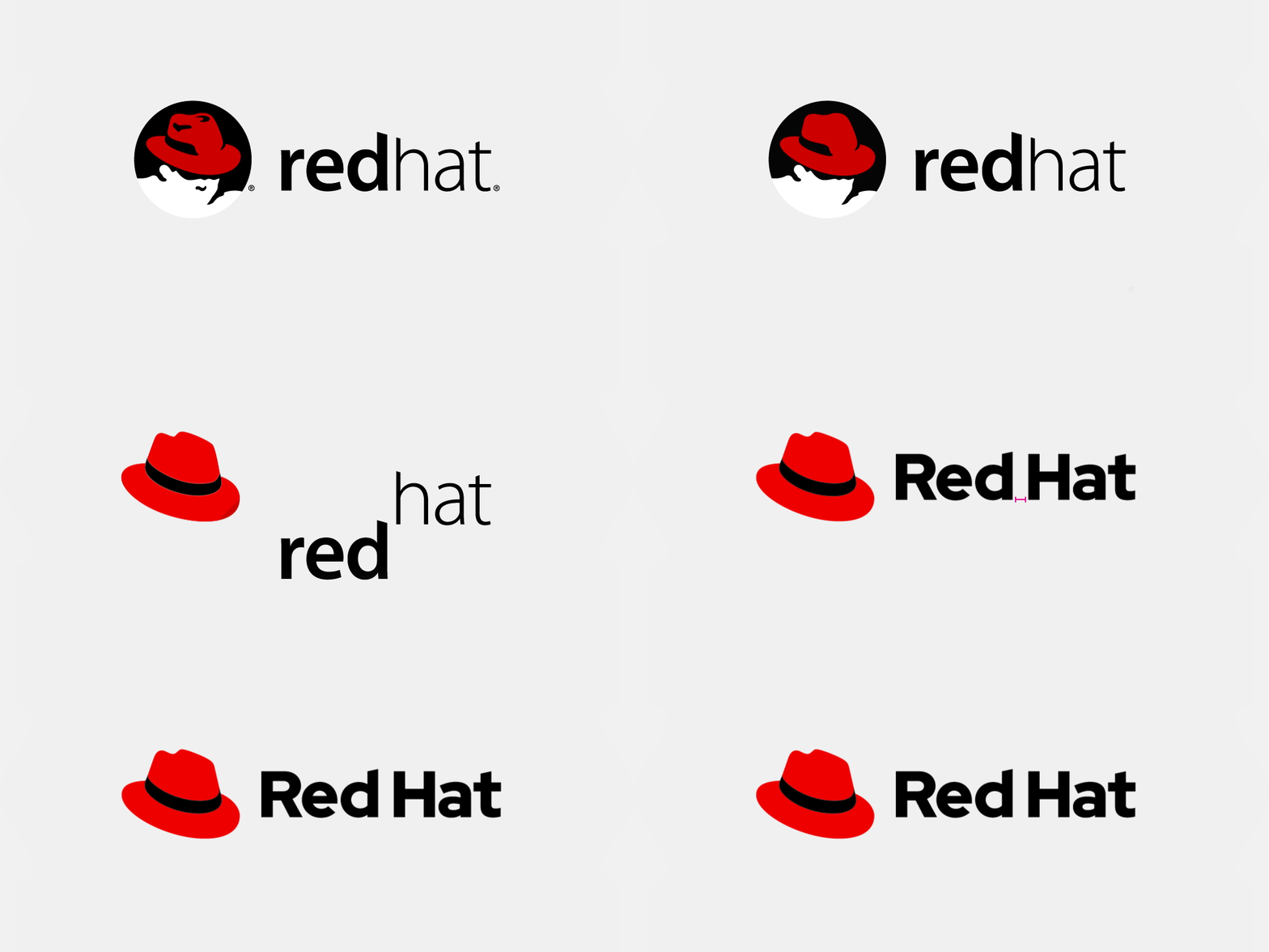
The Red Hat logo is changing for the first time in 19 years. And our challenge, while easy to describe, is thorny. How to preserve the recognizability and reputation (and meaning) of our last mark, while creating something fresh, new and easier to work with.
So, then, how do you make design changes that resonate with the past, seize the current day and position you properly for the next 20 years?
Red Hat chose a deliberate, evolutionary approach, addressing some pretty straightforward problems.
Where is the shadowy guy?
Without a doubt, this was the thorniest of issues. Shadowman, as our previous logo was affectionately known, is a character. Red Hatters understood what he stood for - the fight to level the technology playing field with open source - and rallied around him. (Anthropologists would have had a field day observing our attachment to him. Even referring to him as a real person!) But outside of Red Hat and those unfamiliar with us, took Shadowman at face value. He looked sinister, not as a symbol of openness and transparency. We needed to come out of the shadows.
Shadowman was our symbol for nearly two decades, but the hat—the red hat— is the original and core symbol of the company. When we surveyed Red Hatters and our community, they told us the same thing. The hat was what mattered, not who was wearing it. Using a fedora alone as our logo also helped us solve a lot of problems that made the old logo frustrating to use—it’s simpler, so it works in tiny spaces (like favicons). It’s also easy to infer the name of our company—Red Hat—so we can use the hat on its own in more places. And without the face under the hat, it’s easier to add text and build a full logo system.

How do you spell Red Hat?
Our previous logo didn’t match the proper capitalization and spacing of our name—Red Hat. This led to a lot of confusion, both internally and externally. We spent a lot of time correcting people because our logo was literally inaccurate about our name. A major problem, but a simple fix—we added a space to clearly separate the words and capitalized the “R” and “H.”
Now there’s no question - it’s Red Hat!

What about the font?
For years, we’d been using two different fonts, Overpass (open) and Interstate (proprietary). Neither of them really matched our logo. They were good fonts, based on the U.S. highway signage, but they were also used by a lot of different brands. We wanted something that we could call our own, and that matched our brand and voice exactly.
To that end, we collaborated with a type designer to build a family of open source fonts: Red Hat Display and Red Hat Text.
Our new font is geometric and sans-serif, inspired by the same classic fonts that also inspired Overpass and Interstate. The Display styles have even strokes and tight spacing, with tall, open letterforms. The Text styles have a few tweaks to facilitate extended reading—more contrast between the uppercase and lowercase, narrower width, more generous spacing, and more contrast between thin and thick lines.
Together, they are an open, easy-to-read, flexible type family that is all our own.
All our own, but also freely available.
Open design is important at Red Hat. We have a long history of acquiring and liberating software, freeing it for everyone to use, learn from, and improve upon. And we share other things we create in the same spirit. If it solves a problem for us, maybe it will be useful to someone else.

It’s not just a logo, it’s a logo system!
Our new logo is part of a flexible system that lets us choose the best logo to fit in any application, from tiny digital icons and avatars to the signs on our office walls. The logo can be vertical or horizontal, and the “Red Hat” text can be large or small.
 The logo system extends beyond our corporate logo. With it, we can unify our products and services, give internal teams, projects, and programs a crisp consistent look, and have fun with our brand in ways that we couldn’t before.
 Do I detect a change in the Red Hat red?
Sharp eye! After our logo, the color red is arguably our most recognizable brand asset.
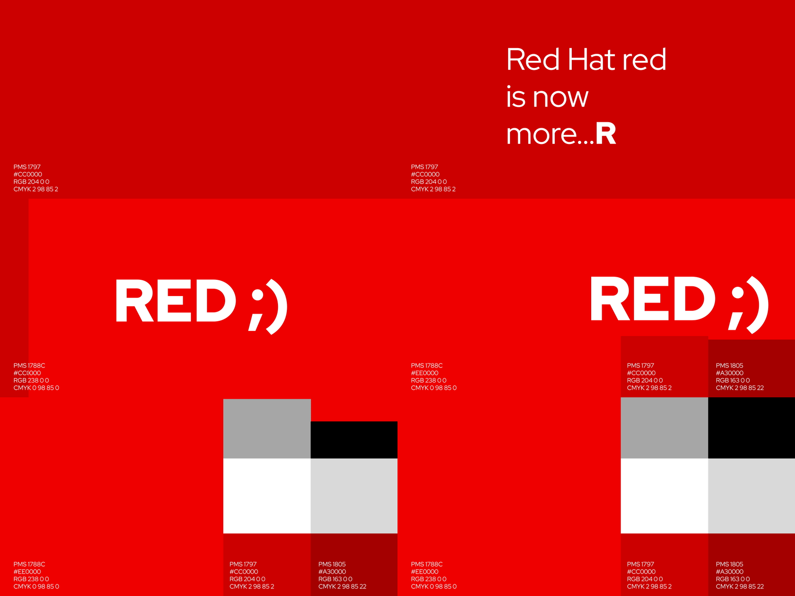
The “classic” Red Hat red (PMS 1797, or #CC0000) failed contrast ratio checks on dark backgrounds, which means that it was difficult or nearly impossible to read for readers with no or limited visual acuity, but it could also cause eye strain for sighted viewers. So we’ve evolved our red to a lighter, brighter shade (PMS 1788C, or #EE0000) that keeps the spirit of the original.
The change can be hard to see unless you’re looking for it, but it makes all the difference when it comes to making our brand legible and accessible for all our audiences.
 Learn more about the details of the project and the steps we took throughout the process that lead us to the new logo. And if you see the new logo out in the wild, snap a pic and share it on Twitter with #OpenBrandProject.
关于作者
Red Hat is the world’s leading provider of enterprise open source software solutions, using a community-powered approach to deliver reliable and high-performing Linux, hybrid cloud, container, and Kubernetes technologies.
Red Hat helps customers integrate new and existing IT applications, develop cloud-native applications, standardize on our industry-leading operating system, and automate, secure, and manage complex environments. Award-winning support, training, and consulting services make Red Hat a trusted adviser to the Fortune 500. As a strategic partner to cloud providers, system integrators, application vendors, customers, and open source communities, Red Hat can help organizations prepare for the digital future.
产品
工具
试用购买与出售
沟通
关于红帽
我们是世界领先的企业开源解决方案供应商,提供包括 Linux、云、容器和 Kubernetes。我们致力于提供经过安全强化的解决方案,从核心数据中心到网络边缘,让企业能够更轻松地跨平台和环境运营。

