
Streamlit is an open source data visualization framework written in Python. It is intended for data science, finance, machine learning, and any other discipline that requires displaying data that can be obtained programmatically.
What sets Streamlit apart from other frameworks is that it's easy to use. It offers a low barrier of entry for people who write applications that require displaying data in sophisticated ways or need to integrate with existing Python code.
This article covers the following topics:
- How to install Streamlit using pip in a virtual environment.
- How to run a basic application that displays data. I'll use race results using the data from my article Build a Grafana dashboard to visualize data using Ansible and Podman.
- How to use third-party libraries to show your data in creative ways.
I will not cover more advanced topics like value caching or other widgets. Also, I assume you have a basic understanding of:
- Scripting in Python
- Writing applications that understand the REST protocol
- Basic usage of the Pandas data structure DataFrame
I'll begin by installing Streamlit.
[ Get the guide to installing applications on Linux. ]
Install Streamlit in a virtual environment
The best way to run Streamlit on a bare-metal or virtual machine (VM) is to install it inside a Python virtual environment. Create a virtual environment like this:
$ python3 -m venv ~/virtualenv/Streamlit
$ . ~/virtualenv/Streamlit/bin/activate
Then create a requirements.txt file containing the necessary Python packages:
pip==23.0.1
setuptools==67.4.0
wheel==0.38.4
streamlit==1.19.0
pandas~=1.5.3
Finally, update pip, then install Streamlit using the requirements file:
$ python3 -m pip install --upgrade pip
$ pip3 install -r requirements.txt
Your application can have other dependencies besides Streamlit. Like other regular Python applications, you can manage those using pip.
[ Learn how to manage your Linux environment for success. ]
Write an application
Before I dive into the code, I'll demonstrate a few concepts using a small program that shows my race results in CSV format.
- Streamlit relies heavily on session data (
st.session_state) to communicate changes between widgets. Every time you change a value on a widget that has a unique name, you can capture the updated status on other widgets. - The flow of a Streamlit app is from top to bottom. When something changes on the user interface (UI), the page executes again, but it carries on changes in the session.
- You can break a Streamlit application into pages to make it easier to display information. To share data between pages, use session state.
Read the session state documentation to make writing the proper workflow for your application easier.
Regarding data, Streamlit can query a database, a binary file, or for this case, a CSV file that looks like this:
Event Name,Event Date,Distance,Finish Time,Pace,Gun Time,Overall Place,Gender Place,Age-Group Place,Age-Graded Time,Age-Graded Place,Age-Graded Percent
2018 NYRR Virtual GOOAAALLL 5K,07/15/2018,5 km,0:24:06,07:46,0:24:06,516,469,59,0:22:02,375,58.97
2018 NYRR Virtual Global Running Day 1M,06/10/2018,1 mile,0:06:31,06:31,0:06:31,203,182,23,0:05:56,138,62.57
2016 Abbott Dash to the Finish Line 5K,11/05/2016,5 km,0:23:27,07:33,0:29:40,1055,819,94,0:21:44,723,59.76
ING New York City Marathon 2013,11/03/2013,Marathon,4:27:18,10:12,4:29:56,27160,19238,4046,4:19:57,21389,47.30
NYC Half 2013,03/17/2013,Half-Marathon,1:42:31,07:50,1:50:39,2322,1760,277,1:39:42,1989,58.56
Grete's Great Gallop in Support of AKTIV Foundation,10/14/2012,Half-Marathon,1:48:34,08:17,1:51:27,1508,1154,237,1:45:02,1267,56.00
NYRR Fifth Avenue Mile Presented by Nissan,09/22/2012,1 mile,0:05:59,05:59,9:59:48,1241,1116,204,0:05:42,1116,65.19
Fitness Games Men,09/15/2012,4 miles,0:29:07,07:17,0:29:55,480,480,97,0:27:43,535,61.00
Percy Sutton Harlem 5K Run,08/25/2012,5 km,0:23:50,07:41,0:25:10,975,771,130,0:22:42,803,57.00
Achilles Hope & Possibility,06/24/2012,5 miles,0:38:38,07:44,0:39:05,386,326,75,0:37:18,409,57.17
Celebrate Israel,06/03/2012,4 miles,0:30:04,07:31,0:31:52,856,748,143,0:28:38,829,59.00
UAE Healthy Kidney 10K,05/12/2012,10 km,0:49:15,07:56,0:51:29,1886,1567,308,0:47:49,1728,55.89
New York Colon Cancer Challenge 15K,04/01/2012,15 km,1:12:47,07:49,1:13:13,651,544,118,1:09:53,594,59.00
NYRR Gridiron Classic,02/05/2012,4 miles,0:30:28,07:37,0:33:45,1173,960,174,0:29:15,1099,57.80
Joe Kleinerman 10K,01/07/2012,10 km,0:55:05,08:52,0:59:35,2423,1708,316,0:52:51,1850,51.00
NYRR Dash to the Finish Line (5K),11/05/2011,5 km,0:23:36,07:36,0:25:32,593,471,90,0:22:40,562,57.28
To use this data in a basic application, first define a Python package called running with a default module containing two functions. The first function helps with loading the data from the race results CSV file. The second helps with getting the list of all the possible distances ever run.
This package also uses Pandas, as it offers great flexibility for making queries and is supported out of the box by the graphic widgets.
Create a file __init__.py under directory running with this content:
from io import StringIO
from pathlib import Path
from typing import List
import traceback
import sys

import streamlit as st
import pandas as pd
from pandas import DataFrame
from pandas.errors import EmptyDataError

DATE_COLUMN = 'Event Date'


def load_data(raw_data: [Path, StringIO], verbose: bool = False) -> DataFrame:
    data: DataFrame
    if isinstance(raw_data, StringIO) or isinstance(raw_data, Path):
        try:
            data = pd.read_csv(raw_data)
        except EmptyDataError:
            if verbose:
                traceback.print_exc()
                st.warning("Will return an empty DataFrame from load_data", file=sys.stderr)
            return DataFrame()
    else:
        raise ValueError(f"I don't now how to handle {raw_data}")
    data[DATE_COLUMN] = pd.to_datetime(data[DATE_COLUMN])
    return data


def get_distances(df: DataFrame) -> List:
    if 'Distance' in df:
        return [x for x in set(df.get(["Distance"]).to_dict(orient='list')['Distance'])]
    return []
The application starts with a file called Main.py, which takes care of showing basic messages on the graphical UI (GUI) and also allows the user to select a CSV file with the race results:
import sys
from pathlib import Path
from io import StringIO
import streamlit as st

from running import get_distances, load_data

if __name__ == "__main__":
    data_load_state = st.text('No data loaded yet...')
    raw_data = None
    if len(sys.argv) == 2:
        st.title(f'NYRR Race results, using {sys.argv[1]}')
        race_file = Path(sys.argv[1])
        if race_file.exists():
            with open(race_file, 'r') as race_data:
                raw_data = race_data.read()
        st.success('File successfully read', icon="✅")
    else:
        st.title(f'NYRR Race results, choose a file')
        uploaded_file = st.file_uploader(
            label="Choose the race results file",
            type=['csv'],
            accept_multiple_files=False,
            key="uploader"
        )
        if uploaded_file is not None:
            bytes_data = uploaded_file.getvalue()
            raw_data = StringIO(bytes_data.decode('utf-8'))
            data_load_state.text(f"Loaded race data")
            st.success('File successfully uploaded', icon="✅")
    if raw_data:
        dataframe = load_data(raw_data)
        distances = get_distances(dataframe)
        st.session_state['race data'] = dataframe
        st.session_state['all race distances'] = distances
        if 'distance chosen' in st.session_state:
            del st.session_state['distance chosen']
        data_load_state.text(f"Loaded race data was loaded ({len(dataframe)} races, {len(distances)} distances).")
I chose to show or hide some graphic elements depending on whether this is the first time the application is called. I also saved all the race results and race distances on a session st.session_state['key'] = 'value' to use on other pages.
Next, define the additional pages under directory pages. This page contains four GUI elements, including:
- A radio button to choose the distance data to display
- A dataframe table that displays distance data
- Two line charts showing the event date and the overall place in the race
Define those in a file Race_Results.py under the pages directory:
import logging
import streamlit as st
from pandas import DataFrame


def has_basic_data() -> bool:
    """
    Check here if required session values exist. They are defined in Main page.
    :return:
    """
    return 'race data' in st.session_state and 'all race distances' in st.session_state


def filter_by_distance(race_data: DataFrame, distance: str, verbose: bool = False) -> DataFrame:
    """
    Query data from an existing Panda DataFrame and return a new filtered instance
    :param race_data:  Original dataframe
    :param distance: Distance to use as a filter
    :param verbose: Show extra messages on the console
    :return: Filtered dataframe
    """
    query = f"Distance == '{distance}'"
    if verbose:
        logging.info(f"Distance query: {query}")
    return race_data.query(inplace=False, expr=query)


if __name__ == "__main__":

    if not has_basic_data():
        st.title(f"NYRR Race results")
        st.write("Please go to the main page and load the race results you want to study")
    else:
        distance_chosen = st.radio(
            label="Refine your distance distance",
            options=st.session_state['all race distances'],
            index=0,
            key="distance chosen"
        )

        filtered_data_frame: DataFrame = filter_by_distance(
            race_data=st.session_state['race data'],
            distance=st.session_state['distance chosen'],
            verbose=True
        )
        st.title(f"NYRR Race results table ({len(filtered_data_frame)} races)")
        st.dataframe(
            data=filtered_data_frame,
            use_container_width=True
        )

        tab1, tab2 = st.tabs(["NYRR place by type", "NYRR Age-graded Percent"])
        with tab1:
            st.line_chart(
                st.session_state['race data'],
                x="Event Date",
                y=["Overall Place", "Gender Place", "Age-Group Place", "Age-Graded Place"]
            )
        with tab2:
            st.title(f"NYRR Age-graded Percent")
            st.line_chart(
                st.session_state['race data'],
                x="Event Date",
                y=["Age-Graded Percent"]
            )
Below is the race results page with the first tab selected:
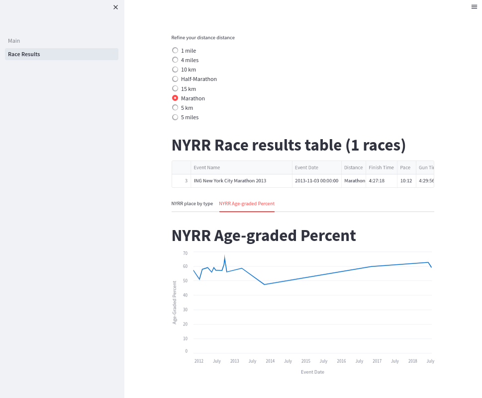
The user can click the race results page before loading any data, so you need to check for the existence of the required session state data. If it doesn't exist, the program refuses to show any GUI components.
If the data is present, it allows the user to filter the original dataframe using the default distance. If the user clicks a different distance, it updates the session. The page runs again from top to bottom, but this time it creates a new filtered dataframe with a different race distance.
Run the application
To run the application, change into the directory with the Main.py file and run streamlit, like this:
(Streamlit) [josevnz@dmaf5 Streamlit]$ cd nyrr
(Streamlit) [josevnz@dmaf5 Streamlit]$ streamlit run Main.py \
   --server.port=8501 --server.address=0.0.0.0

  You can now view your Streamlit app in your browser.

  URL: http://0.0.0.0:8501
Point your browser to the server where you started the application on port 8501.
[ Download now: Podman basics cheat sheet ]
Create a containerized race results application using Podman
You might wonder if there is a good way to package the application so that it can be installed anywhere. A container can do that; let me show you how.
Create a Containerfile:
FROM python:3.9-slim
WORKDIR /app
COPY . /app/
RUN /usr/local/bin/python -m pip install --upgrade pip && \
    /usr/local/bin/pip3 install -r requirements.txt
EXPOSE 8501
HEALTHCHECK CMD python3 -c 'from urllib import request; request.urlopen("http://localhost:8501/_stcore/health")'
ENTRYPOINT ["streamlit", "run", "Main.py", "--server.port=8501", "--server.address=0.0.0.0"]
Create the image:
$ podman build --tag races-streamlite .Then launch it in the foreground:
$ podman run --tty \
    --interactive --name races_result \
    --rm --publish 8501:8501 races-streamlite
So far, you've seen how to create a nice GUI with several graphics components using a few lines of code. It's a living document or a demo.
I was curious about what else I could do with Streamlit. Would you like to take a detour and have some coffee instead?
Una tasa de café, por favor (a cup of coffee, please)
I love coffee. When I was a child living in Venezuela, I grew up drinking café con leche for breakfast. As I grew older, my interest in different ways to prepare coffee also grew, and one day my wife decided to enroll us in a coffee tasting course.
There, I learned how little I knew about how coffee is prepared and how difficult it is to describe what a drink tastes like to others.
The sense of smell can differentiate more things than you can taste, and that's even more than how many flavors anyone can describe with words. To complicate matters, when you talk about coffee, using a common language to describe the taste can reduce ambiguity.
The folks at World Coffee Research have been thinking about this, and they came up with a sensory lexicon:
World Coffee Research unites the global coffee industry to drive science-based agricultural solutions to urgently secure a diverse and sustainable supply of quality coffee today and for generations to come.
If you are like me, you are better with graphics than words. The Speciality Coffee Association of America (SCAA) came up with a flavor wheel that you can use to describe the flavor in your coffee.
Below is a photo I took to give you an idea of how flavors are arranged. If you choose to buy the poster, part of the proceedings support World Coffee Research, which also helps farmers.
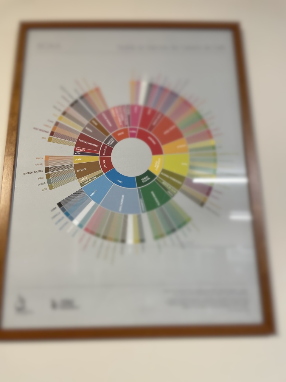
So, how does the wheel work? You take a sip of your favorite Joe and then move from the center of the wheel outwards:
- Say your coffee tastes like nuts/cocoa or "nueces/cacao"
- Move one level out and choose between nueces (nuts) or cacao (cocoa). For the sake of argument, say you decided it's more cacao than nuts.
- Move out one last level. Decide if the flavor is either chocolate or chocolate amargo (dark chocolate).
- Finally, you say the drink tastes like chocolate, and everybody thinks you are a genius!
That's it. Three steps, and you can communicate how your coffee tastes in a standard way.
It would be nice to have a small web app to describe this to anyone tasting coffee. So get to it!
Put the app together
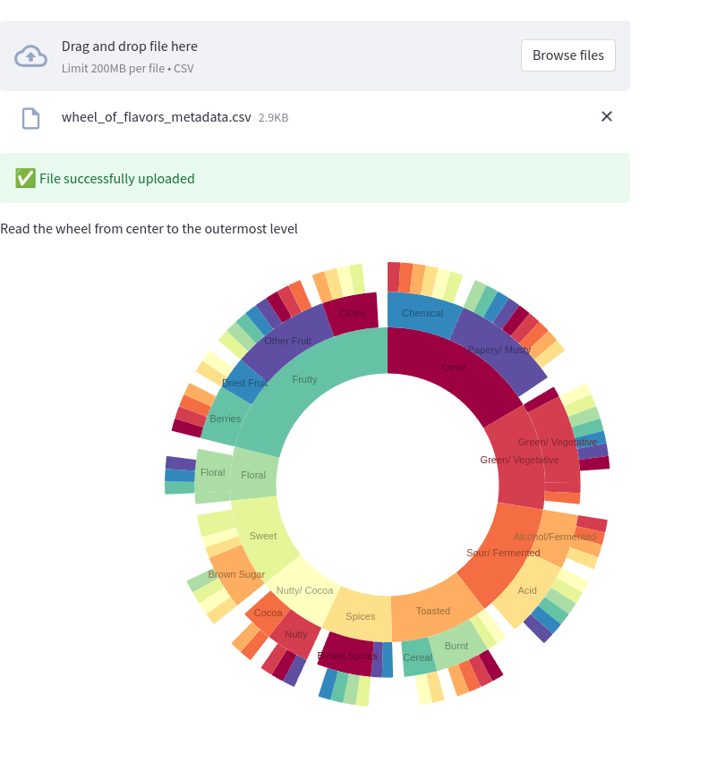
The wheel of flavors looks like a perfect match for a sunburst diagram, using the streamlit-elements wrapper.
The logic is relatively simple. Load all the levels from a flavor metadata CSV file. The file starts like this, and you can get the entire file from wheel_of_flavors_metadata.csv:
"Basic","Middle","Final"
"Basic","Middle","Final"
"Other","Chemical","Rubber"
"Other","Chemical","Skukery"
"Other","Chemical","Petroleum"
"Other","Chemical","Medicinal"
"Other","Chemical","Salty"
"Other","Chemical","Bitter"
Convert the data into a hierarchy that the third-party Nivo Sunburst widget API can understand. Add this code to file Main.py:
"""
This is a Streamlit application that shows how to make the Flavor wheel created
by [SAAC](https://sca.coffee/research/coffee-tasters-flavor-wheel?page=resources&d=scaa-flavor-wheel)
> Originally published in 1995, the Coffee Taster's Flavor Wheel—one of the most iconic resources in the coffee
> industry—has been the industry standard for over two decades. In 2016, this valuable resource was updated in
> collaboration with World Coffee Research (WCR).
Author: @josevnz@fosstodon.org
"""
from io import StringIO
from csv import DictReader
import streamlit as st
from streamlit_elements import mui, elements
from streamlit_elements import nivo

MARGIN = {'top': 1, 'right': 1, 'bottom': 1, 'left': 1}
COLORS = {'scheme': 'spectral'}
BORDER_COLOR = {'theme': 'background'}
ARC_LABELS_TEXT_COLOR = {
    'from': 'color',
    'modifiers': [
        ['darker', 1.4]
    ]
}
CHILD_COLOR = {
    'from': 'color',
    'modifiers': [
        ['brighter', 0.13]
    ]
}


def load_data(raw: StringIO) -> dict[str, any]:
    """
    Parse flat CSV metadata and convert it to format suitable for Graphic rendering
    :param raw:
    :return:
    """
    hierarchy = {}
    with raw:
        reader = DictReader(raw)
        for row in reader:
            basic = row["Basic"]
            middle = row["Middle"]
            final = row["Final"]
            if basic not in hierarchy:
                hierarchy[basic] = {}
            if middle not in hierarchy[basic]:
                hierarchy[basic][middle] = set([])
            hierarchy[basic][middle].add(final)
    flavor = {
        'name': 'flavors',
        'children': [],
    }
    for basic in hierarchy:
        basic_flavor = {
            'name': basic,
            'loc': 1,
            'children': []
        }
        for middle in hierarchy[basic]:
            middle_flavor = {
                'name': middle,
                'loc': 1,
                'children': []
            }
            for final in hierarchy[basic][middle]:
                if final:
                    final_flavor = {
                        'name': final,
                        'loc': 1,
                        'children': []
                    }
                    middle_flavor['children'].append(final_flavor)
            basic_flavor['children'].append(middle_flavor)
        flavor['children'].append(basic_flavor)
    return flavor


if __name__ == "__main__":

    st.title(f'Wheel of Coffee flavor, choose a file')

    """
    > Originally published in 1995, the Coffee Taster's Flavor Wheel—one of the most iconic resources in the coffee
    > industry—has been the industry standard for over two decades. In 2016, this valuable resource was updated
    > in collaboration with World Coffee Research (WCR). The foundation of this work,
    > the [World Coffee Research Sensory Lexicon](http://worldcoffeeresearch.org/read-more/news/174-world-coffee-research-sensory-lexicon), is the product of dozens of professional
    > sensory panelists, scientists, coffee buyers, and roasting companies collaborating via
    > WCR and SCA. This is the largest and most collaborative piece of research on coffee
    > flavor ever completed, inspiring a new set of vocabulary for industry professionals.
    """

    data_load_state = st.text('No data loaded yet...')
    uploaded_file = st.file_uploader(
        label="Choose the flavor wheel metadata file",
        type=['csv'],
        accept_multiple_files=False,
        key="uploader"
    )
    raw_data = None
    if uploaded_file is not None:
        bytes_data = uploaded_file.getvalue()
        raw_data = StringIO(bytes_data.decode('utf-8'))
        data_load_state.text(f"Loaded flavor data")
        st.success('File successfully uploaded', icon="✅")
    if raw_data:
        flavor_data = load_data(raw_data)
        """
        Read the wheel from center to the outermost level
        """
        with elements("nivo_charts"):
            with mui.Box(sx={"height": 900}):
                nivo.Sunburst(
                    data=flavor_data,
                    margin=MARGIN,
                    width=850,
                    height=500,
                    id="name",
                    value="loc",
                    cornerRadius=1,
                    borderColor=BORDER_COLOR,
                    colorBy="id",
                    colors=COLORS,
                    childColor=CHILD_COLOR,
                    inheritColorFromParent=False,
                    enableArcLabels=True,
                    arcLabel='id',
                    arcLabelsSkipAngle=7,
                    arcLabelsTextColor=ARC_LABELS_TEXT_COLOR
                )
Add streamlit-elements==0.1.0 to your requirements file, update the dependencies, and run the application like you ran the NYRR app in Streamlit.
Now you only need to hover your mouse to give a qualitative answer about how your coffee tastes.
This is great. With a few lines of code, you can pack a lot of information on a screen without overwhelming the user.
Wrap up
I covered several examples here, but you can clearly see the potential of this framework for rapid prototyping because of its easy-to-use API and great compatibility with external graphic libraries.
In summary:
- Please check the documentation. It's well-written and clear. Spend some time getting familiar with the framework's features.
- Markdown support is excellent, meaning you can write beautiful interactive tutorials or data science presentations for your users quickly using real production data.
- You can do much more. Polish applications to make them more interactive. This framework's ability to interact with external graphic libraries makes it very attractive for creating good-looking applications with very little code.
- As you did in this article, you can package your fresh-from-the-oven Streamlit with a Podman container so that it runs anywhere with the latest version of Python.
In a follow-up article, I will show you how to use Streamlit to monitor your infrastructure using data sources like Prometheus.
About the author
Proud dad and husband, software developer and sysadmin. Recreational runner and geek.
More like this
The evolution of infrastructure automation in the age of AI: 4 key takeaways from Red Hat Summit 2026
Why automated network configuration assurance matters for enterprise NetOps
Untangling Networks | Compiler
Operating System Management | Compiler
Browse by channel

Automation
The latest on IT automation for tech, teams, and environments

Artificial intelligence
Updates on the platforms that free customers to run AI workloads anywhere

Open hybrid cloud
Explore how we build a more flexible future with hybrid cloud

Security
The latest on how we reduce risks across environments and technologies

Edge computing
Updates on the platforms that simplify operations at the edge

Infrastructure
The latest on the world’s leading enterprise Linux platform

Applications
Inside our solutions to the toughest application challenges
Virtualization
The future of enterprise virtualization for your workloads on-premise or across clouds