Red Hat Developer branding handbook
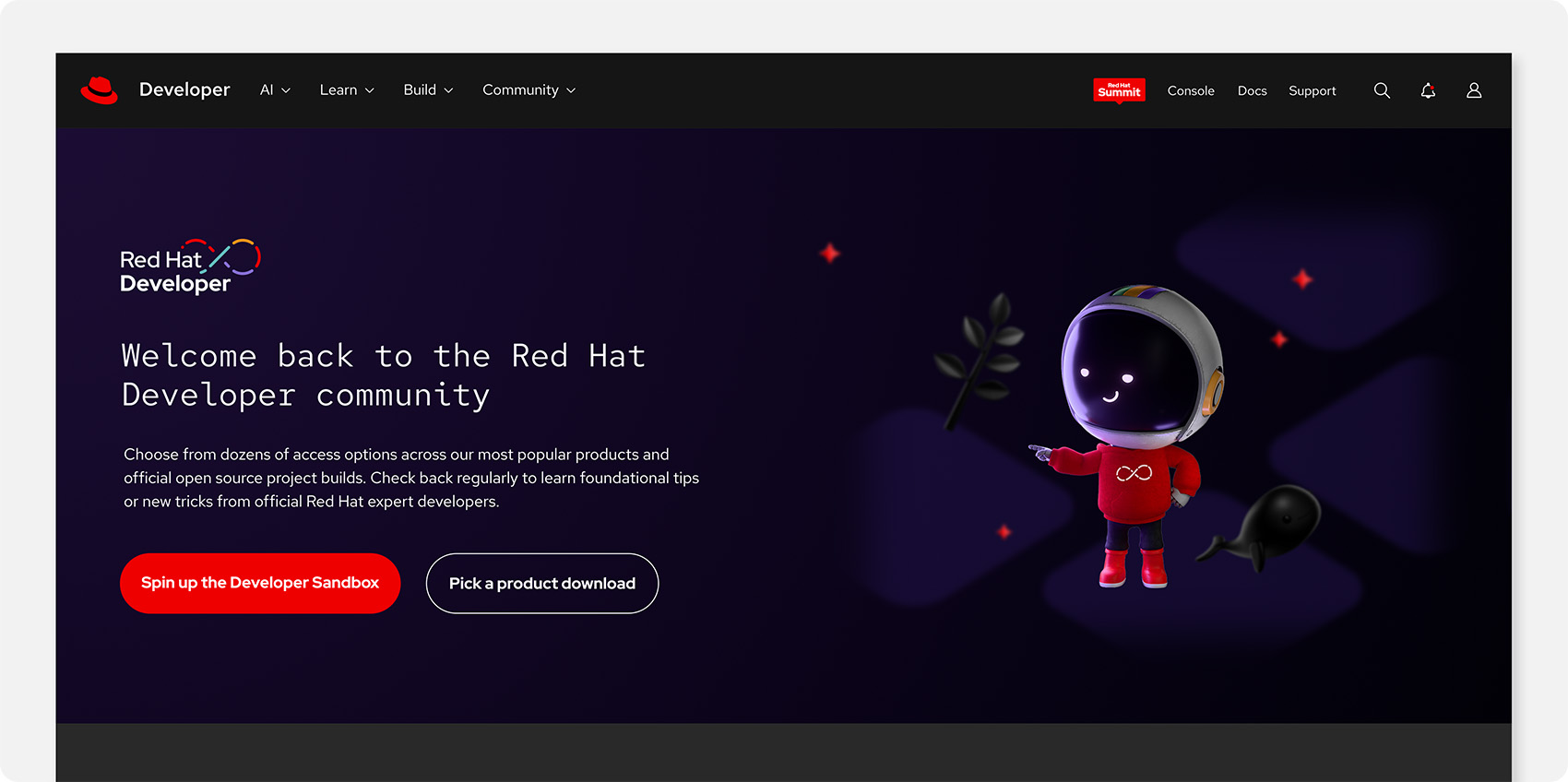
Enterprise developers work in a field of constantly evolving tools and technologies. To capture their attention and maintain their trust, we tell stories that reflect the tech and culture they experience every day. Red Hat® Developer branding extends our brand to meet developers where they’re most comfortable.
Foundations
It’s not enough to simply say that we “get” developers—we have to show them. The Red Hat Developer brand highlights our dedication to developing open source software and openness to sharing first-hand knowledge and expertise with the developer community.
When talking to developers, keep a few principles in mind:

Keep it real
Developers are busy. They need information they can use, not slick marketing. Show that we value their time by keeping things simple and direct. Don’t oversell what we’re offering.
Keep it clever
The bar for what developers consider a credible source is high. Show that we get them by referencing their humor and culture. Strike a witty and playful tone. Our work shouldn’t feel like a pop-up ad in their world; it should feel like it was built there.
Keep it Red Hat
Even when we’re talking to developers, we’re still Red Hat. That means staying true to our brand platform and personality and using our design language. Red Hat Developer branding was built on these foundations.
Red Hat Developer isn’t separate from the Red Hat brand—it’s an extension of hybrid style and our open source culture. We’re not creating a different Red Hat for developers, we’re revealing the one that’s been there all along.


Have feedback on the Brand Standards? Submit it here.
Questions? Red Hatters can reach out via #help-brand on Slack.
Elements
The Red Hat Developer brand starts with the Red Hat design language, borrows aspects of hybrid style, and layers in visual elements designed to tell stories that resonate specifically with developers.
Logo
In addition to using the Red Hat logo, Red Hat Developer has an optional initiative logo that combines text with a multicolor DevOps infinity loop representing the collaborative process of developers. It can be used in several colorways, depending on the context.
Clear space
Clear space around the logo should be equal to the size of the letter ‘o’ in ‘Developer.’ Keep this space clear of other logos, text, or distracting graphics.
Colorways
Default to the full-color logo in most situations, and choose the version with the most contrast against the background. Reserve the one-color versions for applications with production constraints.
Using the Red Hat logo
Either the Red Hat logo or the hat must appear on all Red Hat Developer materials, because being clear about who a message is from is an important part of building a relationship with developers. It should be equal or greater in visual weight to the Red Hat Developer logo.
Place the logos in separate imprint areas when space allows. If the logos must appear in the same area due to space constraints, it should be clear that they are two separate logos—don’t combine them or put them too close together. If there's only room for one logo, use the Red Hat logo.
Not this: Don’t add shadows, gradients, or other effects to the logo.
Not this: Don’t use outdated versions of the logo. Double check the colors.
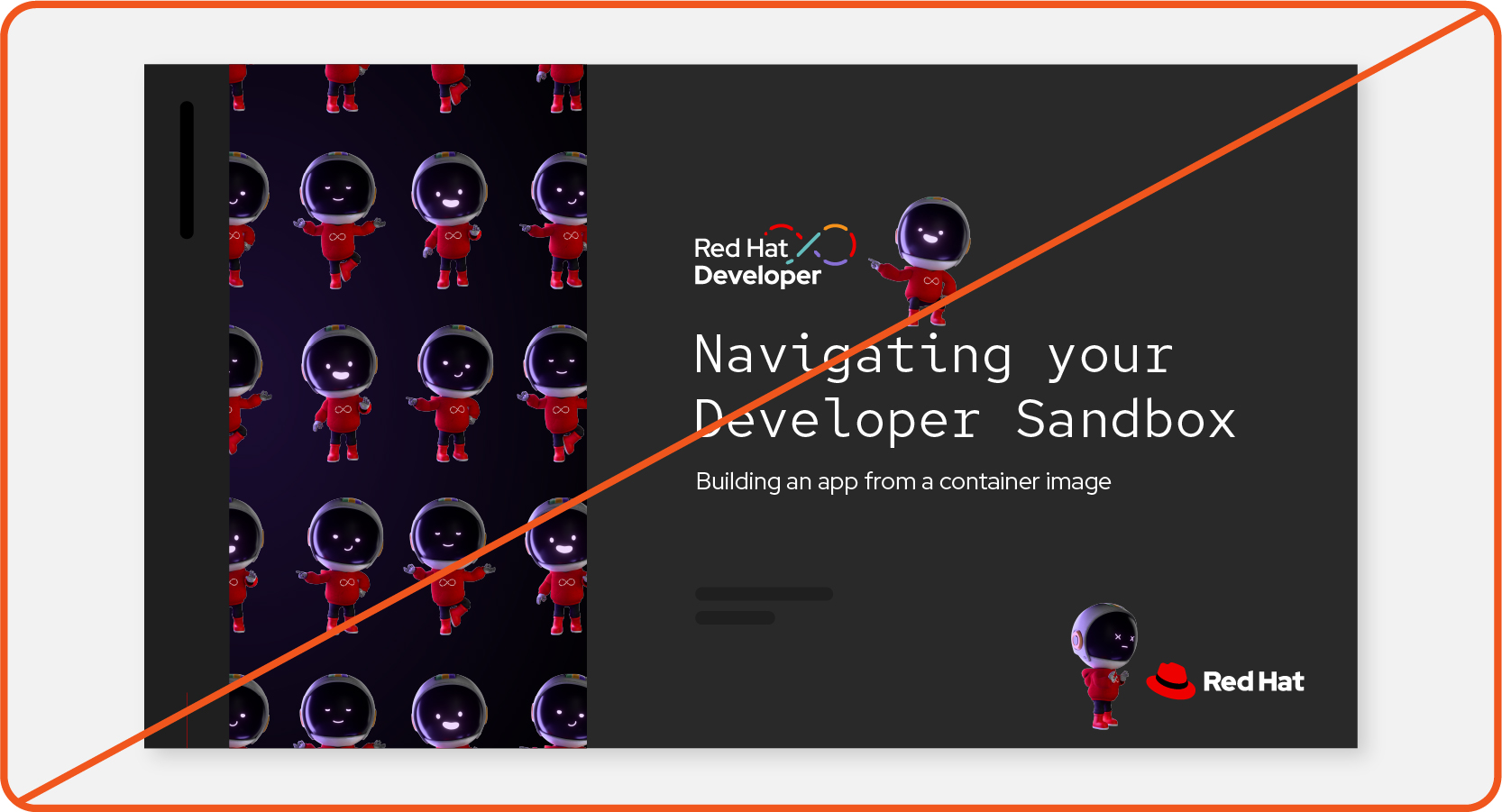
Not this: Don't use the Red Hat Developer and Red Hat logos too close together.
Not this: Don’t combine the Red Hat Developer and Red Hat logos.
Not this: Don’t generate images with the Red Hat Developer logo using AI.
Color
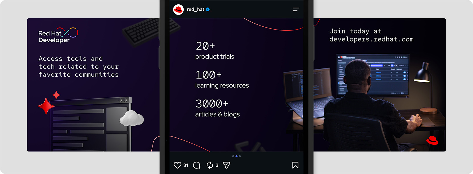
Developers often experience Red Hat in dark mode, spending their time in tools like IDEs and CLIs. Dark color schemes are also prominent in popular media that resonates with developers, like video games and sci-fi.
To match this tone, Red Hat Developer compositions use dark mode and are primarily dark purple and black, with small pops of accent colors. All of the colors are part of the Red Hat color palette.
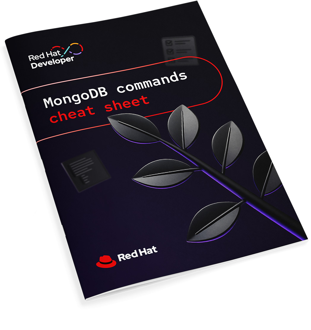
Background color

A radial gradient from purple-80 to black creates subtle depth. Solid black or dark purple can be used as a simpler alternative, when necessary.
Accents

Introduce accent colors via small elements like 3D objects, icons, and base shapes. Start with red (every composition should have Red Hat red somewhere) and add other accents when it makes sense.
Information palette

In software, colors communicate critical info like success and failure. Use the information palette (and other colors) in alignment with our design systems to create consistency between our marketing and product interfaces.
Limited applications like the website or e-books alternate between expressive areas that use dark mode and functional areas that switch to light mode. In these situations, backgrounds can be white or gray. Other elements should remain the same.

Not this: Don’t use colors or gradients outside of those defined in this handbook. Don’t create any new gradients, even using colors in this handbook.

Not this: Don’t mimic the colors of other brands or open source communities.

Not this: Don’t forget to include Red Hat red.
Typography
Red Hat Developer branding follows our font and typography guidelines but places a special emphasis on Red Hat Mono. It also makes use of text stylization that’s reminiscent of coding environments and languages when it makes sense.
When choosing a color for text, prioritize maximum contrast against the background; one flat color is usually best. Remember that red grabs attention, so it should be reserved for short lines of text to highlight key words.

Use Red Hat Mono for headlines and actual code snippets. Don’t overuse it, though; it can become gimmicky and hard to read.
For other text, use Red Hat Display and Red Hat Text as we always would.

Lean into the way code looks with left justification and color changes between words, like how types of commands are differentiated. Mimic coding syntax like line numbers and special characters. Research the coding languages that are related to the message to match their syntax correctly.

Not this: Don’t use Red Hat Mono for body copy, labels, or CTAs. It’s too difficult to read.

Not this: Don’t add elements to the text that aren’t part of real coding environments or don’t match the coding language being referenced.

Not this: Don’t use Red Hat Mono in the Red Hat Developer or Red Hat logos.
Base shapes
The Red Hat Developer brand uses base shapes from hybrid style as accents rather than focal points. Use them to define space and frame compositions.

Use base shapes as stroke lines in a red-30 to red-50 gradient. Exact stroke weight depends on the size of the composition, but should appear thin.

Use base shapes as a subtle background element or pattern in dark purple or black.

Not this: Don’t make base shapes a prominent element in the scene.
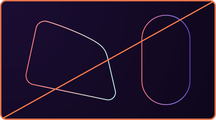
Not this: Don’t use other colors for base shape stroke lines.

Not this: Avoid making base shapes too thin or too thick.
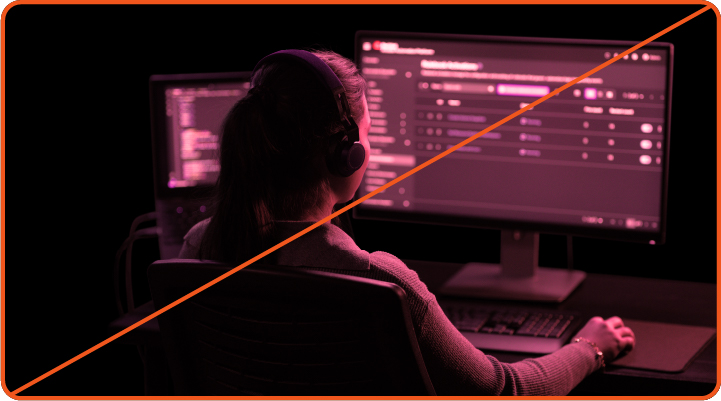
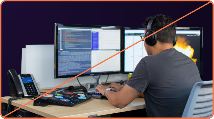
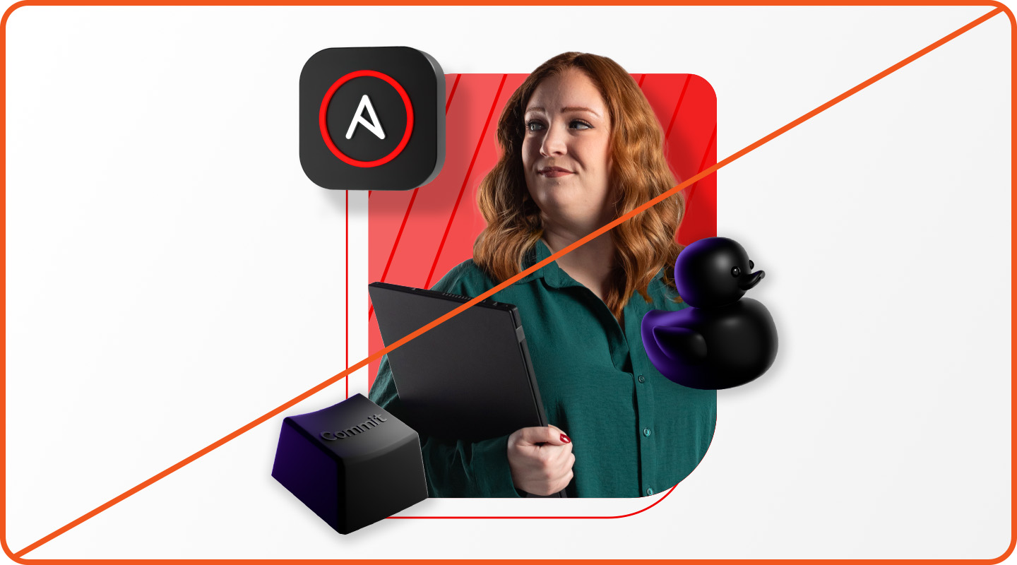
Studio photography
Showing real people working with real software helps the audience to connect to the message. Like hybrid style studio portraits, Red Hat Developer photos feature models captured with stylized poses, props, lighting, and wardrobe. They’re focused on their work, with light emanating from their screen or a small lamp in an otherwise dark workspace.


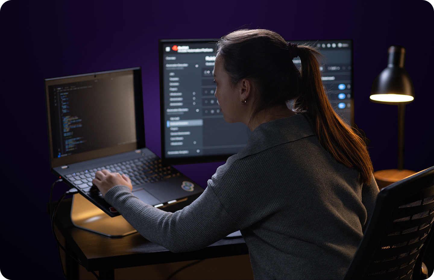

The photos are isolated from their background to make them easier to use together with other elements in collages. They should always be used on a dark background, with gradients so that the lightest color emanates in a way that matches the light source in the photo.
Not this: Don’t edit developer photos or change the lighting or temperature.
Not this: Don’t edit other photos to look like Red Hat Developer-styled photos.

Not this: Don’t use developer photos on a light background. They’re styled for dark mode.

Not this: Don’t use hybrid style studio portraits for Red Hat Developer materials.

Not this: Don’t use purchased stock photos.

Not this: Don’t generate images of real or imaginary people using AI.
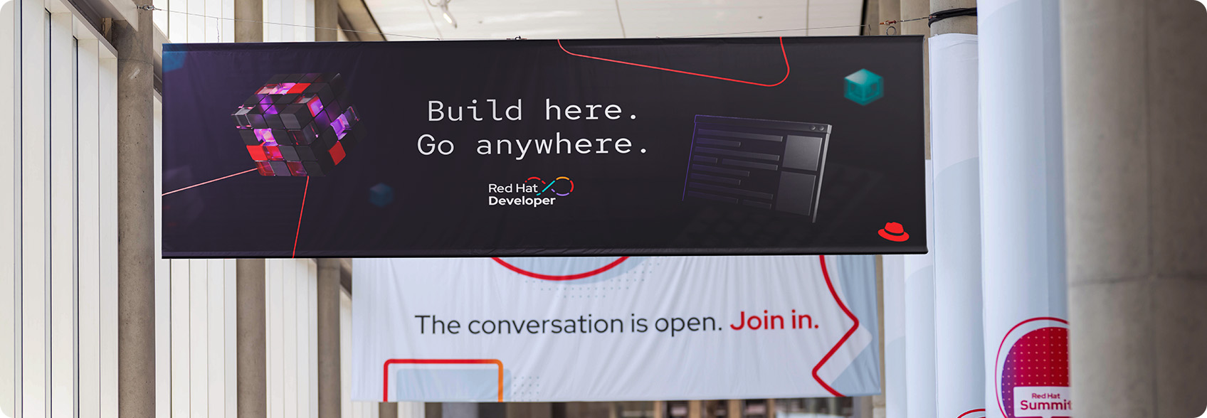
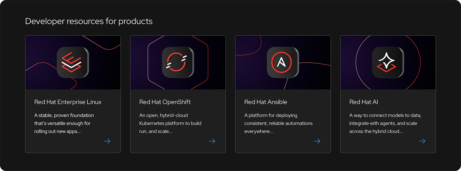
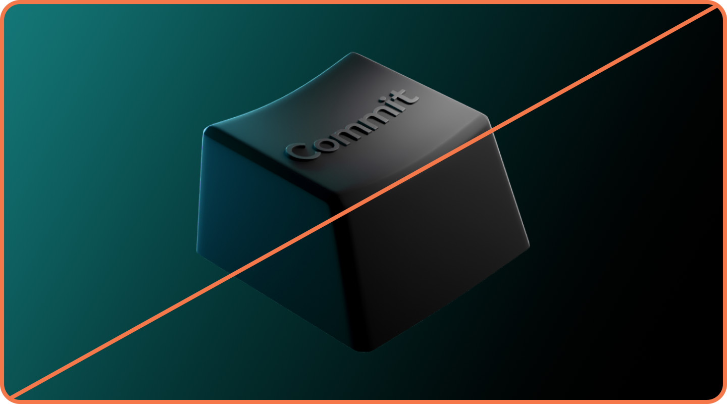
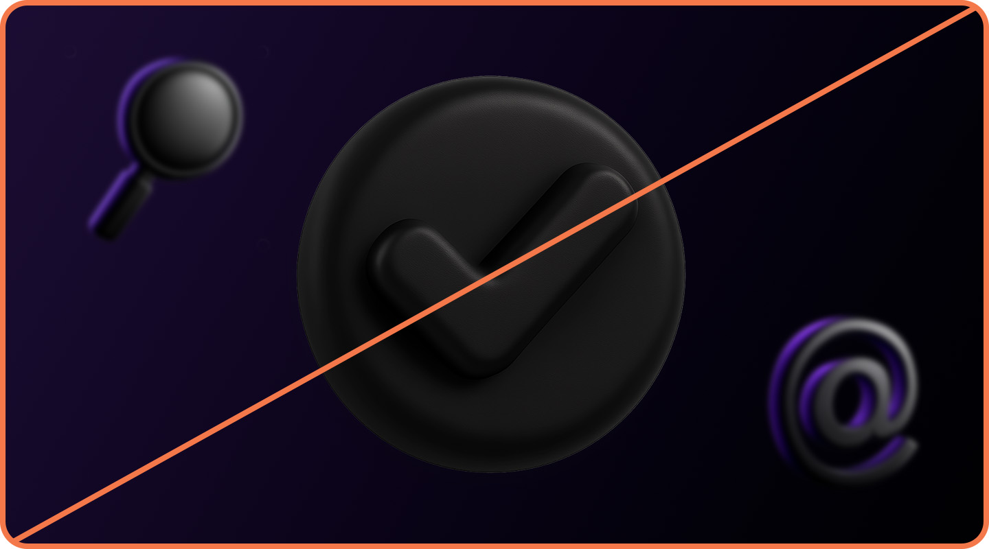
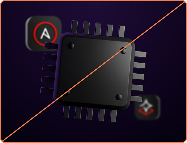
3D objects
In addition to our general library of 3D objects, Red Hat Developer uses a collection of custom dark objects that reference pop culture, technical concepts, and hardware relevant to developers. They can be used as the focal point of the composition or as supporting elements in the background.
New objects are rendered by the Brand team using 3D rendering software and a custom Firefly AI model.
Foreground objects

Foreground objects have a purple glow cast from one side and a white light cast from the other to create a sense of space. Use them as the focal point of a composition, large and in focus.
Background objects

Background objects are monochrome with a matte black texture and hit by diffused white light. They can be pushed to the back by reducing their opacity and adding Gaussian blur to simulate a shallow depth of field.
Not this: Don’t modify the colors of Red Hat Developer-specific 3D objects.
Not this: Don’t use foreground objects as background objects, or background objects as foreground objects. Pay attention to the colors.
Not this: Don’t use developer-focused dark objects in general hybrid style collages.
Have feedback on the Brand Standards? Submit it here.
Questions? Red Hatters can reach out via #help-brand on Slack.
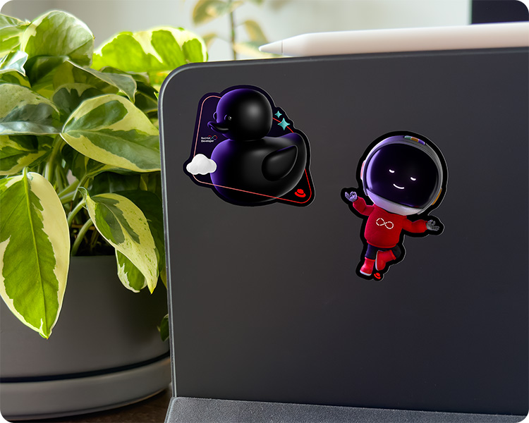
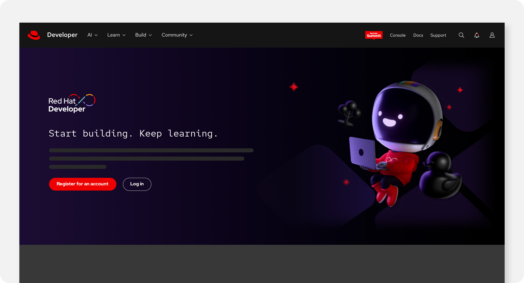
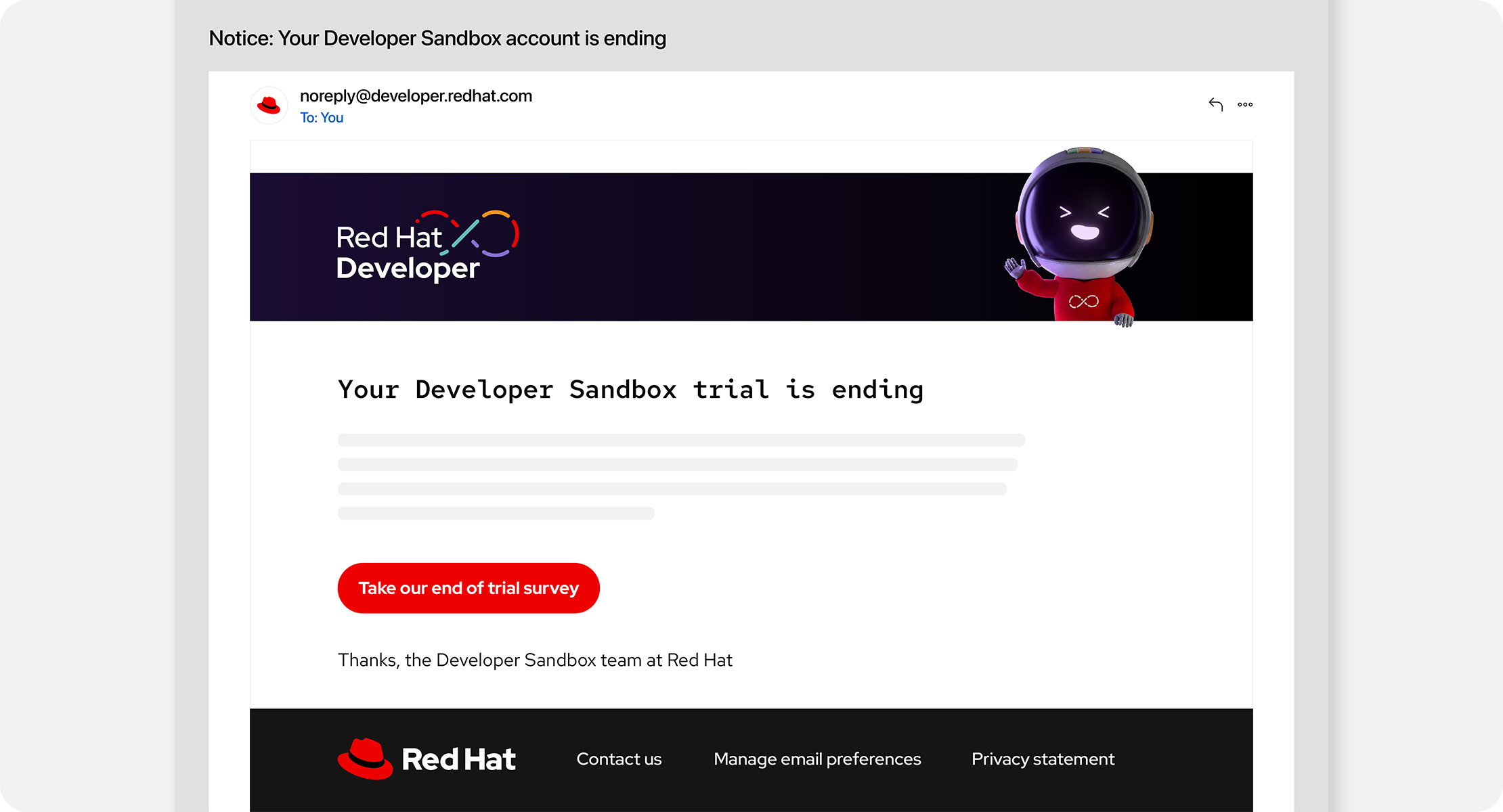
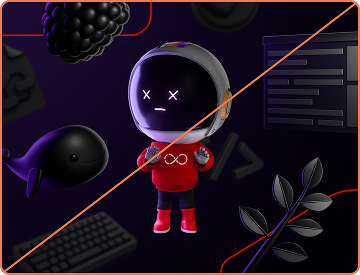
Repo mascot
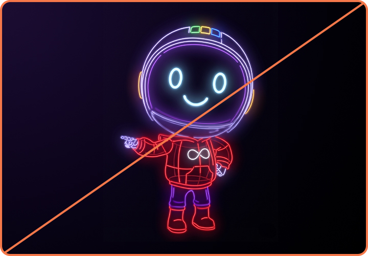
A familiar face can help developers recognize content from a trusted source. Enter: Repo, a curious robotic “reponaut” whose mission is to guide developers as they navigate complex tools and technologies. Inspired by astronauts and space robotics, they represent the ingenuity and pioneering spirit of the open source development community.
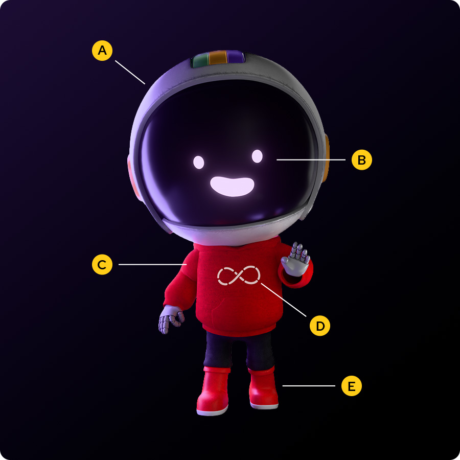
Repo's default hardware
A. Space helmet: Essential for navigating code and surfing cyberspace.
B. GUI: Repo’s digital display, simulating eyes and a mouth for expressing emotions humans can understand.
C. Hoodie: An iconic piece of many developers’ wardrobes, in Red Hat red.
D. DevOps loop icon: Straight from the Red Hat Developer logo (Repo’s a big fan).
E. Moon boots: Practical, all-terrain footwear for exploring complex dev environments.
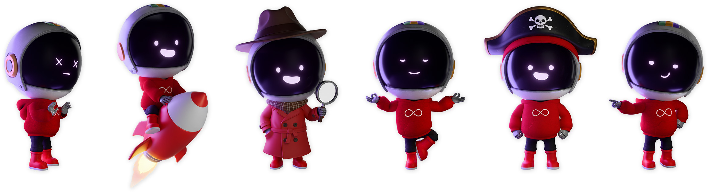
Repo is available in multiple poses with a variety of expressions, objects, and outfits to tell stories and make fun pop culture references. Across these variations, details like the space helmet, GUI facial features, and wardrobe colors remain the same so that Repo remains recognizable. New images are rendered by the Brand team using a modular 3D model and a custom Firefly AI model.
With great power comes great responsibility. As the only mascot used in the Red Hat brand, Repo must be used in ways that represent the brand respectfully and accurately. Avoid using Repo in ways that are divisive, offensive, or would otherwise reflect poorly on our brand.
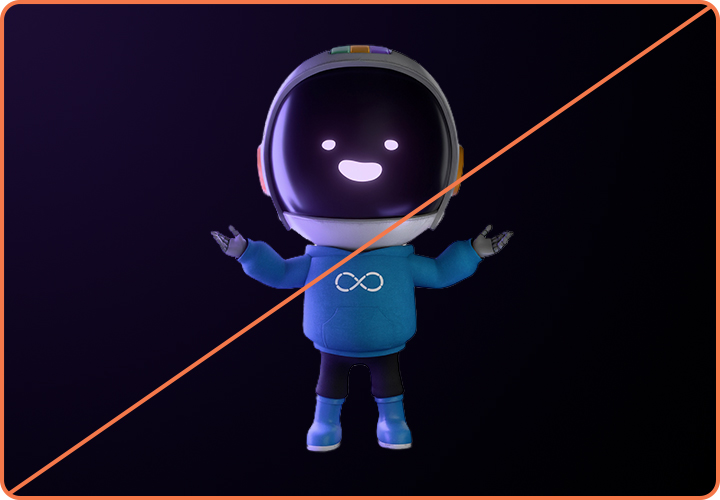
Not this: Don’t alter Repo’s recognizable details, like colors and facial features.
Not this: Don’t use an untrained AI model to create or modify images of Repo.
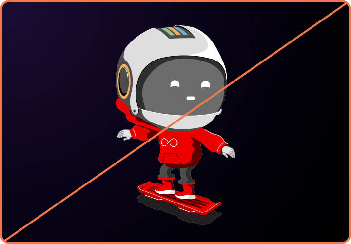
Not this: Don’t use outdated versions of Repo, like the old vector drawing style.
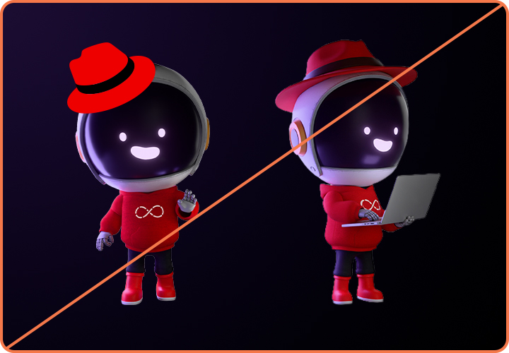
Not this: Don’t place the Red Hat logo, the hat, or any red fedora on Repo.
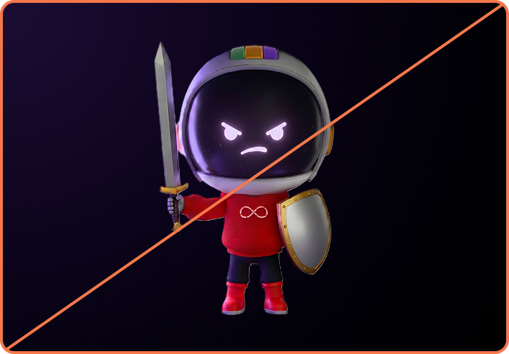
Not this: Repo does not use weapons of any kind.
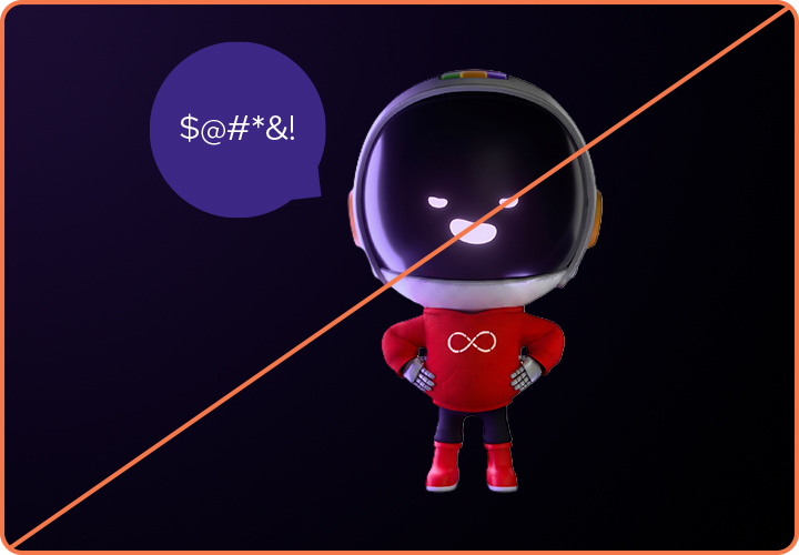
Not this: Repo does not use offensive or inappropriate language or gestures.
Repo in application
Repo is reserved for use in Red Hat Developer materials only. Using Repo outside of their natural environment is less impactful and dilutes their developer cred. And remember, they’re a friend and guide and not a salesperson…ahem…sales robot.
Place Repo in high-impact applications that capture attention and invite developers to learn more. Avoid using Repo more than once in a single layout.

Things to avoid
Not this: Don’t overuse Repo or make a pattern of Repos.
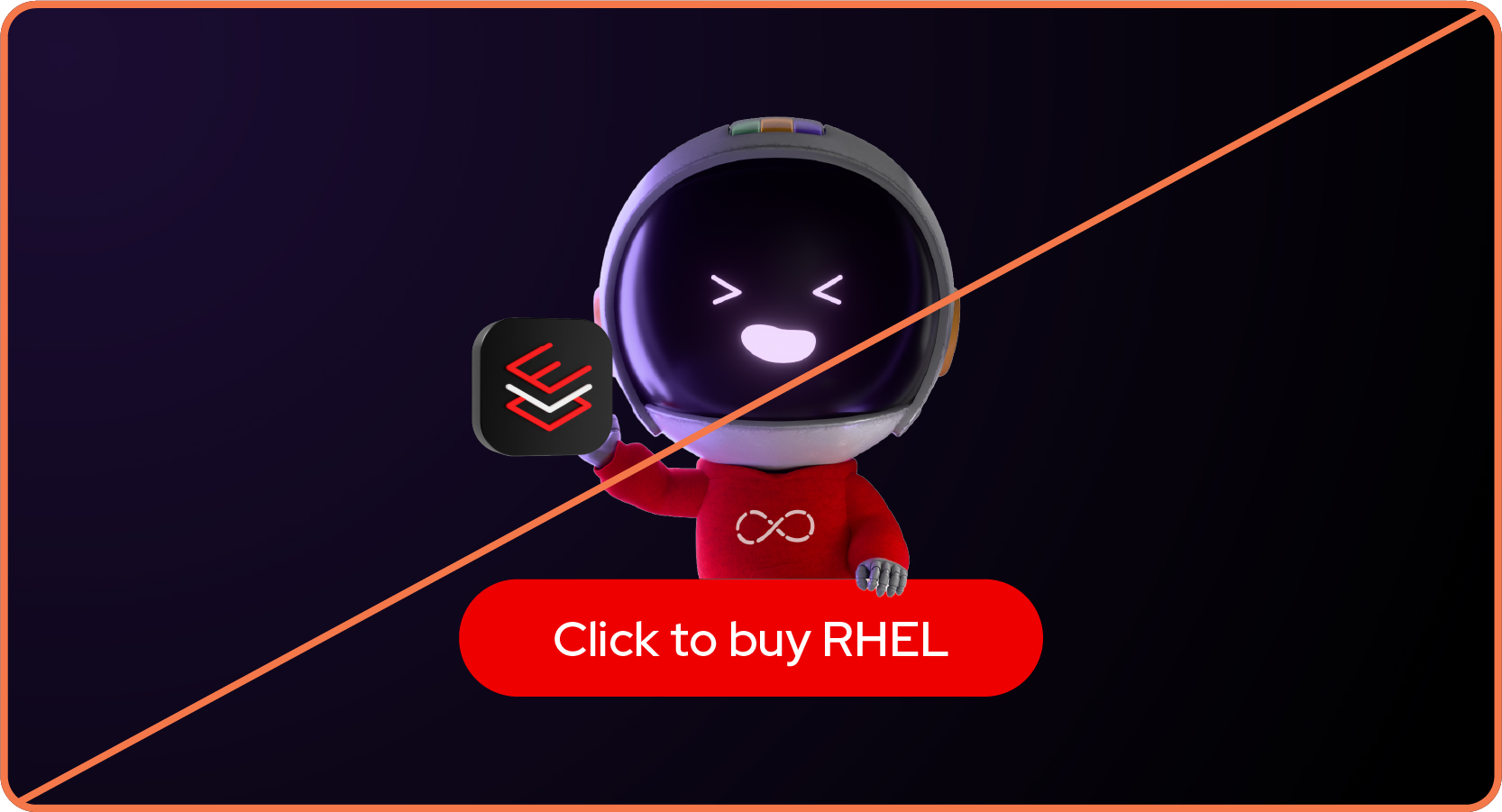
Not this: Don’t make it appear like Repo is endorsing or selling a product.
Not this: Don’t place Repo on materials that aren’t related to Red Hat Developer.
Have feedback on the Brand Standards? Submit it here.
Questions? Red Hatters can reach out via #help-brand on Slack.
Implementation
Like hybrid style collages Red Hat Developer compositions have a single light source and a focal point. But, rather than being combined into a single collage, elements of the composition float in space to encourage exploration and discovery.

Anatomy of a scene
A. Focal point: Choose a single element to be the largest and most prominent. This could be a 3D object with a purple glow, a developer photo, or Repo.
B. Decorative elements: Add small, full-color 3D objects related to the topic.
C. Background objects: Monochromatic 3D objects in the distance create depth. Use size, transparency, and blur to push them into the background.
D. Base shapes: Use base shapes as framing elements or interwoven with other objects.
Despite being in dark mode, compositions should still have plenty of open space. Avoid clutter by using only the elements that are necessary to tell the story. Give text and logos plenty of clear space so that they’re readable and legible and avoid overlapping them with elements like 3D objects or photos.
Resize and rotate elements and apply simple effects to create the appearance of depth and weightlessness. Orient all the elements in a scene so that the lighting looks plausible.
Using effects to create depth
Create depth by using effects and layering to mimic how a camera captures a scene. Push objects into the background by reducing their size and opacity and adding a gentle Gaussian blur, but make sure they’re still decipherable. The exact specs will differ depending on the composition, so adjust them until the details feel right.
Things to avoid when building a scene
Not this: Don’t include an overwhelming number of elements and create clutter. Keep it simple with only the elements required to tell the story.

Not this: Don’t make a non-Developer element the main focal point. The focal point should be a developer-specific 3D object or photo, or Repo.
Not this: Don’t blur or obscure technology icons or other things that need to be fully visible to be recognized.
Making references
Visual and written references to pop culture and technologies are a great way to grab attention and reflect developer culture, but they have to be done right.
We must respect the intellectual property (IP) of others. This is especially important as a leader in open source—the community looks to Red Hat to set a good example. Using IP that belongs to others has the potential to put Red Hat in legal jeopardy, harm our brand, and damage the reputation of open source as a whole.
When working with assets from another company or an open source community, follow our Red Hat-led partner marketing guidelines in addition to the guidance in this handbook.
Referencing pop culture

Do this: Use well-known phrases, acronyms, and relevant internet slang when it relates to the message and feels authentic.

Do this: Reference generic character "types" that developers will recognize, like characters from history, legend, and mythology.

Not this: Don’t use direct quotes from copyrighted materials or song lyrics.
Not this: Don't use inappropriate, offensive, or outdated phrases, acronyms, and slang.
Not this: Don’t use or refer to characters, symbols, or logos that are clearly recognizable from copyrighted materials. This includes re-drawn or AI-generated images.
Referencing a company, community, or technology
Do this: In most cases, allude to a company’s or community’s brand rather than using their logo or brand visuals. Write out the name and/or use a 3D object, icon, or other Red Hat-branded visual that relates.

Do this: If it's necessary to use the logo or brand imagery of another company or community, ask them for permission every time. Use their assets respectfully and without modification.
Not this: Don’t use someone else's logo or brand visuals without their permission. Ask permission before each use.
Not this: Don’t recreate or mimic a logo or brand visual that belongs to someone else in Red Hat’s style.
Not this: Don't use someone else's logo or brand imagery in ways that are disrespectful or that violate their brand guidelines.
Have feedback on the Brand Standards? Submit it here.
Questions? Red Hatters can reach out via #help-brand on Slack.