In this post:
-
Learn how a UXD team helped the engineering team reduce page loading time by 96.6%.
Contrary to the assumption that user experience (UX) design is all about “making things pretty,” UX design extends far beyond simple aesthetics. Let me tell you a story of how Red Hat’s User Experience Design (UXD) team worked closely with our engineering team to improve performance on Red Hat 3scale API Management using design.
But before we get into potential UX solutions, we first need to establish the user frustrations that sparked our explorations in the first place.
Let’s begin at the beginning
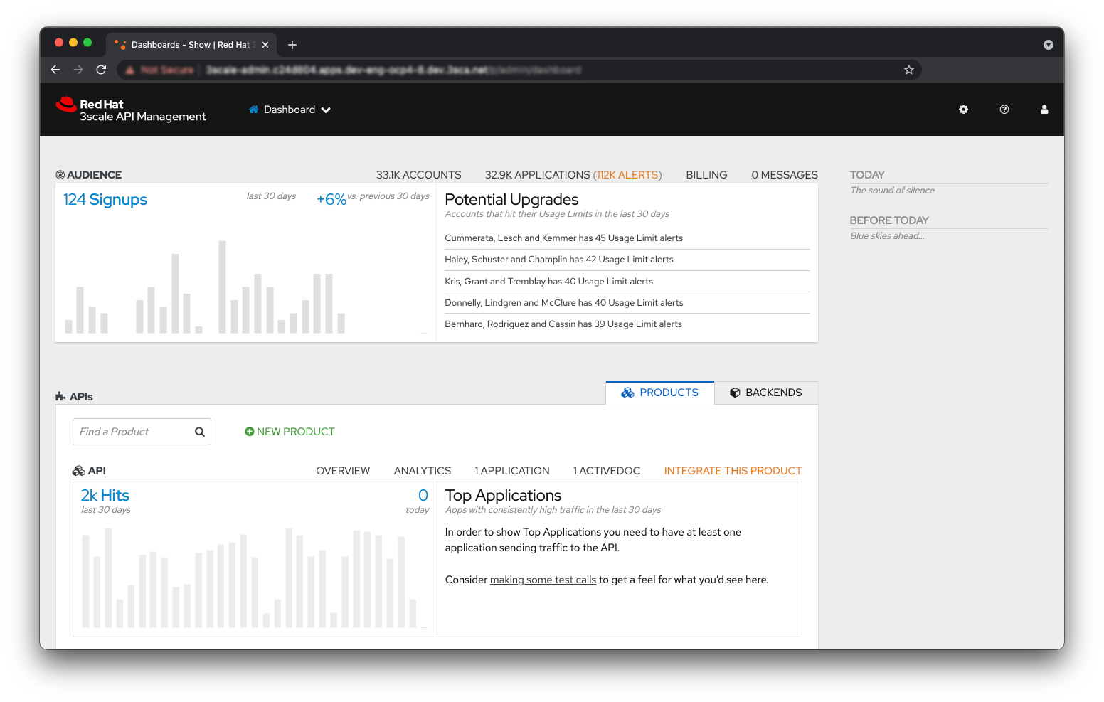
Our current Red Hat 3scale API Management user interface (UI) displays all the API services integrated with the product directly on the homepage. Like many technical tools, the homepage is conveniently structured like a dashboard that reports the status of your system at a glance. Admin users can check and review the customer activity, as well as reach all of the services, expand them and view graphs that describe specific service usage.
 Screenshot of the homepage dashboard. Usage data is pulled and displayed for every single API service integrated with the product.
 What in principle sounds like a good user experience actually raises two issues:
-
It’s easy for a user to have a glimpse of each service status when only a few have been integrated. Add fifty more services to that same list and, with no ability to filter or reorder them, the dashboard user experience will soon reveal its limitations.
-
In order to visualize information for any of the services, a series of calls need to reach the backend of the application where that same information is processed. Simple math will tell you that multiplying the number of calls to the growing number of services displayed would skyrocket traffic between the frontend and backend, which as a consequence will keep feeding that loading hourglass more and more.
The customer is always (mostly) right
We received a support case in which a customer is trying to manage a large volume of APIs and the UI of our product just can’t support the task as it should, resulting in an unacceptable page load time and difficult UI interactions.
Our customer is trying to test out some heavy lifting on their infrastructure: As a big company, they expect intense peaks of traffic, so they need to make sure their system can handle those fluctuations. In technical terms, this customer is trying to manage a use case of about 150 API services.
Being a technical issue, the case gets assigned to the engineering team that tries its best to solve it by optimizing the code, improving caching, testing, and smoothing out any rough edges. Once it was clear that those approaches only incrementally improved performance, the product team approached UXD and asked us how we might address these performance issues with design.
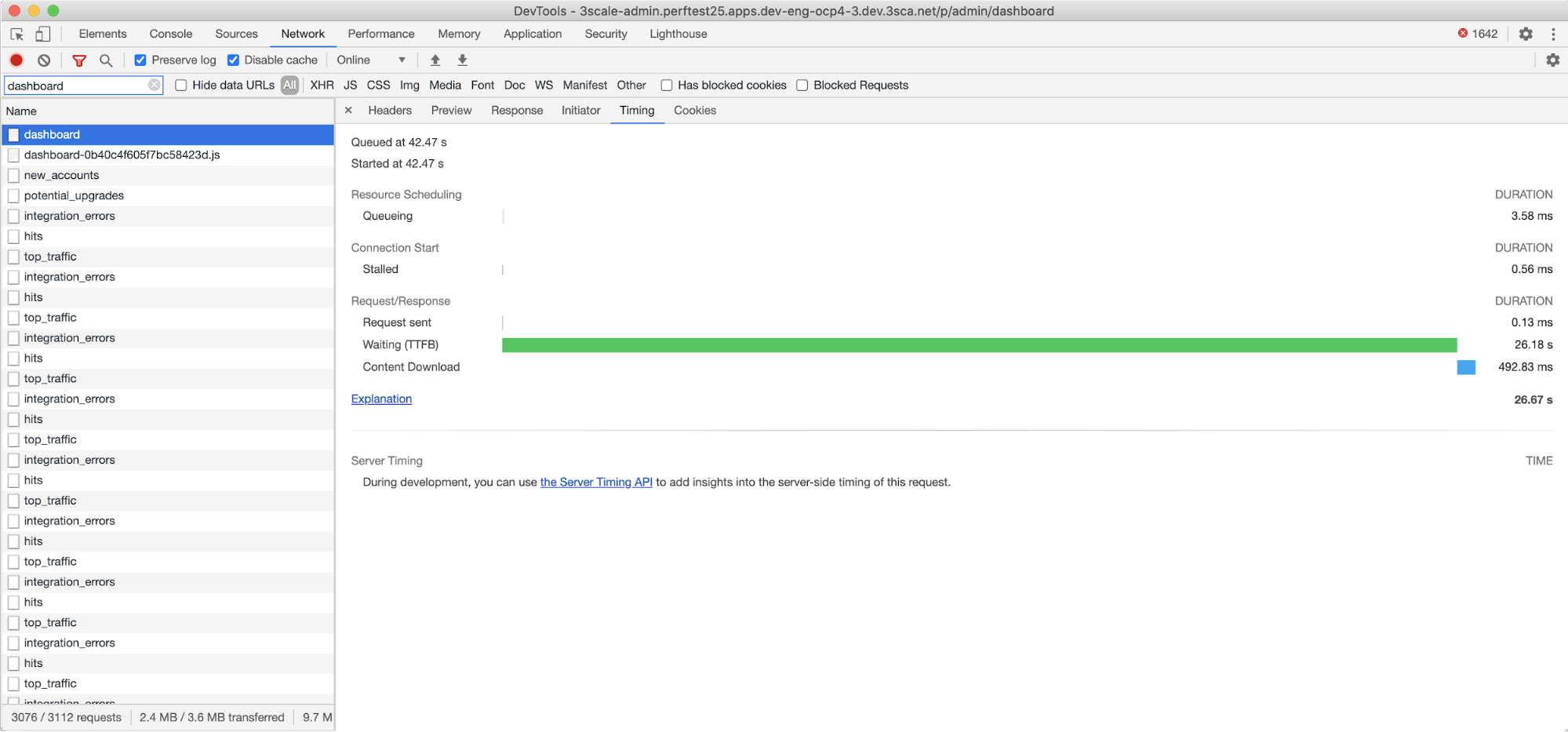
While we start doing early explorations, the engineering team kindly provides us with some measurements: It takes around 44 seconds to fully load a page containing a list of 1,024 API services (a reference number, based on customer feedback, of a high volume of API services managed by a single enterprise installation in the future).
Taking into account that the list of services is actually displayed on the homepage dashboard, it could actually take up to 44 seconds just to open the application’s homepage.
Screenshot of the browser developer tools displaying the total amount of time needed for the frontend to display the page. Server-side response time will add up to a total of 44 seconds from click to page fully loaded.
UX Design in action
Before designing any improvements, we build a list of considerations and goals. By exploring a 3scale API Management homepage redesign, we aim to:
-
Create a homepage that’s entirely a dashboard, unlike the current hybrid between a dashboard and navigation tool.
-
Help users better understand the logic behind the app’s architecture and components.
-
Simplify the navigation.
-
Establish a pattern that we could reuse to fix other scalability issues across the UI.
We start by iterating on a couple of quick UI solutions, such as paginating the lists on the homepage, mostly to keep the implementation effort to a minimum. But that solution doesn’t seem to fulfill all of the design requirements we distilled previously.
This disparity ultimately prompts us to reconsider an idea that had been shared earlier during a usability audit of the product: Decouple the browsing activity from the homepage and move it to new sections entirely dedicated to exploring and managing APIs.
Restructuring the information architecture (the organizing and structuring of content and information in digital tools for usability and findability) would not only help redistribute traffic across different sections and pages, but also invite us to offer the most relevant content for users where they expect to see it. The latter will ultimately lead to a better understanding and easier navigation across the product.
As it mostly happens with design challenges, this use case went from being an issue to an opportunity to improve the overall 3scale API Management user experience.
Our design proposal recommends:
-
Move the lists from the homepage dashboard to two dedicated sections, where they will be paginated and filterable.
 Screenshot of the new API Products explorer page and global navigation menu.
 -
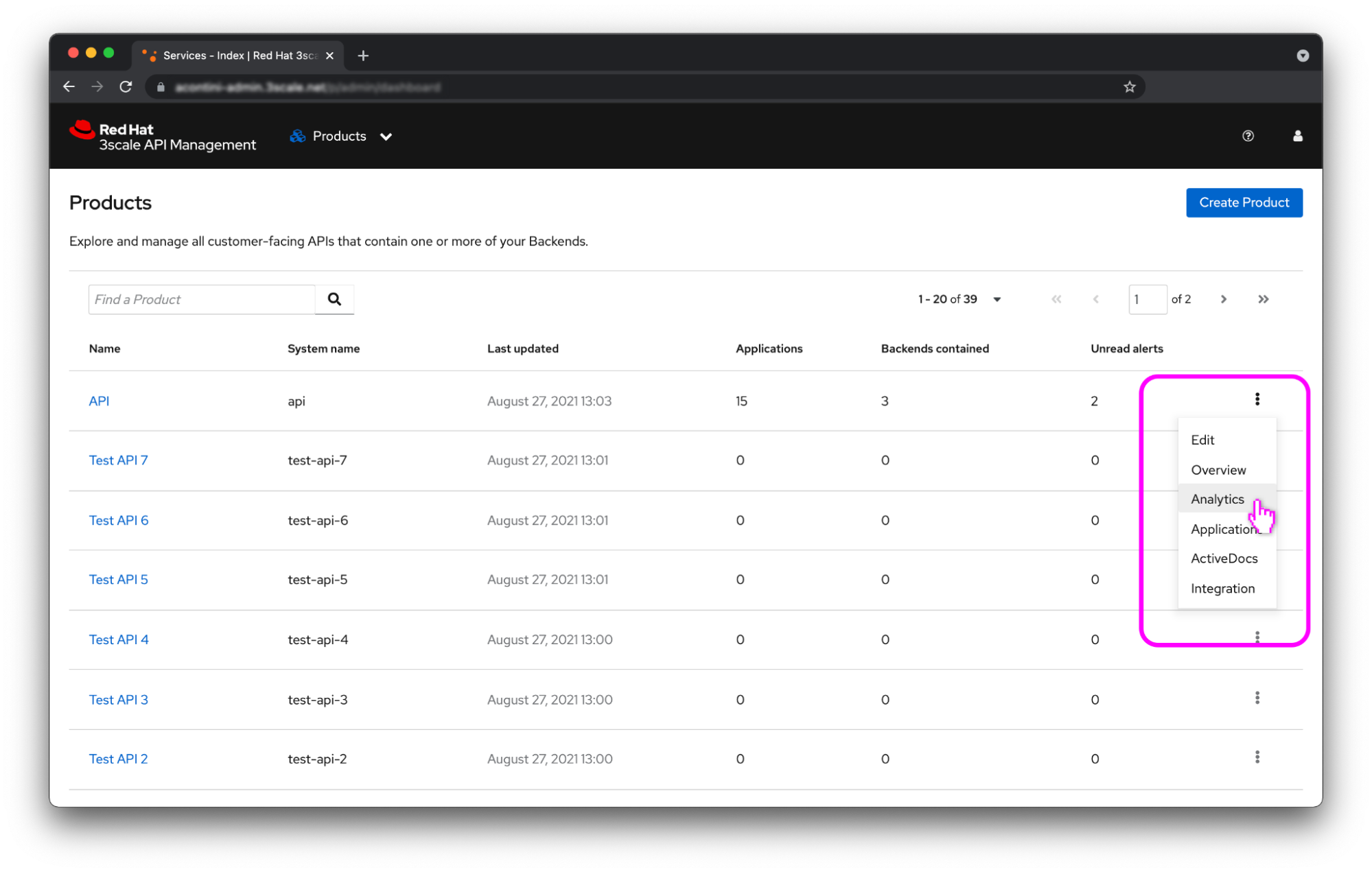
Rearrange how we display service information to make it more informative for the user and easier to reach.
 Screenshot of the new API explorer page and the API contextual menu.
 -
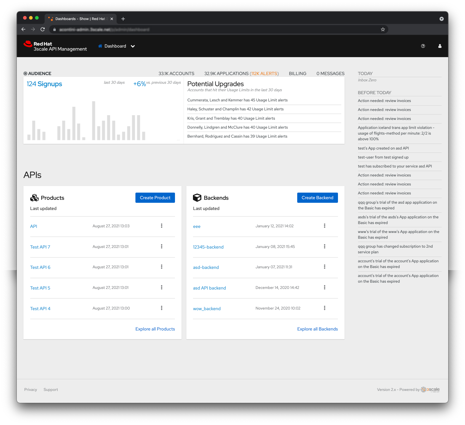
Add two new widgets to the dashboard listing the five most used API services with quick links to their corresponding lists and clear CTAs to create new services. During implementation, we swapped Most used for Last updated for technical reasons.
 Screenshot of the new homepage dashboard with clear call to actions and basic data for each service.
 -
Remove the full list of both API services and the quick filter feature from the top navigation, in favor of adding two clear links to the service explorer pages.
Improving performance with design: The final analysis
In a matter of a few weeks, we hand over all hi-fi mock-ups to the engineering team. Our improvements are discussed and implemented with minor changes due to architectural constraints.
At this point, our design assumptions can be validated from both a technical and qualitative perspective. The engineering team starts running tests on the beta version, trying to load the homepage dashboard when 1,024 services have been integrated.
Data shows that page loading time has been reduced by an astonishing 96.6% when comparing the beta version to the customer’s current version, and by 94.8% when compared to the latest stable release. The homepage of the product now takes a maximum of 1.5 seconds to load with 1,024 services, which stays below the two-second load time threshold identified by Akamai’s “Performance matters” study for online websites and apps.

Comparison of page loading time of the homepage dashboard across different versions of the software.
Solving technical challenges with UX design
If there’s one major lesson that anyone can take away from this project, it’s that UX can actively contribute to solving technical challenges. In our case, this validation has triggered two important next steps:
-
We kicked off a second round of UI scalability improvements across the entire application.
-
We modified our product workflow so that every relevant issue is now reviewed by the UXD team before moving to the implementation phase. By reviewing technical issues with help from engineering, UXD can now spot opportunities for improvement and propose prompt solutions.
To add a cherry on top, we grabbed this chance to update UI components to the latest version of the PatternFly design system. So yes, in addition to making things more usable, we’re still also making things prettier!
저자 소개
Alessandro Contini has been designing and crafting user experiences at Red Hat since 2019. After contributing designs, code, and content to open source projects for about 10 years, Contini is now focusing on helping teams deliver optimal developer experience for cloud-native middleware technology.
유사한 검색 결과
Implementing best practices: Controlled network environment for Ray clusters in Red Hat OpenShift AI 3.0
Friday Five — December 12, 2025 | Red Hat
Technically Speaking | Platform engineering for AI agents
Technically Speaking | Driving healthcare discoveries with AI
채널별 검색
오토메이션
기술, 팀, 인프라를 위한 IT 자동화 최신 동향
인공지능
고객이 어디서나 AI 워크로드를 실행할 수 있도록 지원하는 플랫폼 업데이트
오픈 하이브리드 클라우드
하이브리드 클라우드로 더욱 유연한 미래를 구축하는 방법을 알아보세요
보안
환경과 기술 전반에 걸쳐 리스크를 감소하는 방법에 대한 최신 정보
엣지 컴퓨팅
엣지에서의 운영을 단순화하는 플랫폼 업데이트
인프라
세계적으로 인정받은 기업용 Linux 플랫폼에 대한 최신 정보
애플리케이션
복잡한 애플리케이션에 대한 솔루션 더 보기
가상화
온프레미스와 클라우드 환경에서 워크로드를 유연하게 운영하기 위한 엔터프라이즈 가상화의 미래


