Red Hat OpenShift Container Platform (OCP) has had monitoring capabilities from the start and Network Observability as Developer Preview since OCP 4.10 release.
Network Observability brings user interfaces in OpenShift web console administration to filter and visualize your cluster network flows as:
-
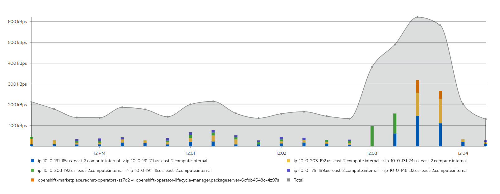
Graph (top 5 flow rates stacked with total example)
-
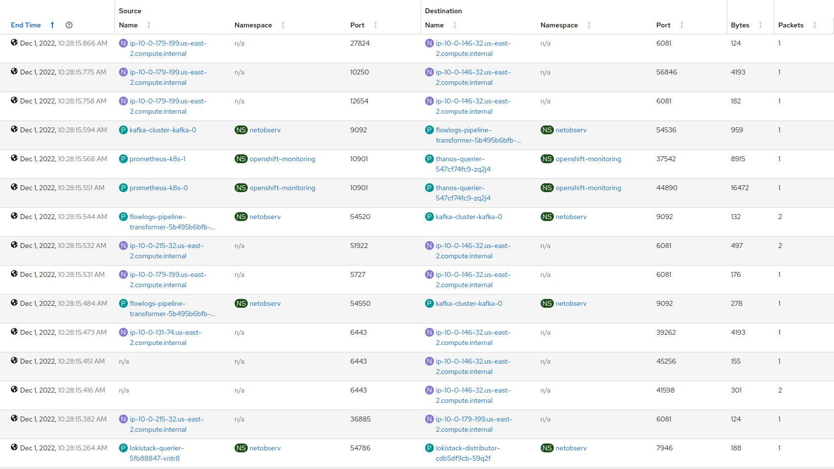
Table (showing sources and destinations sorted by time)
-
Topology (using directed graph layout)
If you are interested in Network Observability for your cluster, check official documentation for installation.
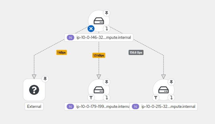
Network representations
Topology view is a great way to understand how the different components of your cluster interact internally and identify which ones are communicating with the external world. It can also help you define your network policies or highlight potential threats.
To avoid huge and unreadable network graphs, we introduced in Network Observability multiple options to focus on the content you are looking for.
-
Time range Showing by default the last 5 minutes, it allows you to focus on a particular time window
-
Filtering To select a particular set of records based on Source and / or Destination criterias such as
IPs,Ports,Protocol,Kind,Nameetc -
Level of details (scope display option) Allowing you to select from
Node/Namespace/Owner/Resourceaggregating metrics into the specified layer -
Groups To arrange components by their ownership
Example of usage
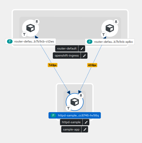
What happens in your network when you deploy a httpd sample application ?

You can see that the final deployed pod in blue involved another pod called httpd-sample-1-build that pulled the image from openshift-image-registry (1), did some DNS resolution for provided image URL (2), pulled it from the resolved external IP (3) before creating our pod through kubernetes services (4).
Finally, some flows are showing between our pod and openshift-ingress after opening the hosted page (5).
After moving my time window or waiting a bit, the httpd-sample-1-build pod disappears as it's status is now Completed.
Complex representations
Sometimes we need to see more than a single application to troubleshoot network issues or to highlight bandwidth usage at cluster level.
2D network topology may start to show its limits as you need to switch between multiple options and never get an overview into a single render.
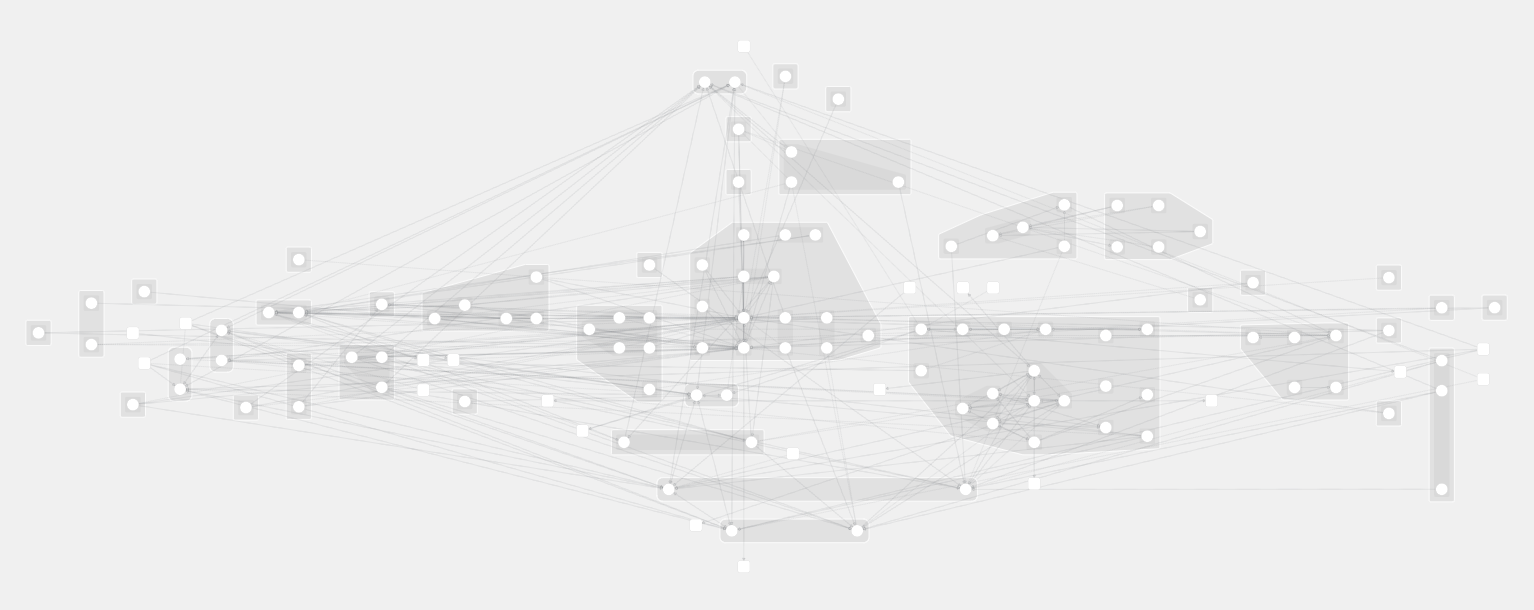
We can do the following observation from this:
- it is almost impossible to have a good overview of your entire network
- drawing each connection on a flat representation is hard to read
- it is difficult to understand ownership and relations between objects without a concrete representation
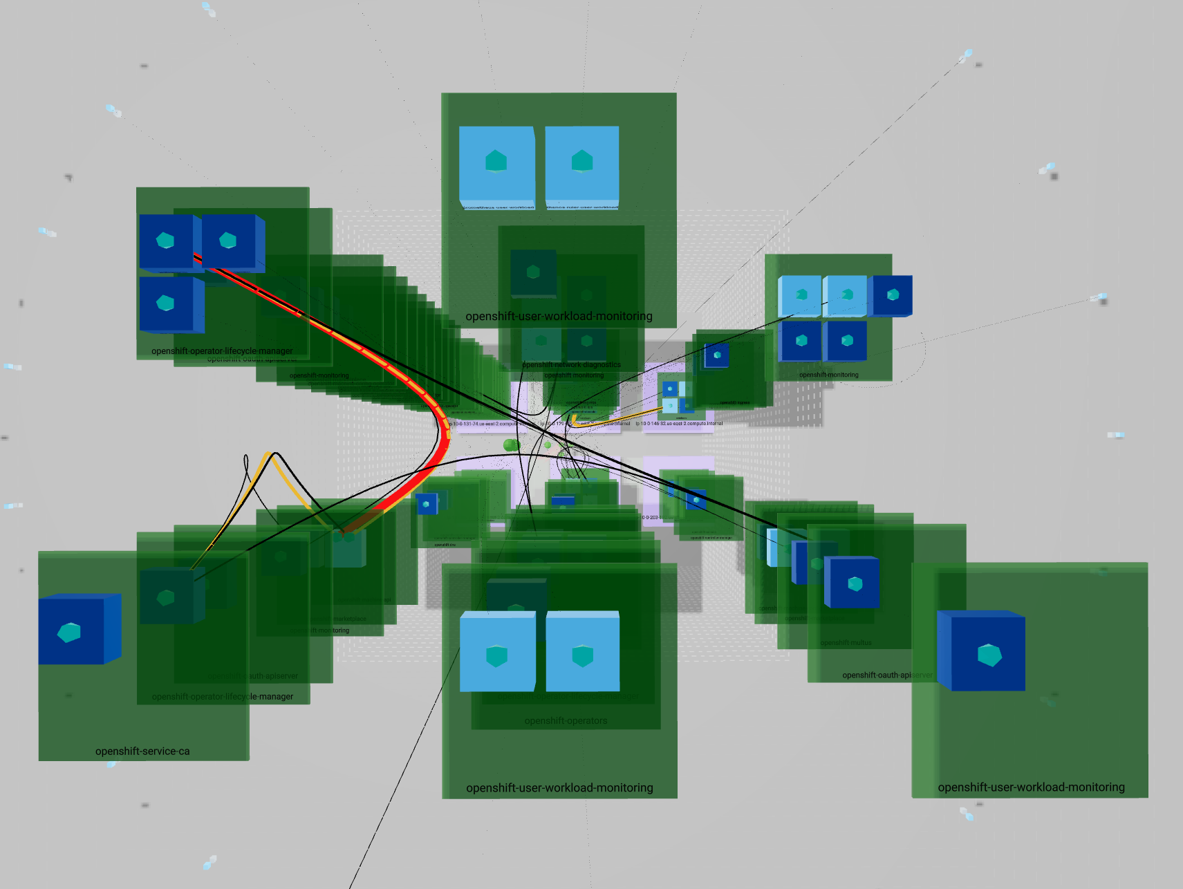
Another dimension
Here is where 3D Topology makes the scene !
3D representations are pretty old and you can find a lot of them online such as networkmaps, vagrant-mesh-net or even more generic ones such as splunk-3D-graph-network-topology-viz. Each of these has its own rendering philosophy to resolve specific use cases.
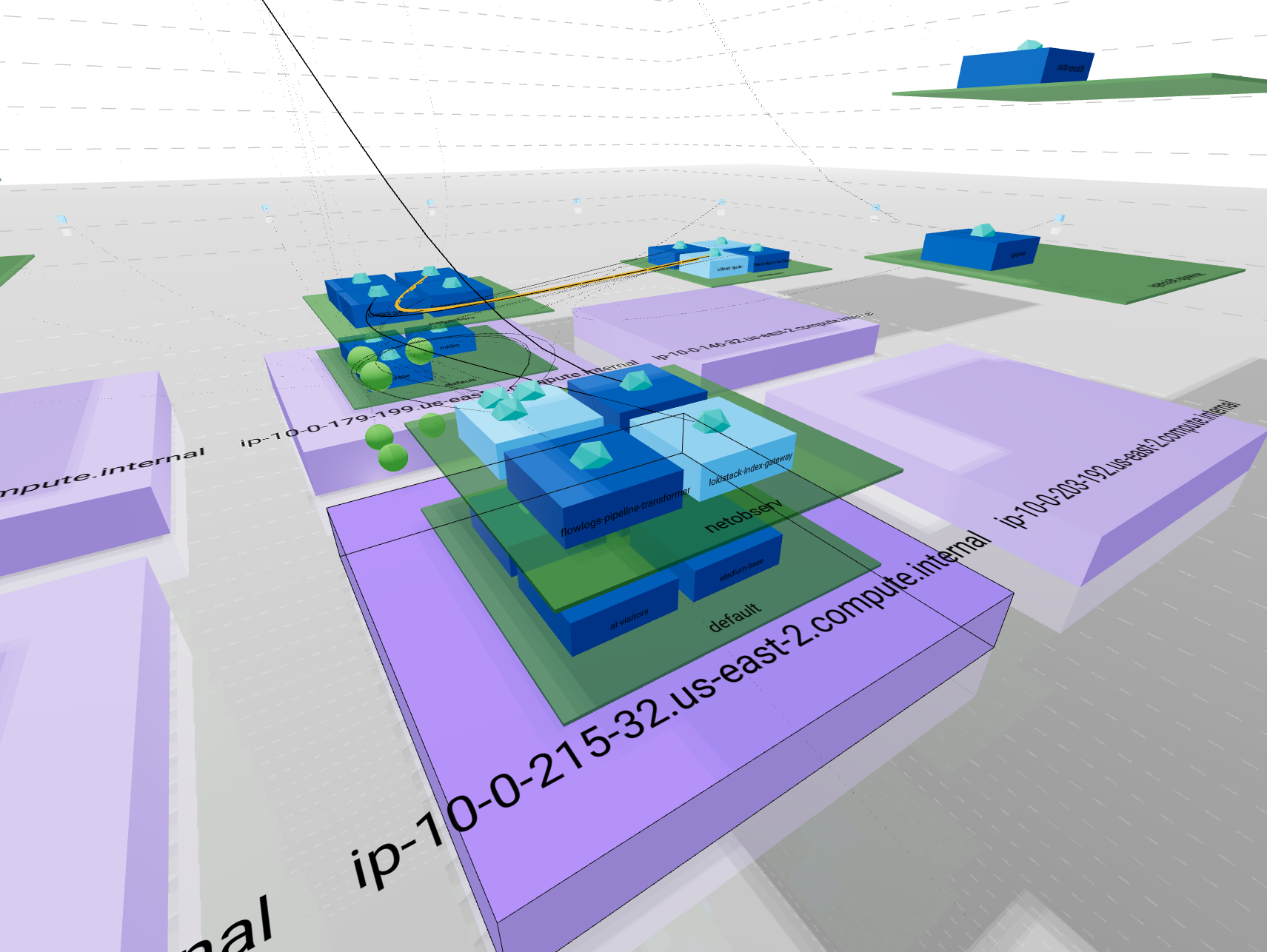
This is a way to render your network using a representation everybody knows: "buildings".
To enable this feature in Network Observability, you will need to use Network Observability v1.0 and add "&3d=preview" in the URL.
Then go to Topology tab -> Show advanced options -> Display options
From there set Scope option as "Resource" and Layout as "3D".
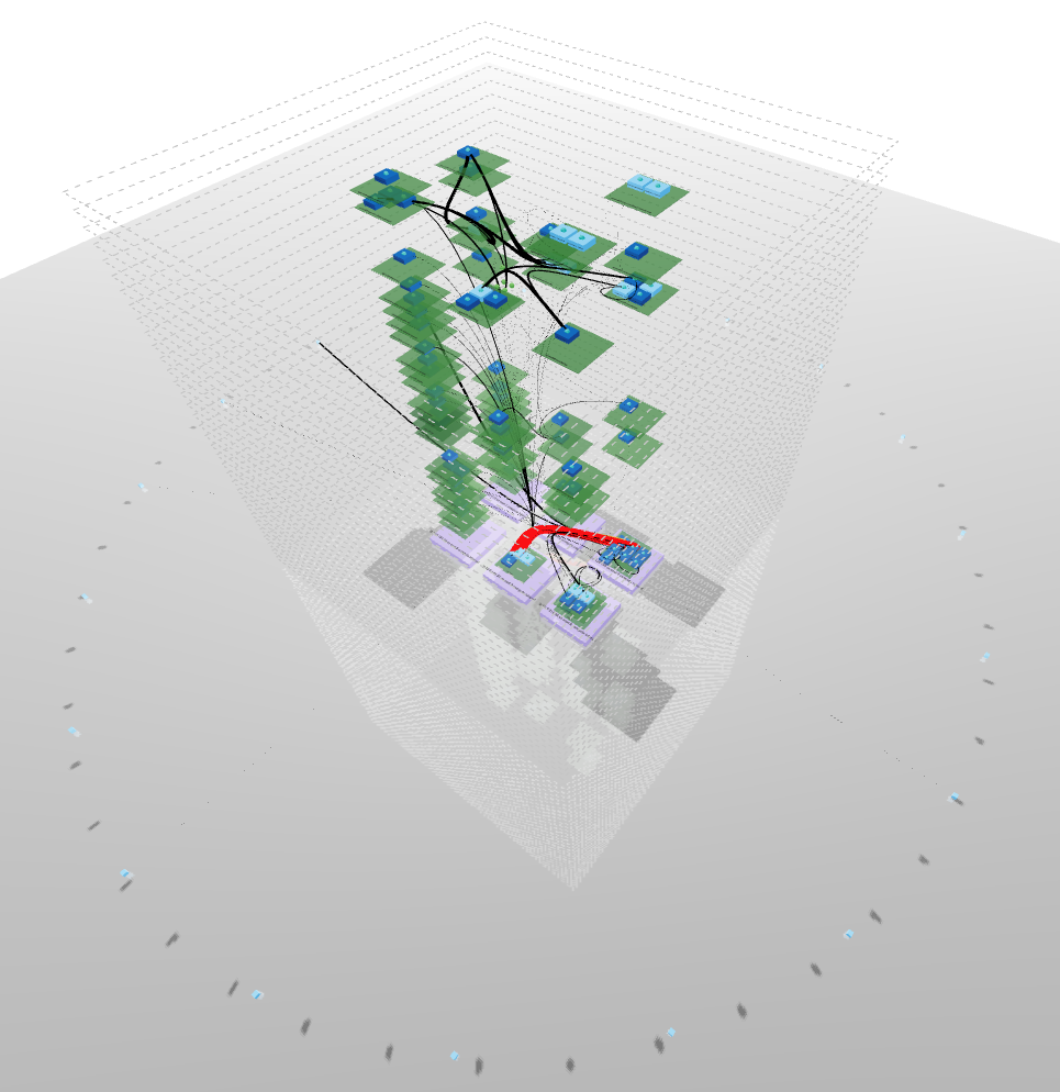
- Building drawn by dotted lines represent your
ClusterEvery internal communication is inside these lines Each floor is represented by a line - Bricks surrounding the building in a circle shape account for
external ips - Ground floor with purple bricks represents your
NodesYou can have multiple nodes all located at ground level - Upper floors in green shows your
NamespacesNamespaces are aligned between nodes so each floor represent a single namespace If a namespace is not carried by a node, you will see an empty space - Rooms stand for owners such as
Deploymentsin dark blue orStatefulSetsin light blue You can have multiple owners per namespaces They will repeat on each node + namespace combination if the load is distributed - Finally, rooms contents depict
PodsThese are represented in the proper node + namespace + owner combination according to its kindred
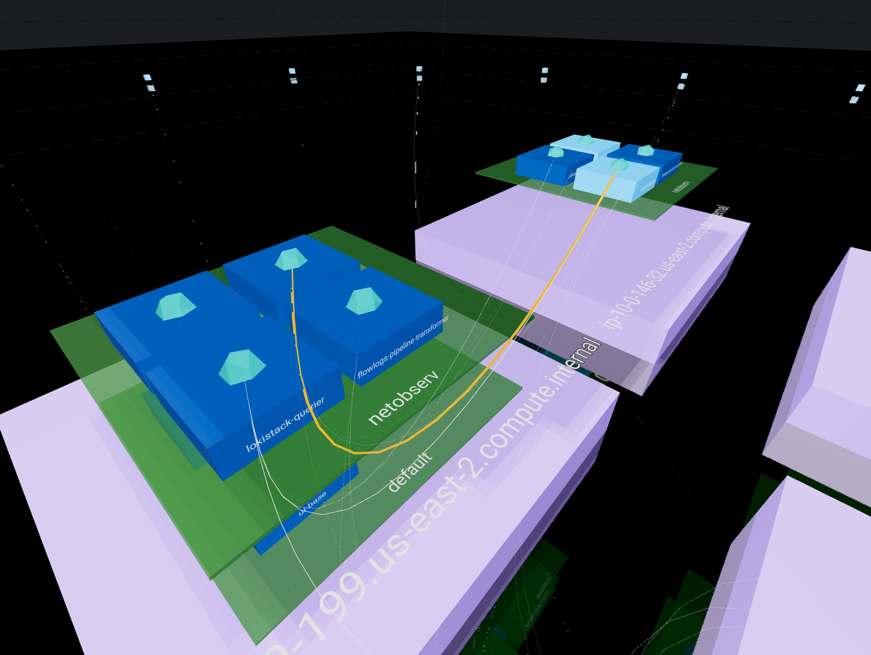
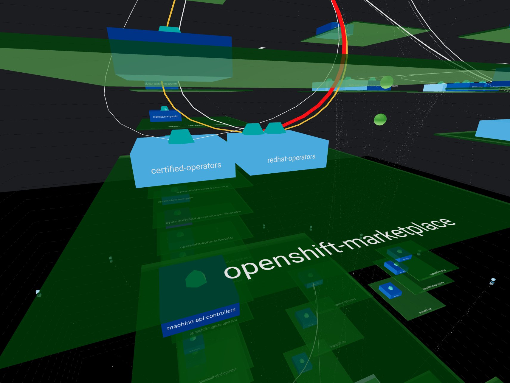
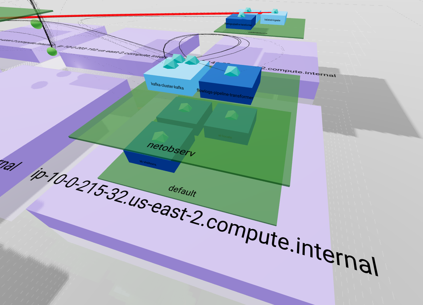 This representation emphasizes the entire ownership chain from
 Node to Pod passing by Namespace. It also pin up how your load is balanced between nodes.

The important part of your network traffic is highlighted since lines are less likely to cross than in the 2D view and their size and color differ according to bytes rate. A thin black line will represent a smaller amount than a heavy red line.
Conclusion
We need to identify the various use cases to elaborate proper representations. This is a daily step by step work between internal teams on both engineering and UI / UX and customers. We are likely to implement more views in the future to highlight network issues, health, threats and usage. One of the next implementations is going to be sankey chart that will be useful for connection tracking.
We need you !
Feel free to contribute by commenting this post, opening issues in netobserv console plugin or opening pull request in any netobserv component
Tell us more about your expectations, the way you currently solve issues and what could help your daily experience.


저자 소개

유사한 검색 결과
과거의 운영 방식에서 벗어나 IT의 미래 구축
AI의 다음 변곡점: 에이전트를 엔터프라이즈 슈퍼유저로 전환
Crack the Cloud_Open | Command Line Heroes
Edge computing covered and diced | Technically Speaking
채널별 검색

오토메이션
기술, 팀, 인프라를 위한 IT 자동화 최신 동향

인공지능
고객이 어디서나 AI 워크로드를 실행할 수 있도록 지원하는 플랫폼 업데이트

오픈 하이브리드 클라우드
하이브리드 클라우드로 더욱 유연한 미래를 구축하는 방법을 알아보세요

보안
환경과 기술 전반에 걸쳐 리스크를 감소하는 방법에 대한 최신 정보

엣지 컴퓨팅
엣지에서의 운영을 단순화하는 플랫폼 업데이트

인프라
세계적으로 인정받은 기업용 Linux 플랫폼에 대한 최신 정보

애플리케이션
복잡한 애플리케이션에 대한 솔루션 더 보기
가상화
온프레미스와 클라우드 환경에서 워크로드를 유연하게 운영하기 위한 엔터프라이즈 가상화의 미래