Joseph Schlosser, art director, and Aaron Williamson, web designer, discuss how the distinct visual style of the video series was extended into the logo and web page. Aaron considers the use of a wider color palette and Joseph talks about working as a cross functional team.
We've included a snapshot of the conversation, but you can also listen to the full conversation with our embedded player or download the MP3.
Joseph: For the logo development, as a team, we were really excited to have this opportunity to come together and work on this new “Red Hat as the Catalyst” series, and just do something a little bit different. With this logo design, the Boston Children’s Hospital team had presented us with a interesting visual of a force-directed graph, which is the model they use to interpret the ChRIS platform on the backend.
If you’re not familiar with a force-directed graph, it’s a very organic-type graph. It has a large center node with these lines that connect to the outer, smaller nodes. And you can have this interactivity with it, where you can like move it around and play with it on a screen. We were able to walk down a path of, “Oh, what could we create with this system?” And so, naturally, a brain kind of came to the foreground of what we could use as the series logo.
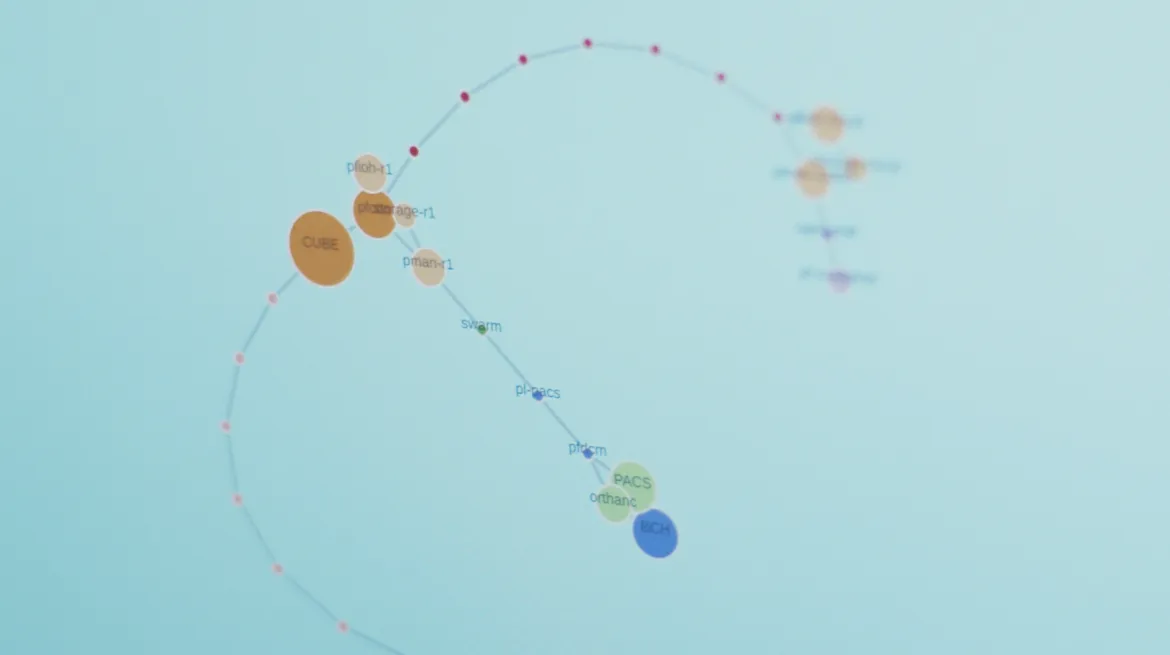
The force directed graph in Creating ChRIS Chapter 1
Aaron: Yeah, and it turns out that brains are pretty popular. I think about halfway through the project, we found out that Cambridge Analytica was going through their scandal, and their logo was a brain that was made of nodes. So we took it back to the team, you know, got the creative strategist in, got more designers on it, and had a little extra brainstorm.
Joseph: We were able to go back, revisit that force-directed graph, and go down a path that felt more relevant to our audience and to our client, Boston Children’s Hospital. And so that really helped it stand apart.
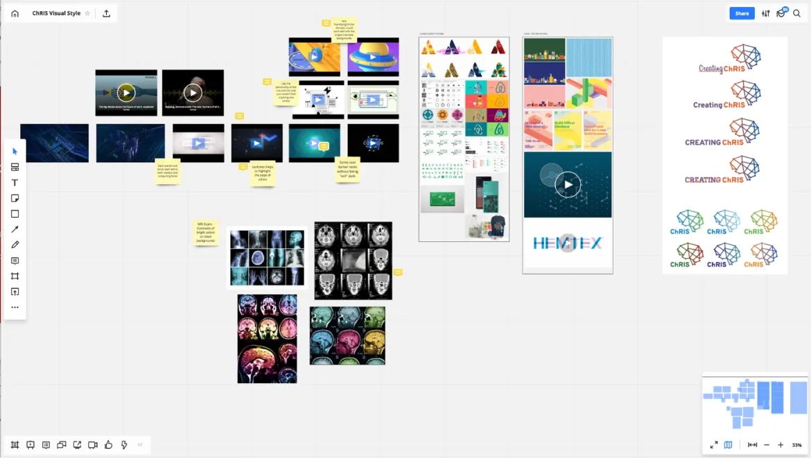
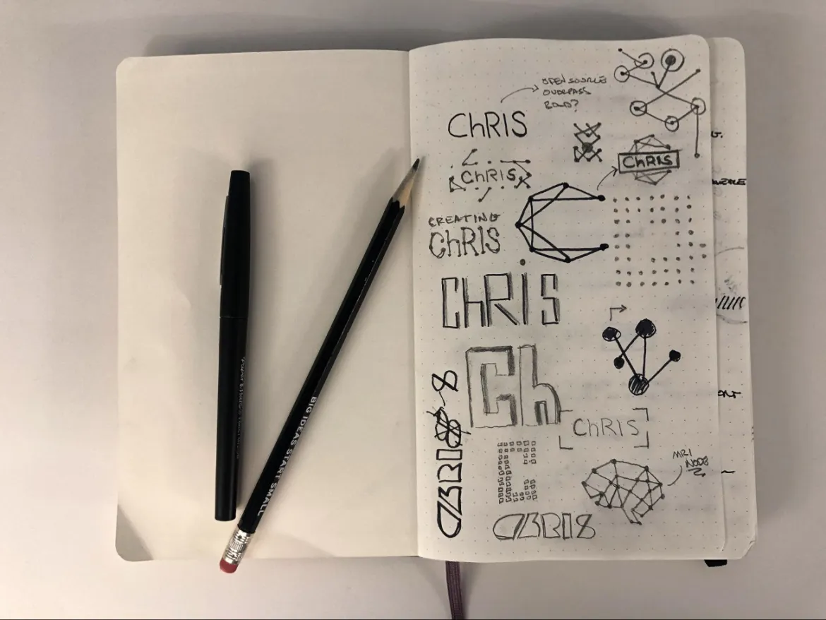
Inspiration and brainstorming materials. Photo credit: Joseph Schlosser
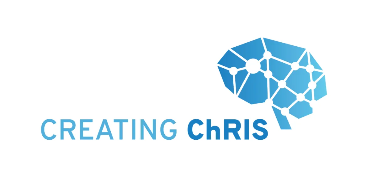
The final Creating ChRIS logo
Aaron: One of my favorite parts about the web design is the color changing backgrounds. When we started this project, we were starting to talk about the color palette. Joseph and I were looking at the forced-directed graph, and we were thinking about how organic it feels,and I started referring to it as a sea creature.
I wanted to figure out how we could keep that organic feeling. Joseph had the idea of instead of using one background color to key off of, let’s use all the colors. Then let’s see if we can make it feel like an organic shift as the user scrolls down the page. And so we came up with this animation of shifting between the palette colors. It makes the page feel like it’s breathing a little bit, makes it feel a little bit more alive or in touch with you. It feels a little bit more engaging than your standard site.
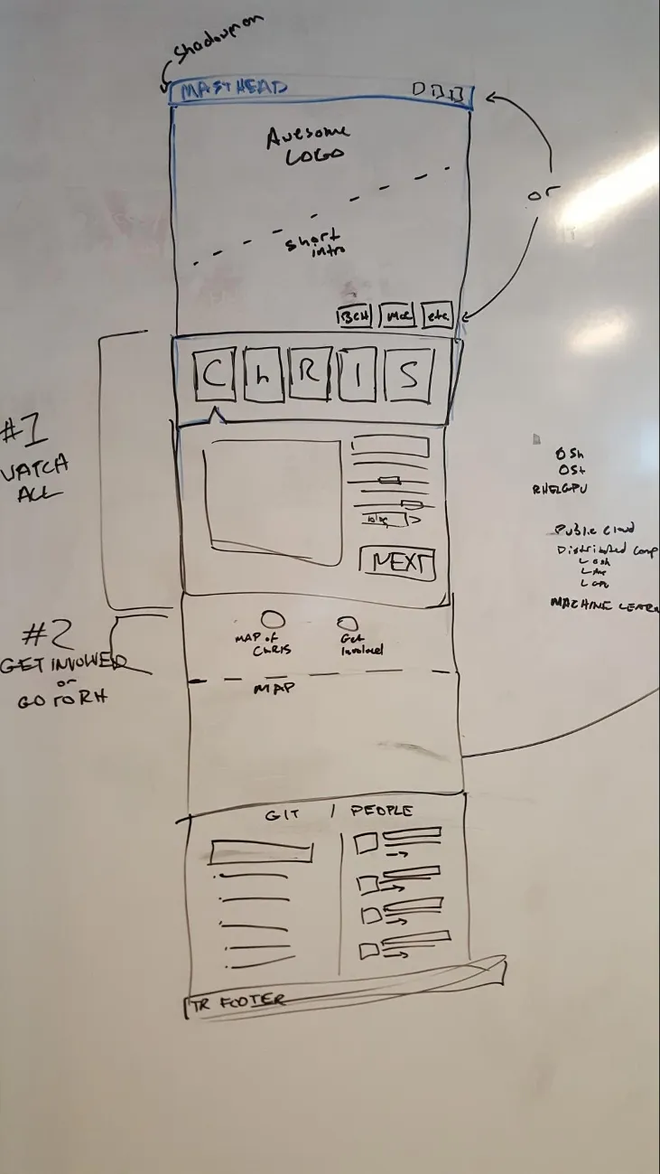
Initial sketch of the wireframe. Photo credit: Aaron Williamson
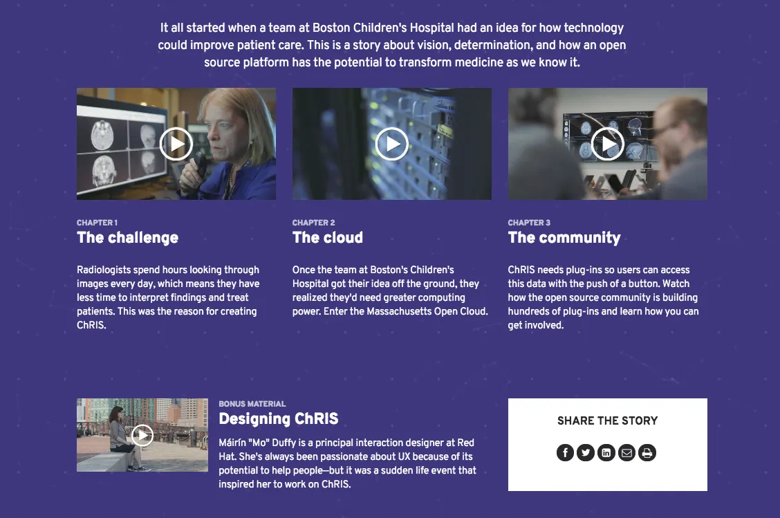
Screenshot of the final Creating ChRIS hubpage
This is part three of a five-part blog series that goes behind the scenes on several aspects of the project. (See part one and part two.) Follow the Open Studio blog for the rest of the series coming soon.
저자 소개
채널별 검색
오토메이션
기술, 팀, 인프라를 위한 IT 자동화 최신 동향
인공지능
고객이 어디서나 AI 워크로드를 실행할 수 있도록 지원하는 플랫폼 업데이트
오픈 하이브리드 클라우드
하이브리드 클라우드로 더욱 유연한 미래를 구축하는 방법을 알아보세요
보안
환경과 기술 전반에 걸쳐 리스크를 감소하는 방법에 대한 최신 정보
엣지 컴퓨팅
엣지에서의 운영을 단순화하는 플랫폼 업데이트
인프라
세계적으로 인정받은 기업용 Linux 플랫폼에 대한 최신 정보
애플리케이션
복잡한 애플리케이션에 대한 솔루션 더 보기
오리지널 쇼
엔터프라이즈 기술 분야의 제작자와 리더가 전하는 흥미로운 스토리
제품
- Red Hat Enterprise Linux
- Red Hat OpenShift Enterprise
- Red Hat Ansible Automation Platform
- 클라우드 서비스
- 모든 제품 보기
툴
체험, 구매 & 영업
커뮤니케이션
Red Hat 소개
Red Hat은 Linux, 클라우드, 컨테이너, 쿠버네티스 등을 포함한 글로벌 엔터프라이즈 오픈소스 솔루션 공급업체입니다. Red Hat은 코어 데이터센터에서 네트워크 엣지에 이르기까지 다양한 플랫폼과 환경에서 기업의 업무 편의성을 높여 주는 강화된 기능의 솔루션을 제공합니다.

