Joseph Schlosser, art director, and Aaron Williamson, web designer, discuss how the distinct visual style of the video series was extended into the logo and web page. Aaron considers the use of a wider color palette and Joseph talks about working as a cross functional team.
We've included a snapshot of the conversation, but you can also listen to the full conversation with our embedded player or download the MP3.
Joseph: For the logo development, as a team, we were really excited to have this opportunity to come together and work on this new “Red Hat as the Catalyst” series, and just do something a little bit different. With this logo design, the Boston Children’s Hospital team had presented us with a interesting visual of a force-directed graph, which is the model they use to interpret the ChRIS platform on the backend.
If you’re not familiar with a force-directed graph, it’s a very organic-type graph. It has a large center node with these lines that connect to the outer, smaller nodes. And you can have this interactivity with it, where you can like move it around and play with it on a screen. We were able to walk down a path of, “Oh, what could we create with this system?” And so, naturally, a brain kind of came to the foreground of what we could use as the series logo.
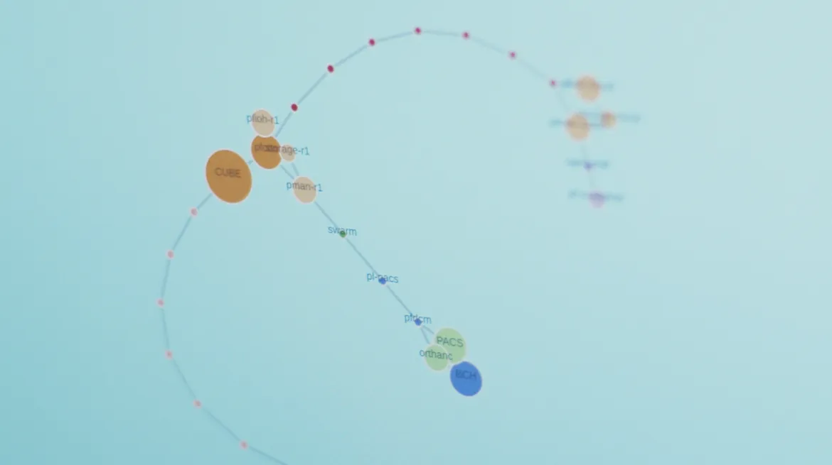
The force directed graph in Creating ChRIS Chapter 1
Aaron: Yeah, and it turns out that brains are pretty popular. I think about halfway through the project, we found out that Cambridge Analytica was going through their scandal, and their logo was a brain that was made of nodes. So we took it back to the team, you know, got the creative strategist in, got more designers on it, and had a little extra brainstorm.
Joseph: We were able to go back, revisit that force-directed graph, and go down a path that felt more relevant to our audience and to our client, Boston Children’s Hospital. And so that really helped it stand apart.
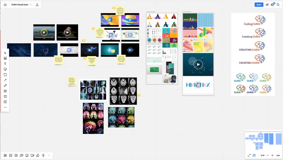
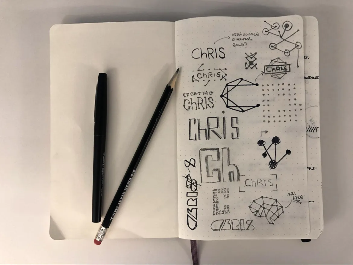
Inspiration and brainstorming materials. Photo credit: Joseph Schlosser
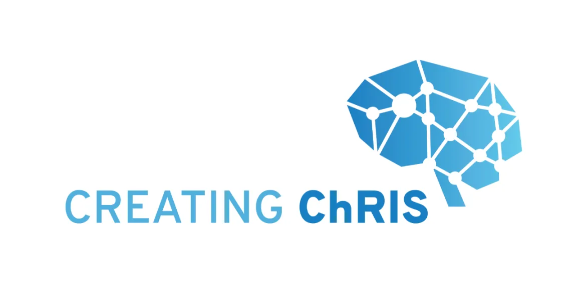
The final Creating ChRIS logo
Aaron: One of my favorite parts about the web design is the color changing backgrounds. When we started this project, we were starting to talk about the color palette. Joseph and I were looking at the forced-directed graph, and we were thinking about how organic it feels,and I started referring to it as a sea creature.
I wanted to figure out how we could keep that organic feeling. Joseph had the idea of instead of using one background color to key off of, let’s use all the colors. Then let’s see if we can make it feel like an organic shift as the user scrolls down the page. And so we came up with this animation of shifting between the palette colors. It makes the page feel like it’s breathing a little bit, makes it feel a little bit more alive or in touch with you. It feels a little bit more engaging than your standard site.
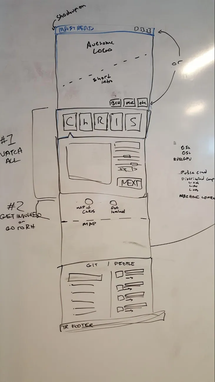
Initial sketch of the wireframe. Photo credit: Aaron Williamson
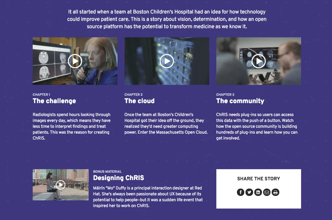
Screenshot of the final Creating ChRIS hubpage
This is part three of a five-part blog series that goes behind the scenes on several aspects of the project. (See part one and part two.) Follow the Open Studio blog for the rest of the series coming soon.
執筆者紹介
チャンネル別に見る
自動化
テクノロジー、チームおよび環境に関する IT 自動化の最新情報
AI (人工知能)
お客様が AI ワークロードをどこでも自由に実行することを可能にするプラットフォームについてのアップデート
オープン・ハイブリッドクラウド
ハイブリッドクラウドで柔軟に未来を築く方法をご確認ください。
セキュリティ
環境やテクノロジー全体に及ぶリスクを軽減する方法に関する最新情報
エッジコンピューティング
エッジでの運用を単純化するプラットフォームのアップデート
インフラストラクチャ
世界有数のエンタープライズ向け Linux プラットフォームの最新情報
アプリケーション
アプリケーションの最も困難な課題に対する Red Hat ソリューションの詳細
オリジナル番組
エンタープライズ向けテクノロジーのメーカーやリーダーによるストーリー
製品
ツール
試用、購入、販売
コミュニケーション
Red Hat について
エンタープライズ・オープンソース・ソリューションのプロバイダーとして世界をリードする Red Hat は、Linux、クラウド、コンテナ、Kubernetes などのテクノロジーを提供しています。Red Hat は強化されたソリューションを提供し、コアデータセンターからネットワークエッジまで、企業が複数のプラットフォームおよび環境間で容易に運用できるようにしています。
言語を選択してください
Red Hat legal and privacy links
- Red Hat について
- 採用情報
- イベント
- 各国のオフィス
- Red Hat へのお問い合わせ
- Red Hat ブログ
- ダイバーシティ、エクイティ、およびインクルージョン
- Cool Stuff Store
- Red Hat Summit

