
When users rely on a product or service, their efficiency depends on its availability and ease of use. If the user interface (UI) is not user friendly, users may get stuck on how to use it effectively. At this point, user experience (UX) designs must improve the UI and help users get familiar with it quickly. This article explains how the Red Hat User Experience Design (UXD) team worked closely with an engineering team to make a UI easier to use and lower users' learning curve.
Keycloak is an open source identity and access management (IAM) solution for modern applications and services. It is also the upstream for Red Hat Single Sign-On (RH-SSO).
[ Related reading: Use Keycloak SSO and TLS to build secure routes ]
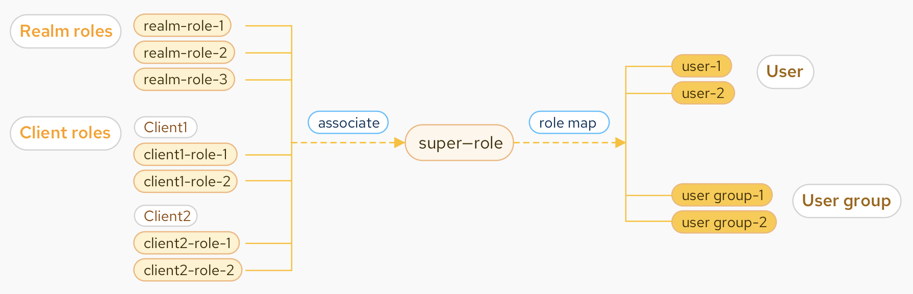
Applications often assign access and permissions to specific roles rather than individual users. A user can be associated with zero or more roles. But assigning multiple roles to users or groups one by one is time consuming and troublesome. Keycloak's composite role was created to address this problem.
A composite role is a role that can be associated with other roles. If a user or group is mapped to a composite role, all associated roles of the composite role will be inherited. —User story
The figure below describes the relationship between the roles and users (user groups). The "super-role" is a composite role. The composite roles can also be associated with other composite roles.
In the original UI, the composite role function could be hard for novice users to use, increasing the cost of learning. I'll break down why users may have found it confusing and how to optimize it.
Understanding users' pain points
Before understanding why the original UI is not user friendly enough, you must understand the composite role's use case.
If I were an administrator, I would use the composite role function to associate various roles, including realm and client roles, so that I could manage these associated roles more easily. By matching users and the composite roles, I could manage many permissions and user access requirements. —Common user
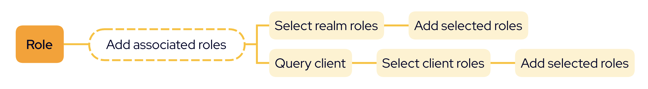
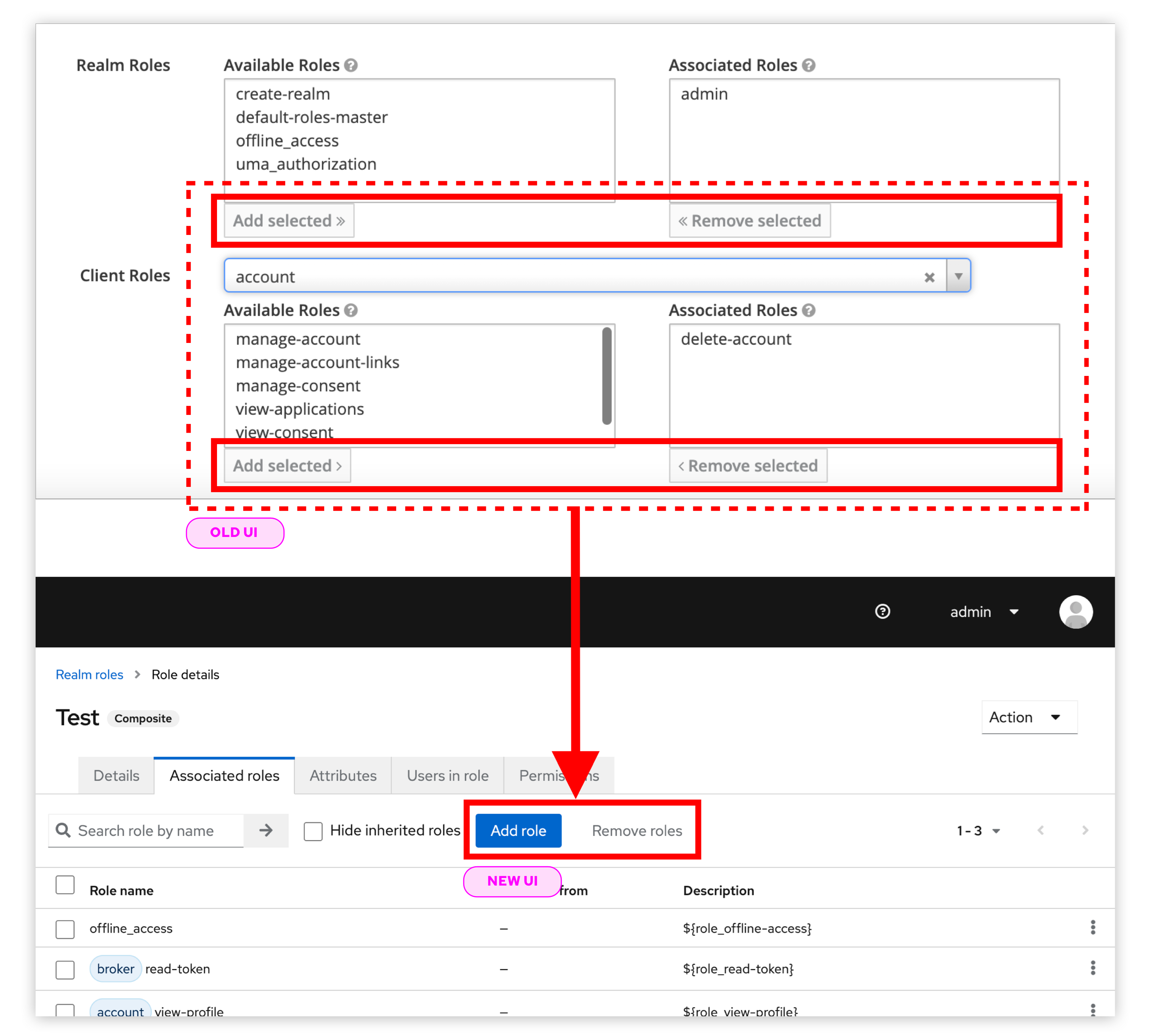
The image below shows how to change a regular role to a composite role through associating roles.
The animation below shows the procedure in the old UI. The process is a bit complicated. Some pain points may ruin the user experience.
1. Associating roles was difficult
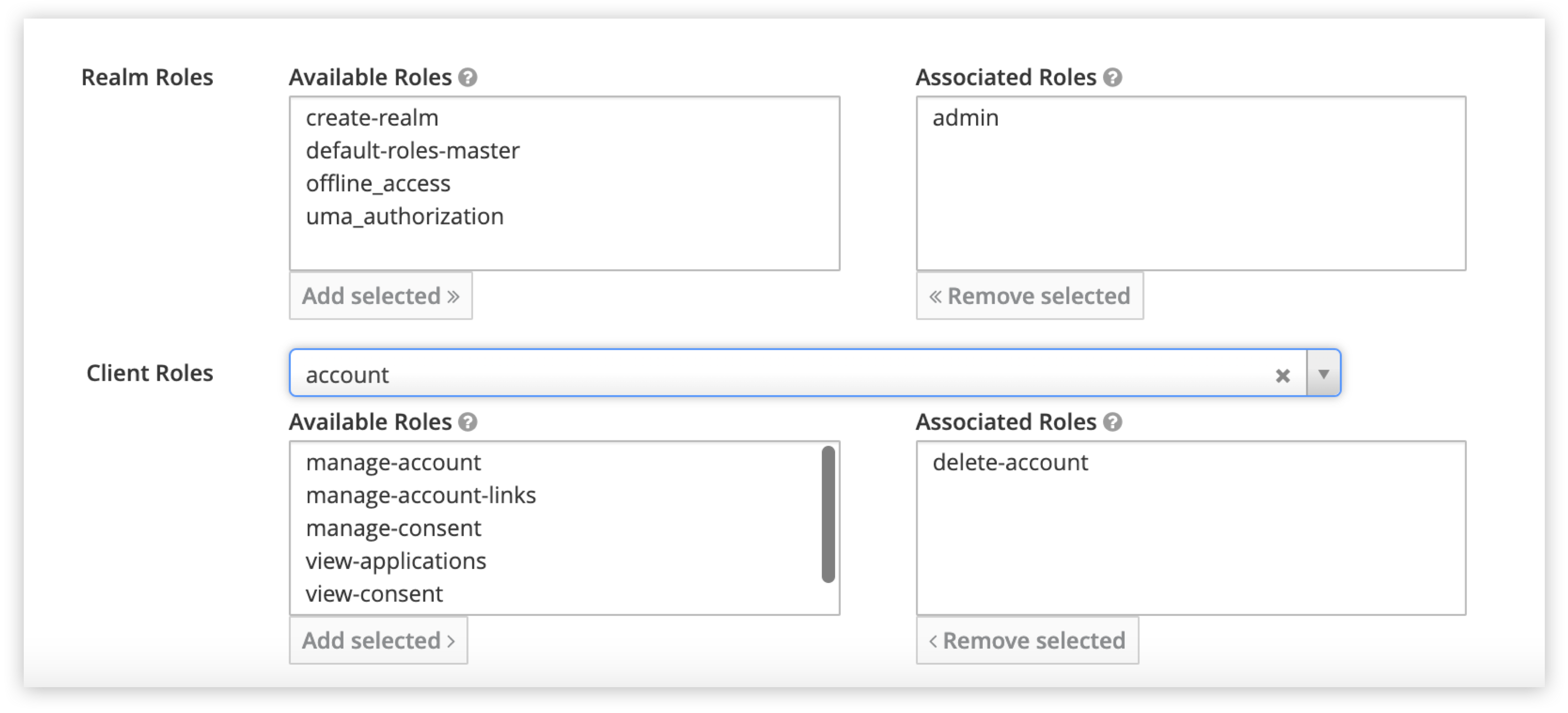
In the old UI, there were four boxes for different types of roles. We asked users if they could quickly add roles at their first glimpse of the interface. Unfortunately, they didn't understand the boxes or how to assign roles. The users often didn't know they needed to filter the client before selecting the corresponding roles, especially when adding a client role. It was difficult for users to realize they could manage multiple roles simultaneously.
Even as users became familiar with the UI over time, new problems hit them.
2. Could not view all assigned roles directly
As the animation above demonstrates, if users wanted to go through all assigned roles, they first had to look at all associated realm roles, then view all the associated client roles individually. They could overlook the realm roles, which is not efficient.
In addition, it was time consuming and confusing when users wanted to check if a specific role had been assigned. Users became lost in the clients and client roles.
[ Learn about upcoming webinars, in-person events, and more opportunities to increase your knowledge at Red Hat events. ]
Redesigning to optimize users' experience
The above pain points diminished users' experience. Our team needed to optimize the interaction and find an elegant way to address issues. We made some changes based on users' psychology and habits after analyzing users' instincts. The main differences are listed below.
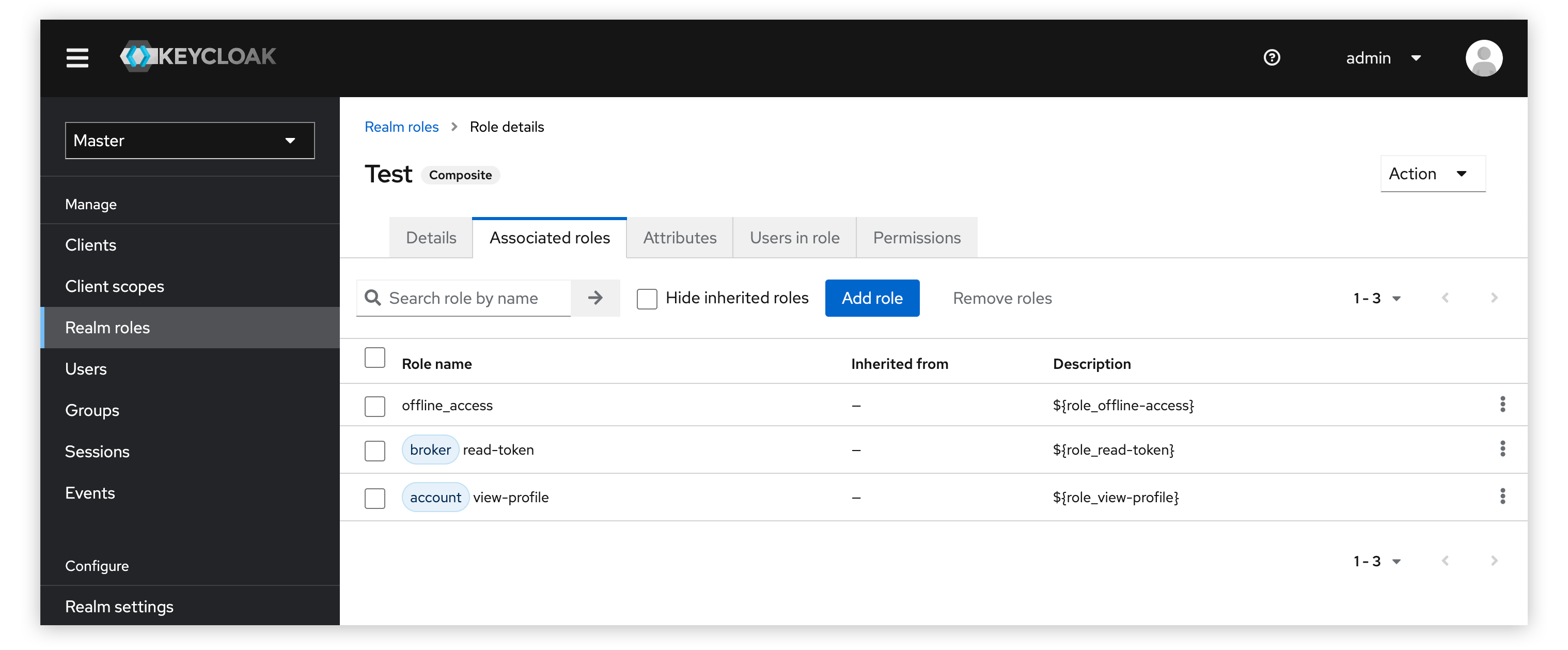
1. Display associated roles in a table view under the new tab
Users tend to view the data quickly rather than query data multiple times. We changed the associated roles boxes to a table displaying associated realm roles and client roles. This way, users can view all the associated roles efficiently. There is a prefixed label for client roles to indicate the client's name.
2. Make the call to action (CTA) clear
Adding and removing associated roles is a core function of a composite role. So it is crucial for users to realize how to add and remove roles quickly.
Hick's Law states, "It takes us longer to make a choice when we have numerous options." It took four actions in the original UI to reach the goal, and there were no obvious hints to help users decide what to do. We kept two buttons: Add role and Remove. The Add role button is more obvious than before. After clicking the Add role button, the roles selection modal is triggered.
3. Other changes
We made other changes, including adding a search function and tabs.
The search function is an essential part of a data system. The principle of least effort tells us, "People are looking for ways to complete tasks with the least possible effort." We added a search function to help users quickly view or check the associated roles, and fuzzy search is supported.

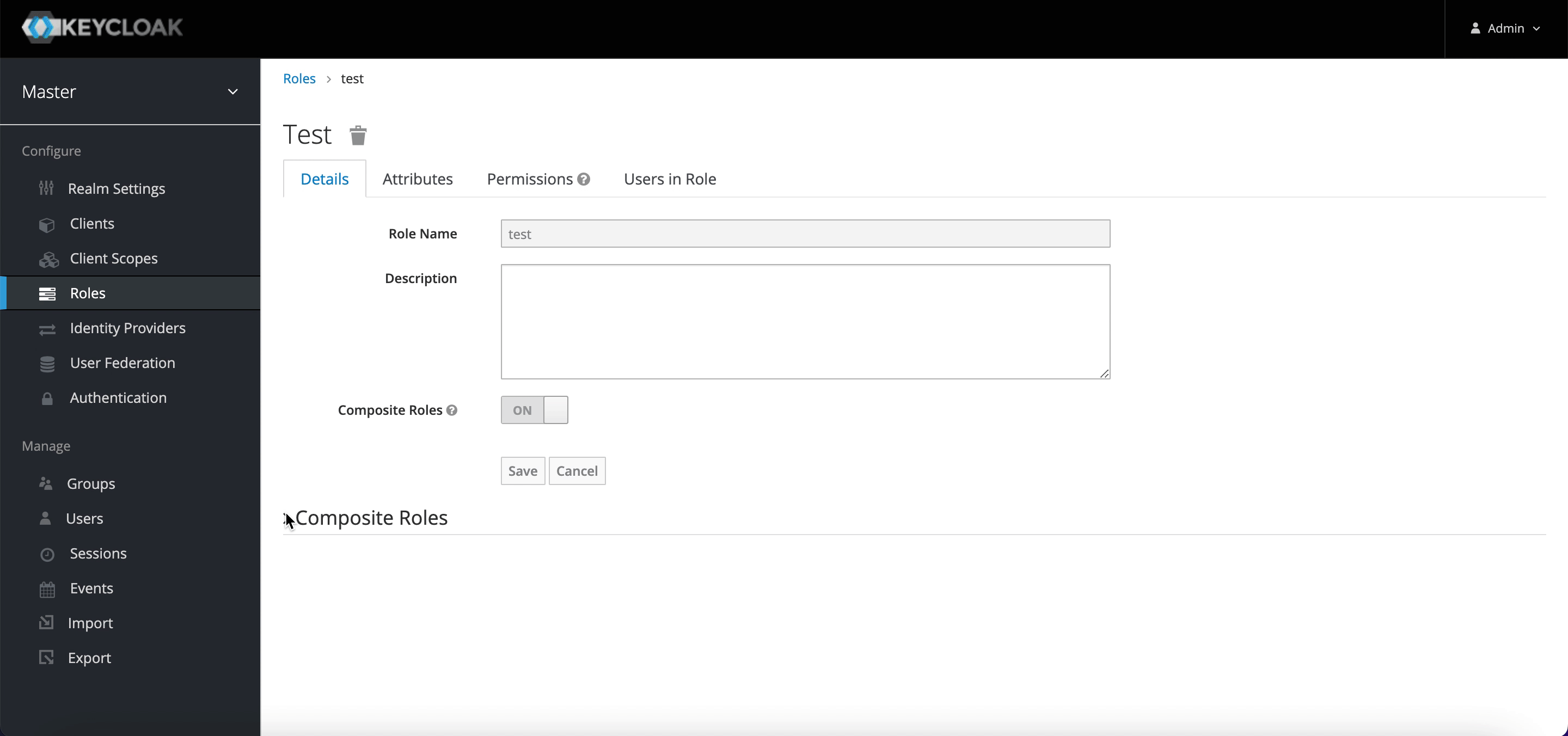
In the old UI, the composite role was under the Settings tab, which was easy to overlook. We placed it in a more prominent position. As shown below, we separated the Associated roles from the Details page as a new tab.

Usability testing to evaluate the new UI
To avoid designer self-righteousness, we collected some users' honest feedback and opinions by conducting usability tests and user interviews to validate our design solution.
[ Learn how IT modernization can help alleviate technical debt. ]
Experienced users
We invited 10 Keycloak users to participate in usability testing. They used the new design and evaluated its usability according to their opinions. The maximum score of the evaluation was 7. According to the statistics after the rating, we can see that most users find the new design easy to use.
Novice users
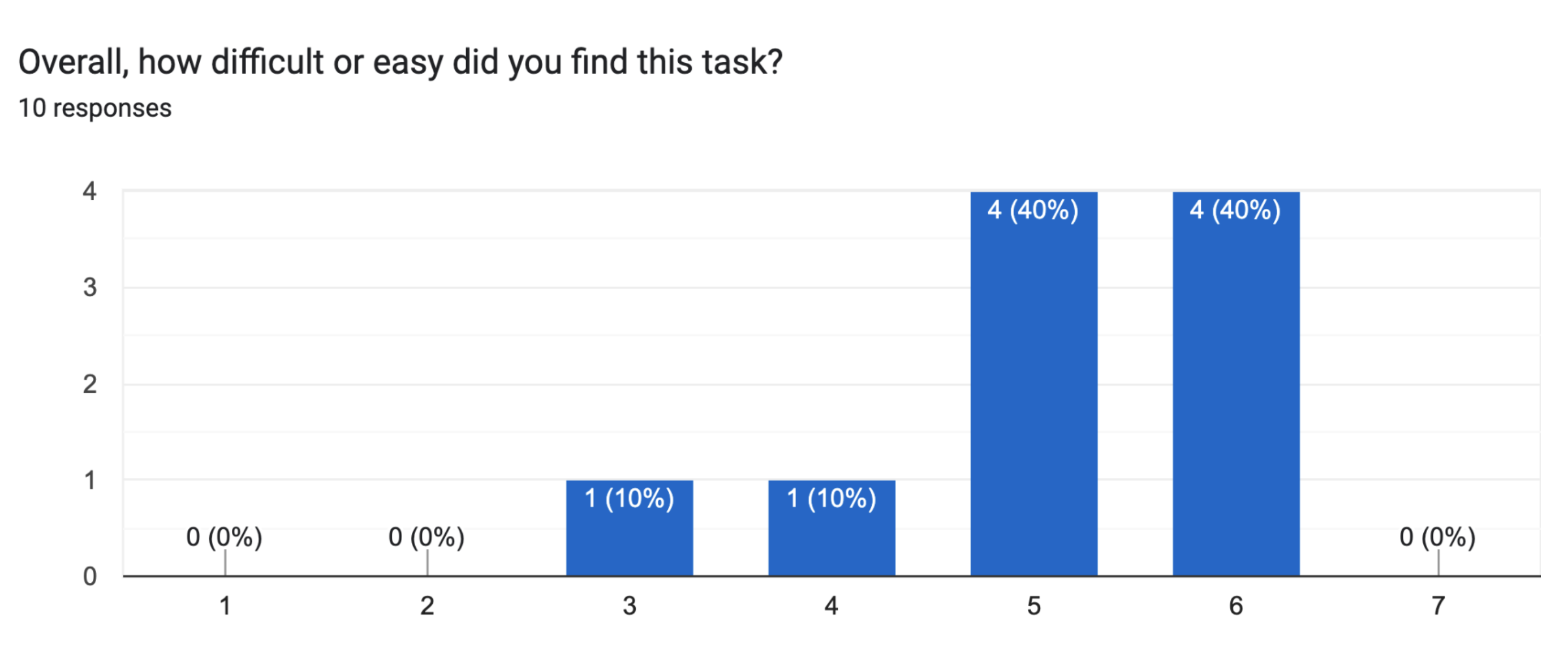
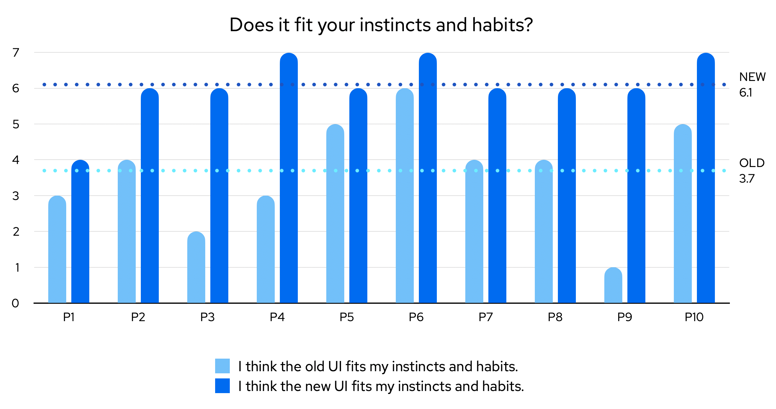
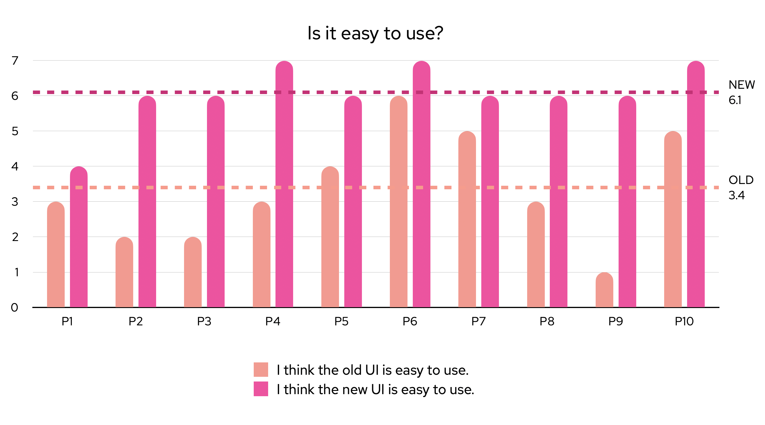
We also invited 10 novice users to join our interviews after implementation. They had never used Keycloak before the interview. Participants tried the old and new UI versions. Each participant rated the two UIs based on their hands-on experience. The maximum evaluation score was 7 points.
The results below show that the new design is more efficient than the old one. Novice users think the new design is more in tune with their instincts and habits than the old one. There are significant improvements in user usability and friendliness.
Wrapping up
Usability and ease of use are important factors in measuring user friendliness. In addition to fulfilling the functional requirements, users also need an effective user experience. In optimizing the composite role function, we achieved the following goals:
- Keep the user interface concise and consistent, conforming to common users' cognition when displaying data.
- Reduce users' learning costs and show the main action more clearly.
- Optimize the process of adding associated roles and support searching in the original table and the Add role modal.
[ Check out Red Hat Portfolio Architecture Center for a wide variety of reference architectures you can use. ]
None of this would have happened without support from Haley Wang, April Ma, the PatternFly team, and Keycloak UI developers. Thank you!
About the author
Kun works on the Red Hat Beijing UXD team. He has been designing and crafting user experiences at Red Hat since June 2019. He also works on focusing on the user experience improvement of Red Hat products, especially Keycloak (RHSSO).
Here is his GitHub profile.
More like this
Can't patch fast enough? Zero trust as a last line of defense
Govern privileged workload boundaries with Red Hat OpenShift, Ansible Automation Platform, and Identity Management
Untangling Networks | Compiler
Collaboration In Product Security | Compiler
Browse by channel

Automation
The latest on IT automation for tech, teams, and environments

Artificial intelligence
Updates on the platforms that free customers to run AI workloads anywhere

Open hybrid cloud
Explore how we build a more flexible future with hybrid cloud

Security
The latest on how we reduce risks across environments and technologies

Edge computing
Updates on the platforms that simplify operations at the edge

Infrastructure
The latest on the world’s leading enterprise Linux platform

Applications
Inside our solutions to the toughest application challenges
Virtualization
The future of enterprise virtualization for your workloads on-premise or across clouds