The Cluster Overview dashboard we introduced in Red Hat OpenShift 4.2 was a significant and well-received addition to the Web Console, and our team has greatly enjoyed seeing how OpenShift users (and even our own developers) have been using it to identify and resolve issues they otherwise may not have noticed.
We’ve made a number of changes both big and small to the dashboard based on our user research findings and the feedback we’ve collected from readers like you. This post covers some of the key improvements and introduces a new member of the dashboard family that we think developers in particular are going to love.
If you’d like to help us make these dashboards even better in the future, consider filling out our survey to provide feedback and sign up for future research opportunities.
Let’s dive in.
Visual polish

With the help of visual designers on our User Experience Design team and a closer adherence to the open source PatternFly design system, the 4.3 dashboard provides a much cleaner first impression. The new Red Hat font, adjusted spacing, fewer separators, and more clearly-defined charts make this the cleanest window into OpenShift clusters yet.
More signal, less noise
Dashboards have a tendency to become disorganized smörgåsbords of cards and information that compete for attention as they gain more functionality. When that kind of noise starts to creep in, figuring out what’s important and what actions need to be taken at a glance can become difficult.
Our team made a conscious effort in 4.3 to reduce the amount of visual noise from the previous iteration and boost the important signals that make managing and fixing clusters easier. Along with a variety of smaller iconography and behavioral tweaks, we were able to combine three cards into one without losing any functionality and integrate links to other areas of the Console (like alert details pages) when they become contextually relevant.
These changes make the dashboard a more effective launching point than ever, requiring less guesswork and fewer clicks to find and fix issues.
Card-by-card refinements
There are a ton of little details I could dig into, but for the sake of your eyes and my fingers I’ll cover the highlights and let the rest be nice little surprises. If you prefer to spoil nice little surprises, take a peek at our detailed design documentation in the OpenShift Design GitHub repository.
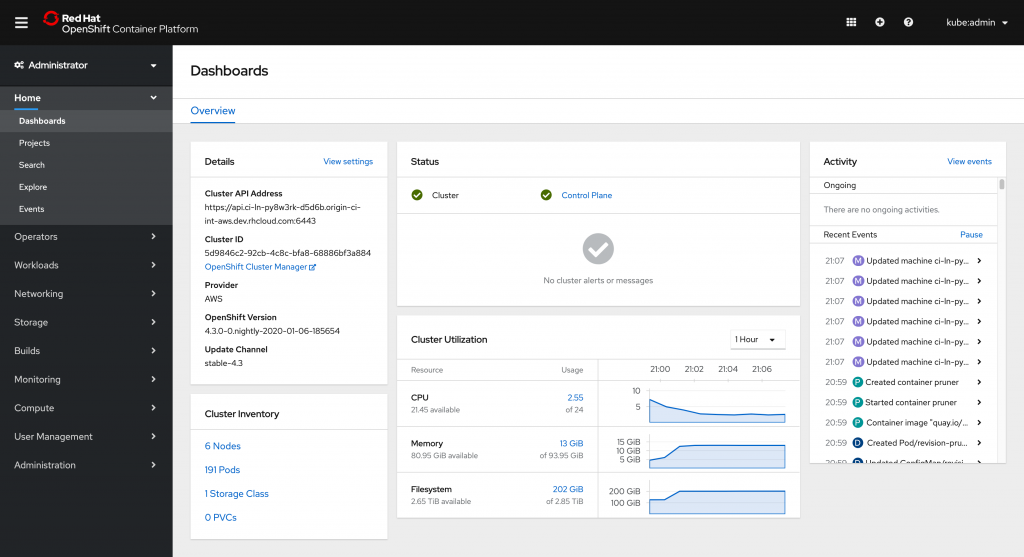
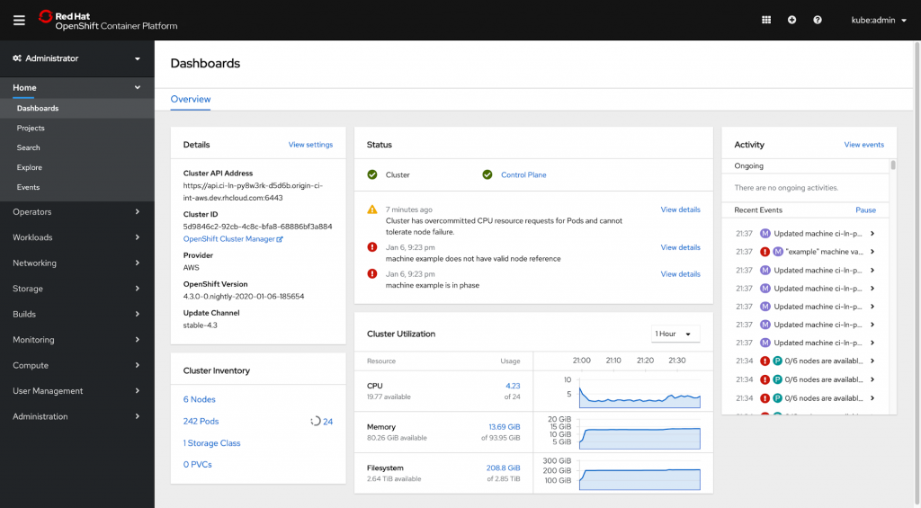
The Details card now includes the cluster’s API address, a link to the OpenShift Cluster Manager, the current upgrade channel, and a handy link to the cluster’s settings page. You’ll also see a version upgrade notice here when one is available.
Resources in the Inventory card can now be clicked to view the full list page of each type, and the card now includes the cluster’s Storage Classes as well.
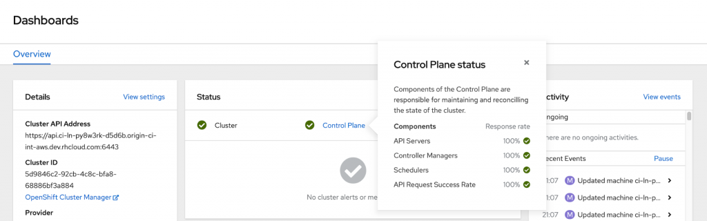
The Status card regains the same subsystem statuses that were available in the Cluster Status page of 4.0, with the response rates of each control plane component included in a popover. The alerts that appear in this card also now include links to view additional information about each one.
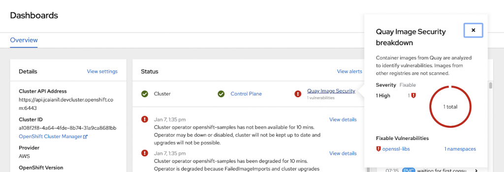
When the Red Hat Quay operator is installed an additional Quay Image Security status appears that flags any container vulnerabilities that are found, with links to the Quay console for additional information. Learn more about the Console’s Quay integration in this post.
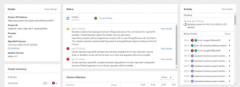
The revised Activity card condenses all events into denser, easily-scannable rows and highlights certain long-running operations (like cluster updates) in a new Ongoing section so they can’t easily be missed.
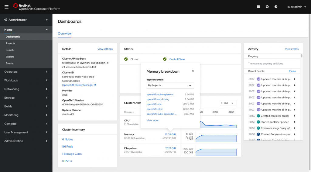
Finally, the Utilization card now incorporates the best pieces of 4.2’s Capacity and Top Consumers cards to show the current resource usage and remaining capacity in one place. Clicking any measurement reveals the top consumers of each resource by either project, node, or pod, and the card’s charts can be adjusted to show the last 1, 6, or 24 hours of resource consumption.
The new Project Dashboard
Forgive me for saving the biggest news for last, but the new Project dashboard (which is also available in the Developer perspective, of course) provides the same familiar dashboard experience but scoped to project-level resources and metrics.
The Inventory card includes the quantity and statuses of deployments, pods, PVCs, services, routes, config maps, and secrets, and the Utilization card includes the network utilization and historical pod count of the current project. Any resource quotas applied to the project are also included, and an additional Launcher card with relevant external links can be added via the new ConsoleLink CRD.
What’s next
New features, refinements, and surprises, of course!
Check out the OpenShift Console and OpenShift Design GitHub repositories if you’d like a sneak peek, but until then, we would really love to hear your ideas and feedback! Please fill out our brief survey to get in touch, or sign up to participate in future OpenShift research opportunities.
About the author

Red Hatter since 2018, technology historian and founder of The Museum of Art and Digital Entertainment. Two decades of journalism mixed with technology expertise, storytelling and oodles of computing experience from inception to ewaste recycling. I have taught or had my work used in classes at USF, SFSU, AAU, UC Law Hastings and Harvard Law.
I have worked with the EFF, Stanford, MIT, and Archive.org to brief the US Copyright Office and change US copyright law. We won multiple exemptions to the DMCA, accepted and implemented by the Librarian of Congress. My writings have appeared in Wired, Bloomberg, Make Magazine, SD Times, The Austin American Statesman, The Atlanta Journal Constitution and many other outlets.
I have been written about by the Wall Street Journal, The Washington Post, Wired and The Atlantic. I have been called "The Gertrude Stein of Video Games," an honor I accept, as I live less than a mile from her childhood home in Oakland, CA. I was project lead on the first successful institutional preservation and rebooting of the first massively multiplayer game, Habitat, for the C64, from 1986: https://neohabitat.org . I've consulted and collaborated with the NY MOMA, the Oakland Museum of California, Cisco, Semtech, Twilio, Game Developers Conference, NGNX, the Anti-Defamation League, the Library of Congress and the Oakland Public Library System on projects, contracts, and exhibitions.
More like this
Friday Five — May 8, 2026 | Red Hat
Your guide to Red Hat OpenShift Service on AWS (ROSA) at Red Hat Summit 2026
Collaboration In Product Security | Compiler
Keeping Track Of Vulnerabilities With CVEs | Compiler
Browse by channel

Automation
The latest on IT automation for tech, teams, and environments

Artificial intelligence
Updates on the platforms that free customers to run AI workloads anywhere

Open hybrid cloud
Explore how we build a more flexible future with hybrid cloud

Security
The latest on how we reduce risks across environments and technologies

Edge computing
Updates on the platforms that simplify operations at the edge

Infrastructure
The latest on the world’s leading enterprise Linux platform

Applications
Inside our solutions to the toughest application challenges
Virtualization
The future of enterprise virtualization for your workloads on-premise or across clouds