Desktop enhancements in RHEL 9
Red Hat Enterprise Linux (RHEL) 9 includes significant enhancements for workstation users and customers. These improvements span many aspects of the product, from performance, to application features, to the look and feel of the desktop.
RHEL 9 Workstation includes version 40 of the GNOME desktop, and this brings some noticeable changes to the Activities Overview feature. This post describes what these changes are and how they will affect the workstation user experience, so on to learn what to expect in the new version.
The Activities Overview
The Activities Overview is an important feature of the GNOME desktop. Originally introduced in RHEL 7, it functions as a single view in which users can switch between tasks, launch applications and organize their windows into workspaces. It includes a bird’s eye view of the open windows on the current workspace, as well as application launchers, a search feature and a view of the user’s other workspaces.

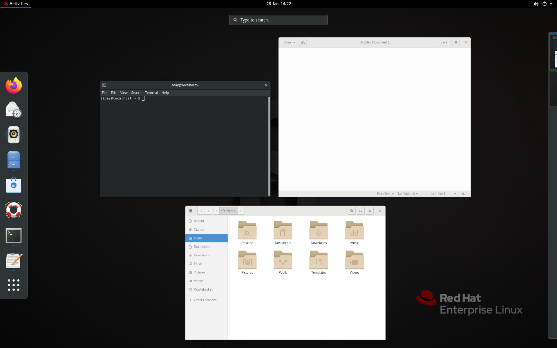
The Activities Overview in RHEL 8 Workstation
In GNOME 40, the role of the Activities Overview remains the same, and its feature set has been entirely preserved. Additionally, the other main aspects of the GNOME desktop are largely the same as in previous versions. For instance, the top bar remains as it was and the same applications are provided. Pre-existing RHEL options, such as classic mode, continue to be available.
What has changed is the layout of the Activities Overview, alongside some of the ways in which workspaces and the overview are navigated. As part of these changes, a number of existing features have also been enhanced.
What’s changed
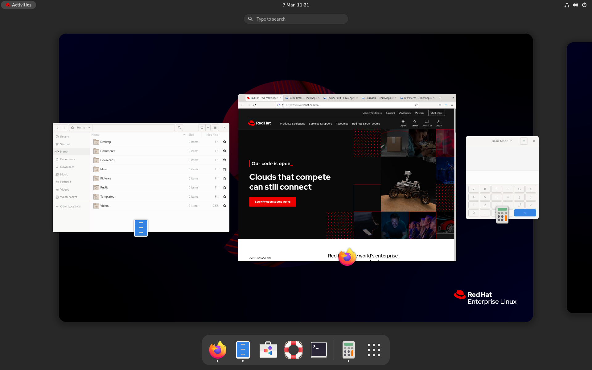
The most noticeable desktop change in GNOME 40 is how the Activities Overview is arranged. The current workspace is shown as a large tile in the center of the screen, with open windows shown floating above it. Additional workspaces are arranged horizontally like a film strip, with the edges of adjacent workspaces visible to the side. The dash, which contains launchers for pinned and running apps, is located at the bottom of the screen.

The Activities Overview in RHEL 9 Workstation
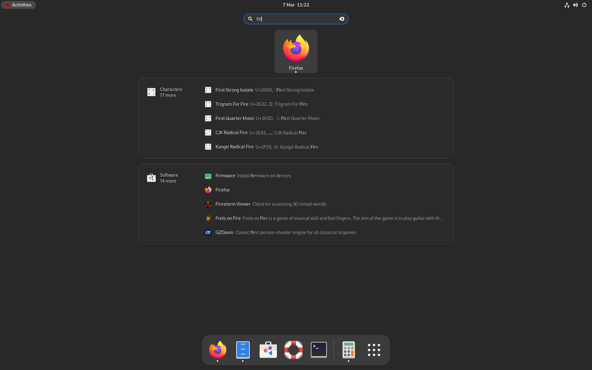
From the initial overview, users can begin a search simply by typing, which replaces the view with dynamic search results.

Search in RHEL 9 Workstation
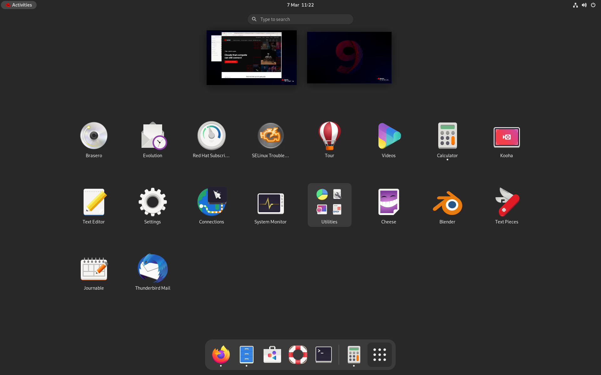
Users can also open the app grid by clicking the grid icon in the dash. This shrinks the workspace thumbnails and displays a grid of application launchers in the center of the screen.

Applications Grid in RHEL 9 Workstation
This logic of the new overview arrangement is clearest when seen as a series of transitions. Switching workspaces horizontally pans between each virtual desktop. Switching to the overview appears as zooming out to get a higher-level view of the current workspace. Switching to the app grid appears as zooming out again, this time to a higher level.
Organizing the desktop this way makes it easier for users to navigate the system. It also helps to create a smoother experience in which all the desktop elements fit seamlessly together. When testing the new design, we discovered that users found workspaces more engaging and easier to get started with.
System navigation
GNOME 40’s rearranged overview facilitates a new system of shortcuts and gestures, which allows users to quickly navigate the desktop. Here, up and down actions move into and out of the overview and applications grid, while left and right actions switch between workspaces. As can be seen in the table below, these navigation actions are consistent across a range of input devices.
| Action | Keyboard | Touchpad | Mouse |
| Switch workspace left | Super+Alt+Left | 3 finger swipe left | Super+Scroll up |
| Switch workspace right | Super+Alt+Right | 3 finger swipe right | Super+Scroll down |
| Open activities overview | Super / Super+Alt+Up | 3 finger swipe up | Click activities |
| Close activities overview | Super / Super+Alt+Down | 3 finger swipe down | Click activities |
| Open app grid | Super+Alt+Up | 3 finger swipe up | Click app grid icon |
| Close app grid | Super+Alt+Down | 3 finger swipe down | Click app grid icon |
App grid and dash
The individual elements that make up the Activities Overview are also enhanced in GNOME 40. One example is the dash, which is now split into two sections. The left side includes only pinned apps, and the right side includes running apps that haven’t been pinned. This makes it easier to know which apps have been pinned and which haven’t.
The app grid, where users can browse all their installed applications, has also been significantly updated in GNOME 40. In the past, the app grid had a static alphabetical order, but with GNOME 40 the grid can now be fully reorganized, allowing users to personalize and optimize for their own workflows. Rearranging the grid is simply a matter of moving each app launcher using drag and drop. Drag and drop can also be used to create folders of app launchers, and these folders can be renamed in place.
Conclusion
The updated Activities Overview makes RHEL 9 Workstation faster, smoother and easier to use, and we have already received excellent feedback about it from users. This is one of many significant improvements in RHEL 9 Workstation, which also include a new multimedia framework called PipeWire, Wayland improvements, better performance, a more seamless lock screen, support for dual GPU machines, power profiles and much more.
To try out the new Activities Overview, or any other aspect of RHEL 9, try the Beta today. More information on how to download can be found in Introducing the new Red Hat Enterprise Linux Beta experience.
About the author
More like this
Building a hardened, image-based foundation for AI agents
Announcing Fedora 44
GitOps with Argo CD | Technically Speaking
Open source for climate finance | Technically Speaking
Browse by channel
Automation
The latest on IT automation for tech, teams, and environments
Artificial intelligence
Updates on the platforms that free customers to run AI workloads anywhere
Open hybrid cloud
Explore how we build a more flexible future with hybrid cloud
Security
The latest on how we reduce risks across environments and technologies
Edge computing
Updates on the platforms that simplify operations at the edge
Infrastructure
The latest on the world’s leading enterprise Linux platform
Applications
Inside our solutions to the toughest application challenges
Virtualization
The future of enterprise virtualization for your workloads on-premise or across clouds
