The Red Hat logo
Our logo was introduced in 2019 as part of the Open Brand Project, an initiative to update and simplify our corporate logo and brand system in collaboration with the Red Hat® community.
Our logo is made up of two parts: the hat and the wordmark. The hat is the same fedora worn by Shadowman–the figure featured in our previous logo–and is an embodiment of the trust and goodwill we’ve built with customers, partners, and the community as we’ve grown. Our company name appears in bold in the wordmark, created from our open source font.
Logo variations and clear space
Our logo has three versions that give us the flexibility to choose the one that best fits the available space. The logo can be vertical or horizontal, and the wordmark can be large or small. Logos A and B should be the logos you use most often. Logo C and the hat alone should be reserved for specific circumstances.
Clear space is the area around the logo that should not have text, distracting graphics, or other logos. This space ensures that nothing interferes with the visual impact of our logo.
Logo A
Logo A is the preferred logo for most applications. It fits best in spaces that are wider than they are tall.
Minimum required clear space is the height of the letter "e" all the way around the logo. More is better.

Logo B
Logo B fits best in spaces that are more square. The hat and wordmark are the same size as they are in logo A, but they’re stacked instead of side by side.
Minimum required clear space is the height of the letter "e" all the way around the logo. More is better.

Logo C
Logo C should only be used for large-scale signage. The combination of small text and a stacked layout is ideal for making the most of larger square spaces, like signage.
Minimum required clear space is double the height of the letter "e" all the way around the logo. More is better.

The hat
The hat in our logo is an important symbol of our shared culture and commitments. How we portray the hat affects how people perceive Red Hat as an organization. It can be used independently in some situations, but only when the context of the Red Hat brand is clear.


Do this: Use the version of the logo that fits best in the available space.

Not this: Don't use a version of the logo that is too wide or tall for the available space.

Do this: Use appropriate clear space around the logo.

Not this: Don't use small margins that make the logo feel cramped.
Background variations
When the logo has color behind it, the first priority is visibility. Switch the color of the wordmark accordingly. Black type is best for light backgrounds, while white type is best for dark backgrounds. You can learn more about color contrast and accessibility on the color page.


Sometimes printing costs or visual constraints mean that we need to use the logo in one color. When you can, choose the red version so that the hat is red. Use the white version on a red background.


If you’re placing the logo on an image or video, place the logo somewhere without visual clutter and use the version of the logo with the best color contrast.
Red Hat logo in use
We’re protective of our logo. Why? Because as an open source company, our trademarks are the most important intellectual property we own. By using our logo consistently and correctly, we make sure it’s protected and will serve us well for years to come.

Not this: Don't change the color of the band or remove it from the full color logo.
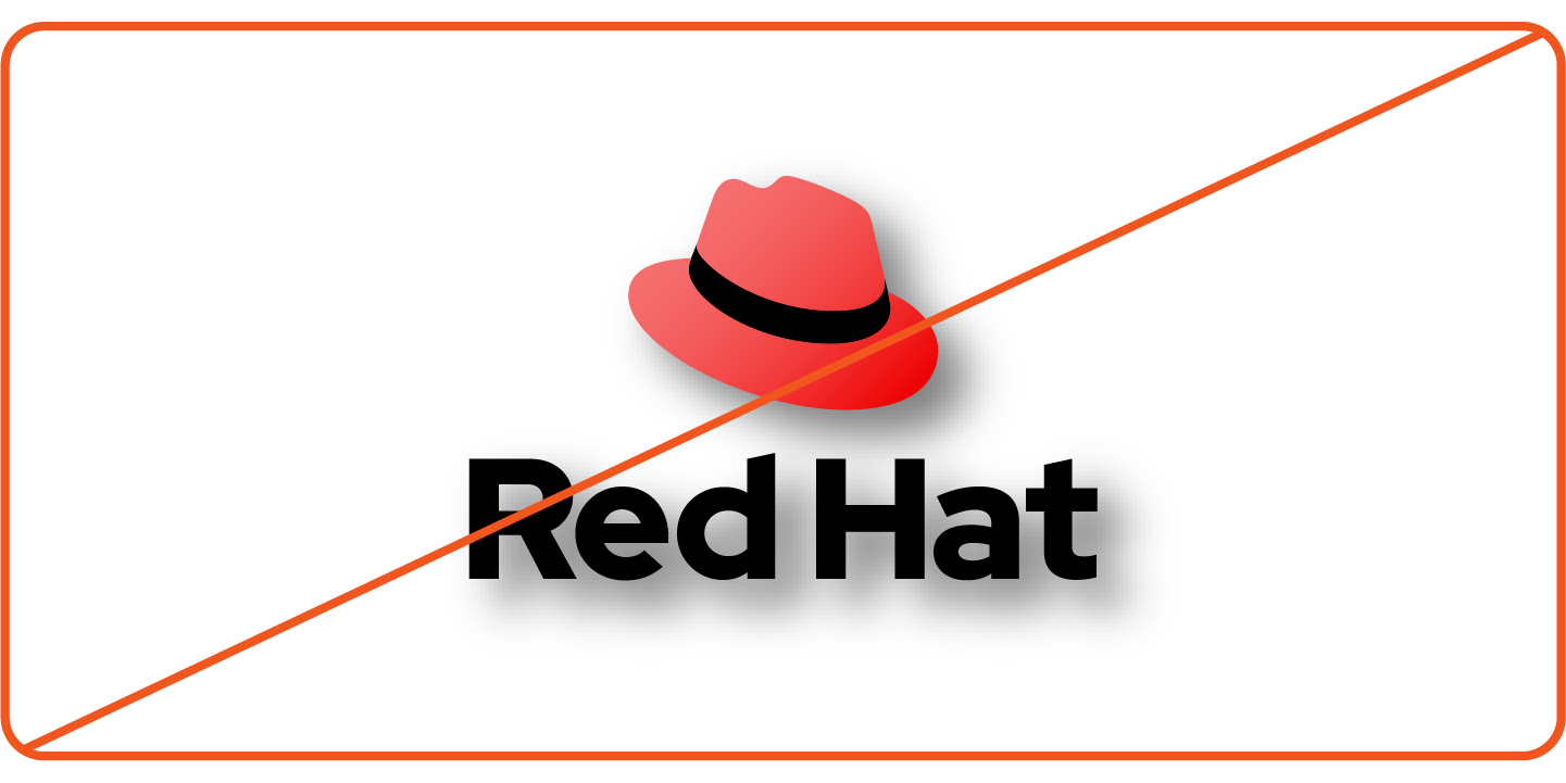
Not this: Don't add gradients or shadows.
Not this: Don't change the colors of the logo. Use one of the approved colorways.
Not this: Don't stretch or distort the logo.

Not this: Don't scale or move parts of the logo independently of each other.

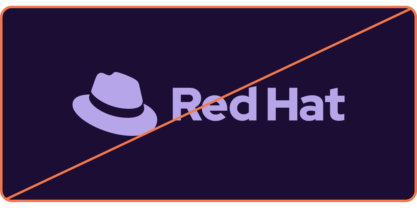
Not this: Don't use the full color logo in grayscale. If color is limited, use a one-color option.

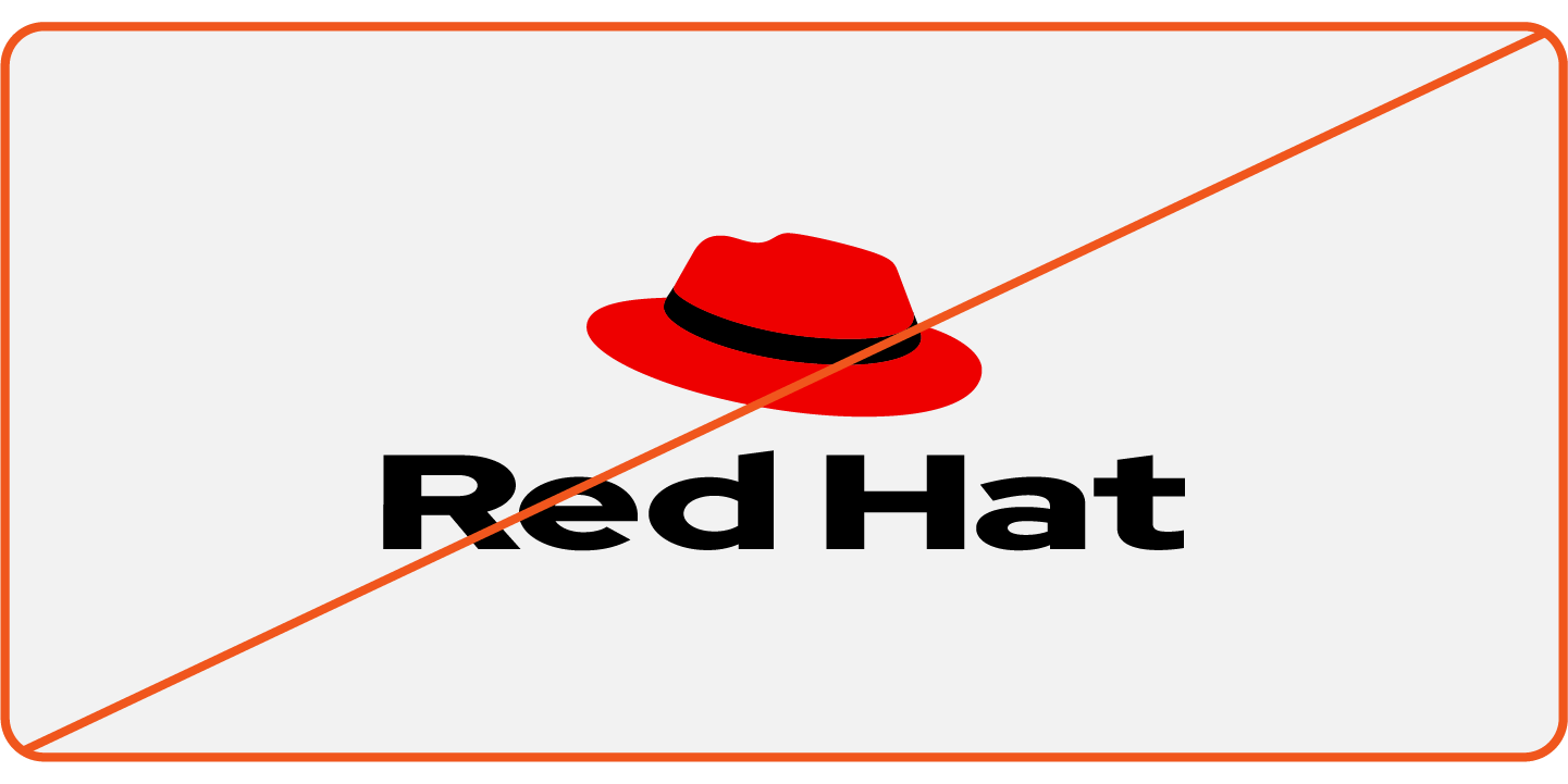
Not this: Don't place the logo on a cluttered background that makes the hat or the text difficult to make out.

Not this: Don't use legacy logos or Tux the penguin (the Linux® mascot), with or without the Red Hat logo.

Not this: Don't generate images of the logo or fedoras using AI.

For small spaces where the logo can’t fit, like a favicon, you can use the hat. Read more about using the hat alone.

The stacked logo with large type (Logo B) makes the best use of the available space on this travel mug.
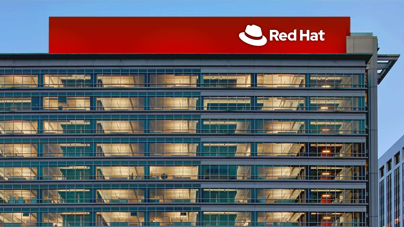
The space on top of Red Hat Tower is wide and narrow, so we chose a horizontal logo. We also needed our name to be visible from far away, so we chose the version with large type (Logo A).
In video, we use an animated version of the Red Hat logo for outros. Read more in the Red Hat video standards (Login required).
Red Hat trademarks
Aside from the Red Hat logo, our trademarks include the Red Hat wordmark and the names of certain products, services, and technologies. Using our trademarks correctly in documentation, web pages, marketing materials, and collateral is as important as using the logo correctly.
Have feedback on the Brand Standards? Submit it here.
Questions? Red Hatters can reach out via #help-brand on Slack.