The hat
To us, the hat is more than just something that we wear. While the exact style of hat has changed over the years, the meaning has remained the same: it’s a symbol of our shared culture and commitments.

We've worn a few
Red Hat® co-founder Marc Ewing was known for his red Cornell baseball cap and his willingness to help people solve their technology challenges. In the computer lab at Carnegie Mellon University, his peers learned that when they needed help they should “look for the guy in the red hat.”
That spirit of helping others, of not hoarding knowledge but sharing it openly with the curious, has lived on through the company’s history.
When Marc and Bob Young started a business selling his custom distribution of the Linux® operating system in 1993, they named the company Red Hat Software. The style of hat used to represent the company has changed over the years as the business grew.

1995: The red top hat appeared on the first Red Hat Software invoice.

1996: The “running man,” with his little red cap and briefcase, was made from clip art and appeared on ads and manuals.
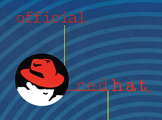
1997: The introduction of “The Red Hat Man”—later known as Shadowman—and the first iteration of the red fedora.
In 1997, Red Hatters thought of ourselves as “secret agents” of sorts, working hard to change the opinions and future of open source in the enterprise IT industry. The introduction of the mysterious Shadowman symbolized our efforts to sneak past the barriers built by proprietary software companies.
The hat today
Inspired by Shadowman, a red fedora with a black band is what represents Red Hat today. The fedora symbolizes freedom: to share knowledge and code, to form communities, and to stand up for what we believe in. Our associates earn their hats at the beginning of their Red Hat journey and wear them proudly as members of a community of innovators worldwide who champion the principles of open source. We also give them as gifts to partners, customers, and contributors that share our values.
In our communications, offices, and events, we often show hats or allude to them to identify who we are. We wear our hats—on our heads and in our logo—to represent being there to help others, because we know that no one innovates alone.

We take photos of Red Hatters wearing their hats in our offices and at events.

We put hats on racks, hang them in displays, and show them in the backgrounds of our video calls.

We allude to hats using felt textures in graphics and in real life—like office furniture.

We share special event fedoras—with the Red Hat logo printed on the band—with partners, customers, and contributors at Red Hat events.
Keeping it all under the brim
Marc Ewing’s legacy as “the helpful person in the red hat” lives on today in every associate around the world. And just as that tradition of passing on expertise to others has expanded well beyond the computer lab at Carnegie Mellon, so too has the tradition of the red hat as a symbol. When we represent Red Hat, we always use a red fedora with a black band.

Use this: Our hats are red, felt fedoras with a black band.

Not these: Don't use any other type or color of hat to represent Red Hat.
How we portray fedoras affects the way that people perceive us as an organization. When people see our hats, we want them to think of the collaborative spirit and technology innovation they associate with Red Hat. Be thoughtful about the quality of the fedora itself and also the way you use fedoras—and images of them—to avoid diluting their meaning.
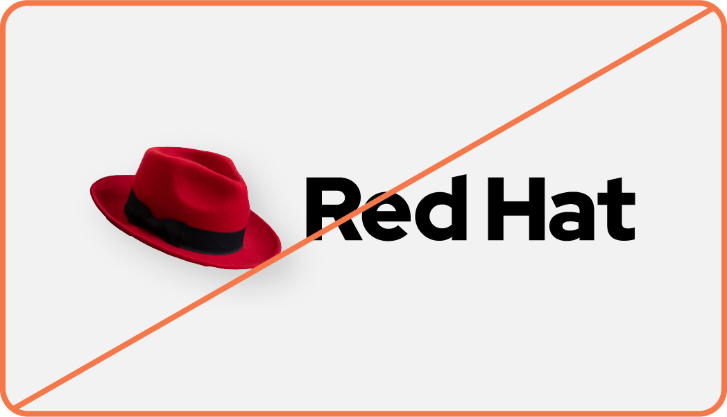
Not this: Don’t replace the hat in our logo with a photo or rendering of a fedora.

Not this: Don’t create 3D renderings of fedoras. Use a photo or video of an actual fedora instead.

Not this: Don’t use AI to generate images of people or characters wearing a red fedora.

Not this: Don’t use AI to generate images of fedoras. Use a photo or video of an actual fedora instead.
The hat in our logo
When the Shadowman logo was introduced in the late 1990s, the hat represented the fighting, plucky upstart courage of open source. That spirit has evolved and lives on with our current logo, so it’s important to have guidelines in place to ensure the integrity of the hat as a symbol of the principles of the company and of open source.
Our logo is our most recognizable brand asset. Therefore, the stakes are higher for getting it right, so we only use one specific drawing of a red fedora affectionately known as “the hat.”
The hat as a trademark
The hat represents our people and culture, but it’s important to remember that it’s also our trademark. As an open source company that contributes most of our intellectual property to upstream communities, it’s even more important that we protect our trademarks by using them correctly.
Regardless of how or where the hat is being used, it should always be the exact trademarked shape we use in our logo. Never use AI to recreate or generate new images of the hat.
Shape
The hat vector drawing consists of three shapes: the crown, the band, and the brim. Sometimes we remove the band, but it’s still visible in the negative space between the crown and brim.
Every representation of the hat should consist of all three of these pieces exactly as they are drawn.

Clear space
Clear space around the hat should be approximately the height of the brim. Clear space is the area around the hat that shouldn’t have any text, distracting graphics, or other logos. Even more space is better.

Color versions
The full color version of the hat is red with a black band. Use this version of the hat whenever possible, regardless of the background color.
When we need to use limited color because of printing costs, use the one-color version.

Size
Regardless of where the hat appears, it should always be legible. The minimum size that the hat should be used is 16 pixels in height (0.22in/5.5mm).
There is no maximum size.

Dimension
When the hat is used in a physical application—like signage or awards—create depth by extruding, embossing, or debossing the shape of the hat.
Do not recreate the hat as a 3D object.

Using the hat to represent Red Hat
In most cases we prefer to use the full logo—defined as the hat plus the “Red Hat” wordmark—when representing Red Hat, in case anyone in the audience isn’t already familiar with our brand. But, in circumstances where the audience is already aware that what they’re seeing came from us, we can use the hat by itself. In these cases, the hat should always be in red with the black band.

The hat appears as the favicon on our web pages.

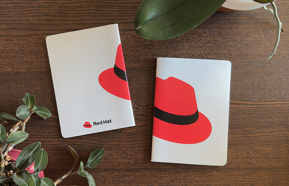
The hat appears beside our information on the front of our business cards.

Our social media accounts use the hat as their profile image.

We use the hat as signage at our offices and event spaces.

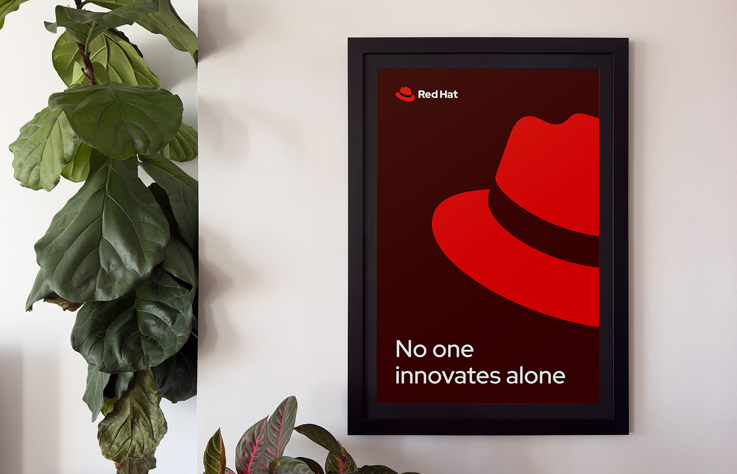
We use the hat as a detail in our videos and advertising.

We use the hat as swag, like lapel pins and keychains.
What to avoid
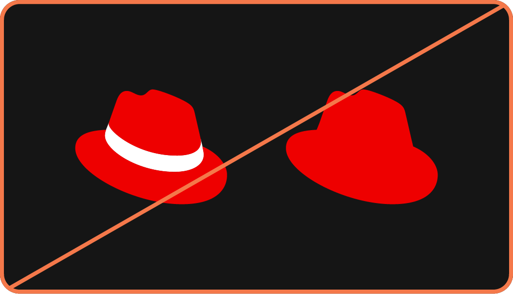
Not this: Don’t change the color of the hat band, remove it, or merge the hat into one flat shape.
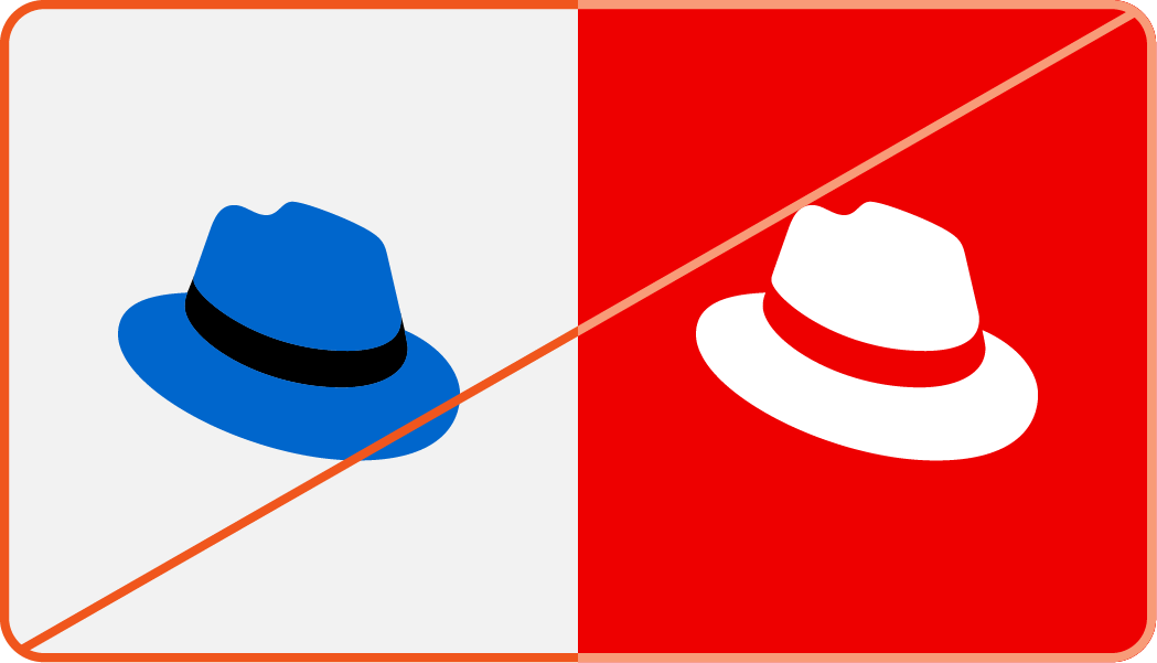
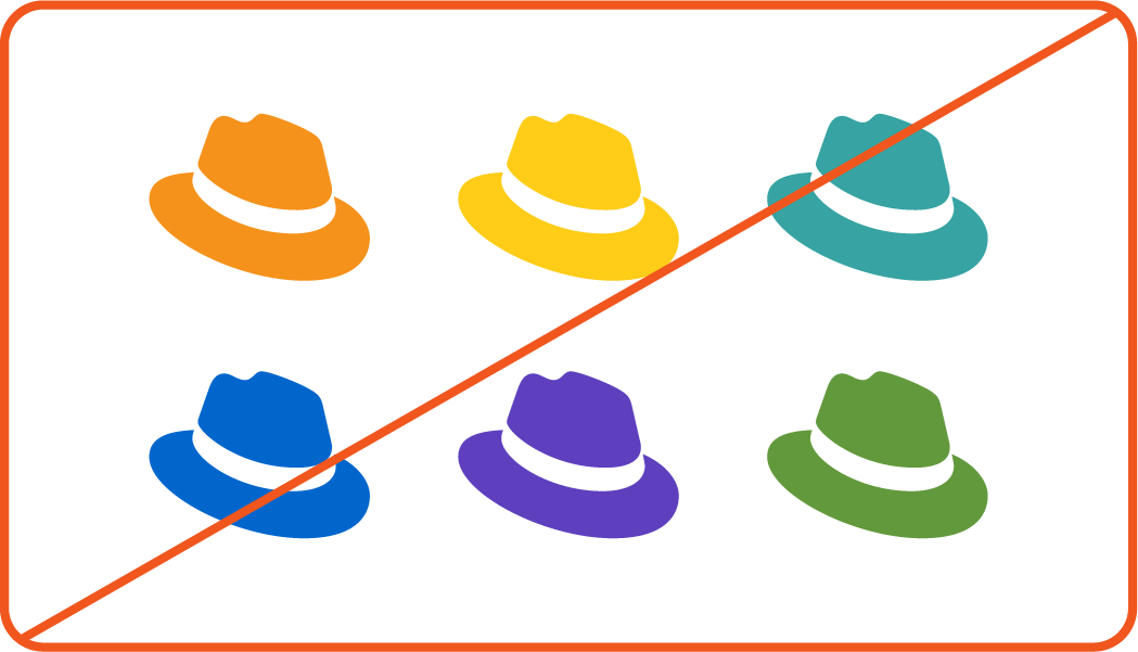
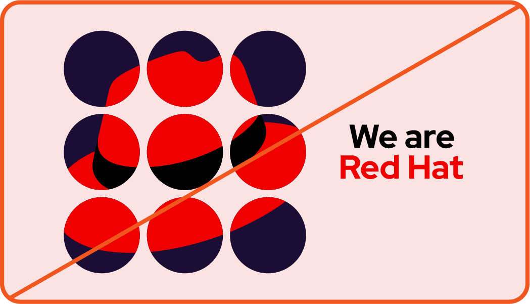
Not this: Don't use the hat alone in any color other than Red Hat red. We are Red Hat.

Not this: Don’t flip the hat or change the angle.

Not this: Don’t recreate the hat as a 3D object.

Not this: Don’t place the hat on people, characters, objects, or other logos.
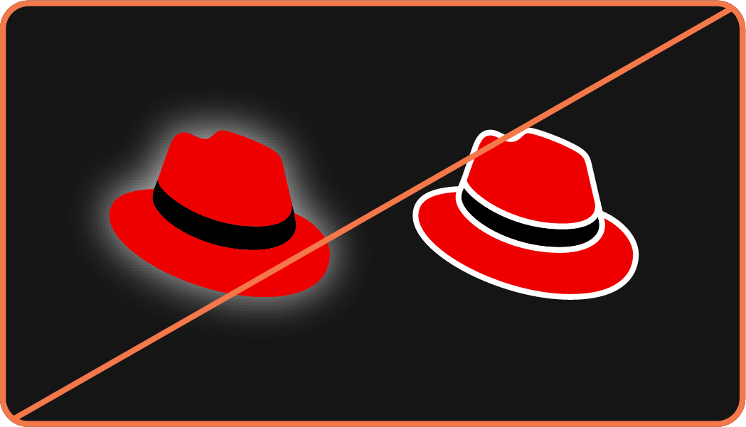
Not this: Don’t add effects like drop shadows or strokes to the hat.

Not this: Don’t use AI to recreate or generate new versions of the hat.

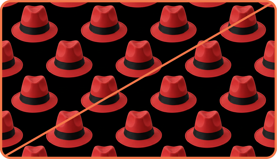
Not this: Don’t create or use other drawings of hats.
Using the hat as artwork
In places where we know everyone is familiar with our brand, we can have fun with the hat. We use it as decorative artwork by masking it inside of shapes, using it as a mask, repeating it in a pattern, cropping it off the page, and more.
Hat artwork should always be in one of our core colors (red, black, gray, or white) and feature the exact trademarked hat from our logo. The full Red Hat name or logo should appear somewhere nearby.


What to avoid

Not this: Don't manipulate the shape of the hat or remove the band.
Not this: Don't flip the hat or change the angle.
Not this: Don't use AI to generate patterns or artwork of hats.
Red Hat trademarks
Aside from the Red Hat logo, our trademarks include the Red Hat wordmark and the names of certain products, services, and technologies. Using our trademarks correctly in documentation, web pages, marketing materials, and collateral is as important as using the logo correctly.
Have feedback on the Brand Standards? Submit it here.
Questions? Red Hatters can reach out via #help-brand on Slack.