Color
Colors do more than look nice: they impact the way our audience perceives the tone and relevance of our message. With red at the core, our color palette balances practicality with our brand personality to invite our audience to engage with us.
Not just any red
Every brand has an identifiable brand color, but few have a color so inextricably connected to their core identity. The color red has played a pivotal role in Red Hat's story from the very beginning and it represents our passion for collaboration and helping others.
Red Hat® red is pure red (no blue or green here).
#ee0000
RGB 238, 0, 0
CMYK 0, 98, 85, 0 Pantone 1788 C
Red Hat red (also known as red-50) commands attention, so use it wisely. Pops of red-50, which should be included in everything we create, identify our brand and highlight what matters without being overwhelming.
Core colors
To create something that’s unmistakably Red Hat, stick to our core colors—the colors that are in our logo and are most closely associated with our brand. Tints and shades of red and neutral grays provide flexibility for creating depth and shadows.

Expressive colors
Always used in addition to our core colors and never on their own, our expressive colors allow us to add depth and energy. They were chosen to complement Red Hat red without competing with it.
Secondary colors

Our secondary palette consists of tints and shades of orange, yellow, teal, and purple. For maximum impact, stick to 1 or 2 secondary colors in a single composition or application.
Gradients

As part of hybrid style, some core and secondary colors come together to create specific gradients for subtle accents and backgrounds. Gradients shouldn't be the main focus of a composition; they should enhance, not overtake.
Auxiliary colors
In addition to our core and secondary colors, we have 2 auxiliary color palettes. These colors should only be used for their intended purposes, never as expressive colors.
Information palette
The information palette is reserved for statuses and interactivity. It’s utilitarian, not decorative. Use these colors in interfaces, web pages, graphs and diagrams, reports, and other informative visuals.

People palette
Our goal is always to represent people as they are in real life. These colors should only be used as skin tones for illustrated people. For each illustrated person, choose 1 skin tone family. Learn more about illustrating people.

How to use color
Looking like Red Hat requires more than just using the colors in our palette. The amount of each color used and where it appears is just as impactful. To use color consistently, follow these core principles.
Keep it simple
Use restrained, stylized color. Keep things simple and use generous white space to put a spotlight on the message and allow our audience to focus on what matters.
Use red, with intention
Red Hat red is a strong color. Rather than flooding an entire space, use pops of red to highlight key elements of the composition.
Create balance
Fill large objects and backgrounds with the lightest tints, darkest shades, and subtle gradients. Use the most saturated color values sparingly—to call something out, help with navigation, or add richness.
Consider color sources
Zoom out and pay attention to the colors of all elements in the composition. Consider how they work together and where attention is being directed.
Color collections
These collections combine colors across the palettes in different ways to make it easier to choose colors that work well together. For every project, start with one of these collections.


For more specific information about color in user interfaces, visit ux.redhat.com (for web design) and PatternFly (for product design).
For more specific information about color in user interfaces, visit ux.redhat.com (for web design) and PatternFly (for product design).
What to avoid
Not this: Don't use colors outside of the Red Hat color palette.

Not this: Don't flood everything with Red Hat red. Red is a strong color. Use it to add pops of color.

Not this: Don’t forget to include Red Hat red. Everything from Red Hat should include it.

Not this: Don’t overuse gradients. Use them to add subtle depth and richness. Learn more on the hybrid style handbook.

Not this: Don’t create new gradients. Only use the gradients specified in the hybrid style handbook.

Not this: Don’t use images generated by AI tools without evaluating and adjusting the colors. Even images like these, created using our custom Firefly model, will not match our color palette as-generated.
Providing context with color
Color can quickly communicate a message or data point. Rely on these commonly-understood color associations in user interfaces as well as slide decks, infographics, and diagrams to create consistency across the customer journey.
| Color | Association | More info |
| Red Hat | Red is our brand color. Do not use red to represent negative things. | |
| Error, decrease, or failure | Something negative has occurred, like a destructive error or a decrease in value. | |
| Caution | A non-destructive action or error has occurred. | |
| Warning | Take action now to avoid a destructive action or error. | |
| Success, increase | Something positive has occurred, like a successful action or increase in value. | |
| General or neutral | A button or information has no severity. | |
| Link or interaction | Clicking the object or text leads to a hyperlink or state change. | |
| Info or note tip | Helpful information is available. | |
| Null | A button or information is unavailable or unimportant. |
Have feedback on the Brand Standards? Submit it here.
Questions? Red Hatters can reach out via #help-brand on Slack.
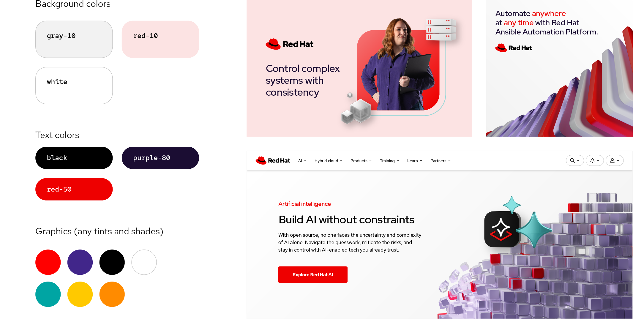
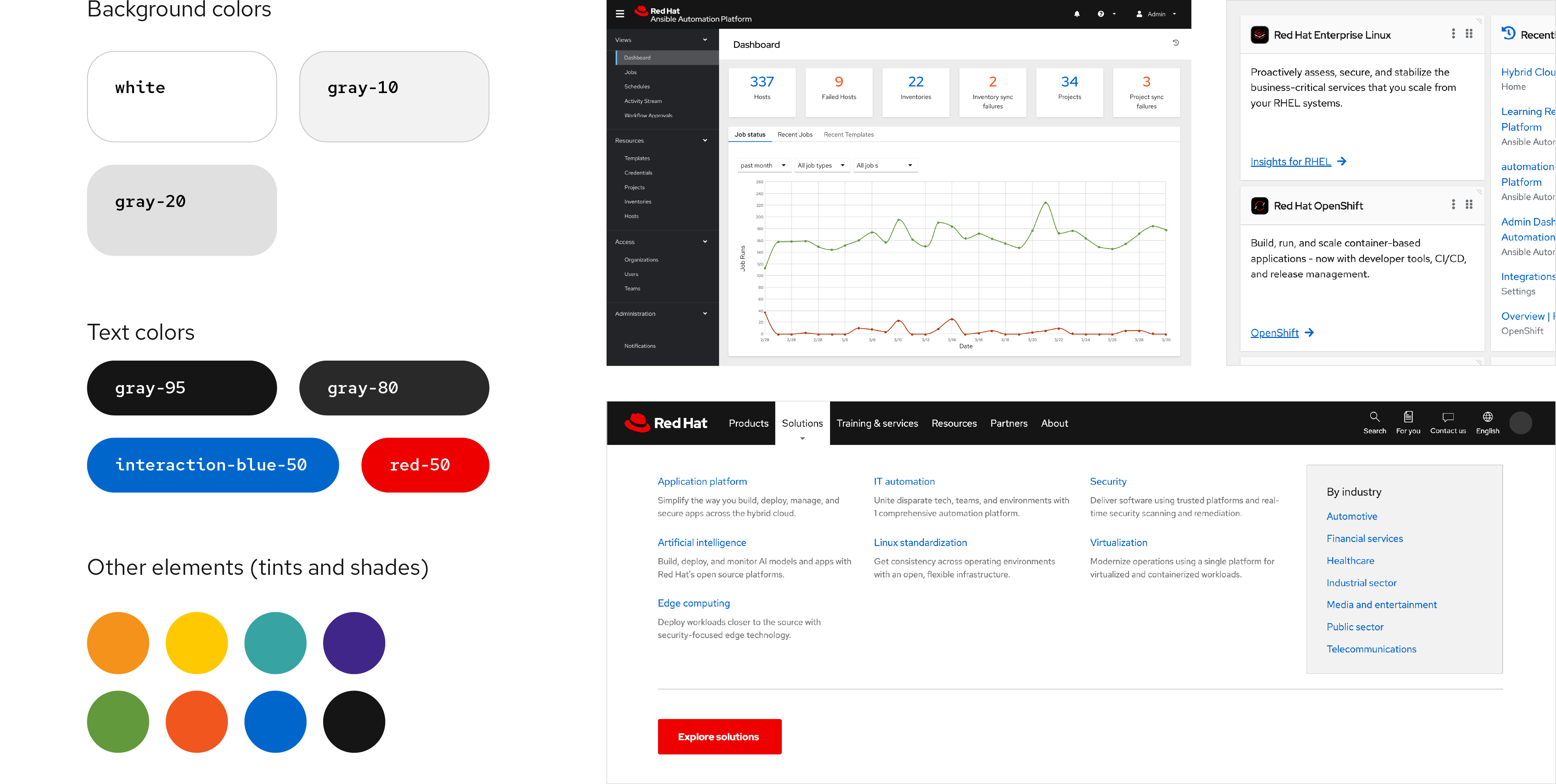
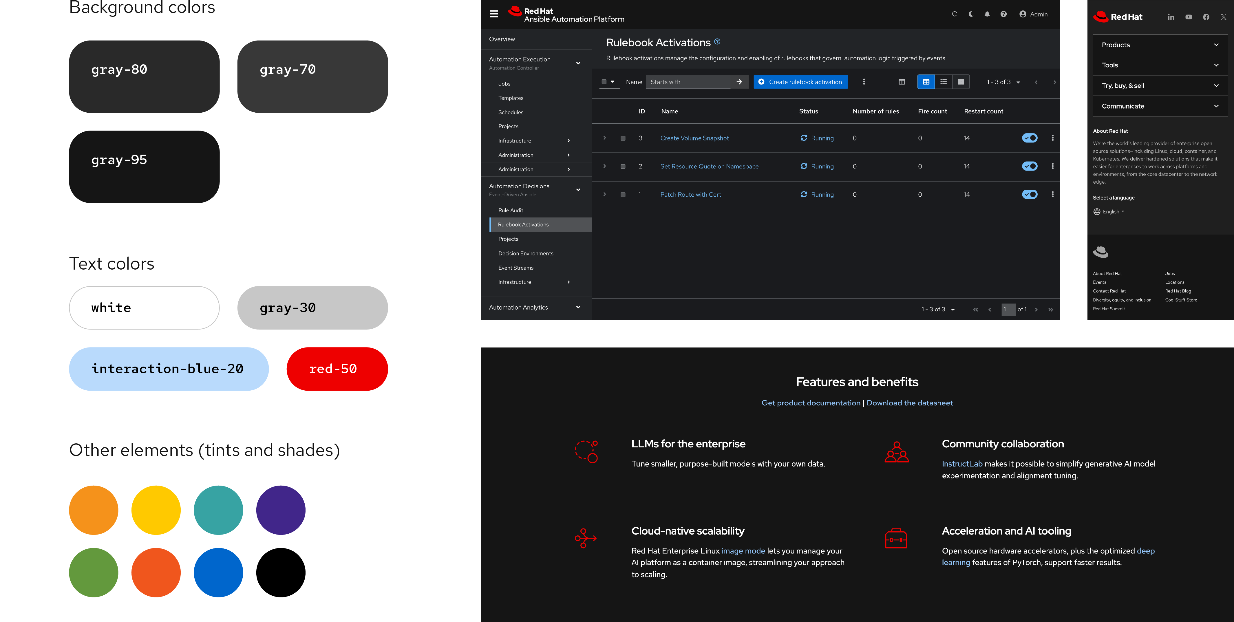
Color swatches
We organize our color palette into 11 color families. Individual colors are labeled numerically from light to dark, starting with 10. Colors from different families that share the same number are similar in saturation and value and have similar visual weight.
Click on a color swatch below to copy the hex code into your clipboard, or download our swatch files (Login required).


Our brand colors
These are the colors we use to represent and build recognition for the Red Hat brand.
Core palette
red-05
#fef0f0
red-10
#fce3e3
red-20
#fbc5c5
red-30
#f9a8a8
red-40
#f56e6e
red-50
(Red Hat red)
#ee0000
RGB 238 0 0
CMYK 0 98 85 0
Pantone 1788C
red-60
#a60000
red-70
#5f0000
red-80
#3f0000
white
#ffffff
RGB 255 255 255
CMYK 0 0 0 0
Pantone White
gray-10
#f2f2f2
gray-20
#e0e0e0
gray-30
#c7c7c7
gray-40
#a3a3a3
gray-45
#8c8c8c
gray-50
#707070
gray-60
#4d4d4d
gray-70
#383838
gray-80
#292929
gray-90
#1f1f1f
gray-95
(ux black)
#151515
black
#000000
RGB 0 0 0
CMYK 60 40 40 100
Pantone Black C
Secondary palette
orange-10
#ffe8cc
orange-20
#fccb8f
orange-30
#f8ae54
orange-40
#f5921b
RGB 245 146 27
CMYK 0 50 100 0
Pantone 144C
orange-50
#ca6c0f
orange-60
#9e4a06
orange-70
#732e00
orange-80
#4d1f00
yellow-10
#fff4cc
yellow-20
#ffe072
yellow-30
#ffcc17
RGB 248 204 23
CMYK 0 15 100 0
Pantone 108C
yellow-40
#dca614
yellow-50
#b98412
yellow-60
#96640f
yellow-70
#73480b
yellow-80
#54330b
teal-10
#daf2f2
teal-20
#b9e5e5
teal-30
#9ad8d8
teal-40
#63bdbd
teal-50
#37a3a3
RGB 55 163 163
CMYK 80 10 30 10
Pantone 2234C
teal-60
#147878
teal-70
#004d4d
teal-80
#003333
purple-10
#ece6ff
purple-20
#d0c5f4
purple-30
#b6a6e9
purple-40
#876fd4
purple-50
#5e40be
RGB 94 64 190
CMYK 85 80 0 0
Pantone 2097C
purple-60
#3d2785
purple-70
#21134d
purple-80
#1b0d33
Auxiliary colors
Information palette
These colors are utilitarian. They should only be used for their intended purposes, not for decorative visuals.
success-green-10
#e9f7df
success-green-20
#d1f1bb
success-green-30
#afdc8f
success-green-40
#87bb62
success-green-50
#63993d
RGB 99 153 61
CMYK 70 0 100 10
Pantone 7737C
success-green-60
#3d7317
success-green-70
#204d00
success-green-80
#183301
danger-orange-10
#ffe3d9
danger-orange-20
#fbbea8
danger-orange-30
#f89b78
danger-orange-40
#f4784a
danger-orange-50
#f0561d
RGB 240 86 29
CMYK 0 83 100 0
Pantone 165C
danger-orange-60
#b1380b
danger-orange-70
#731f00
danger-orange-80
#4c1405
interaction-blue-10
#e0f0ff
interaction-blue-20
#b9dafc
interaction-blue-30
#92c5f9
interaction-blue-40
#4394e5
interaction-blue-50
#0066cc
RGB 0 102 204
CMYK 85 55 0 5
Pantone 2387C
interaction-blue-60
#004d99
interaction-blue-70
#003366
interaction-blue-80
#032142
People palette
Skin tone families are described differently from traditional color associations: cool tones lean towards pinks, while warm tones lean toward yellows and browns. Learn more about illustrating people.
cool-tone-10
#ffe3dc
cool-tone-20
#f7c8bb
cool-tone-30
#e8a997
cool-tone-40
#ce8873
cool-tone-50
#a66552
cool-tone-60
#724335
cool-tone-70
#40251d
warm-tone-10
#ffe9dc
warm-tone-20
#f9d5c0
warm-tone-30
#edbea1
warm-tone-40
#d8a381
warm-tone-50
#b88564
warm-tone-60
#8e6549
warm-tone-70
#664934
Have feedback on the Brand Standards? Submit it here.
Questions? Red Hatters can reach out via #help-brand on Slack.
Accessibility
Being open and helpful means creating experiences that are equitable and inclusive. All Red Hat assets—presentation slides, web pages, product interfaces, social media posts, and more—should be accessible to everyone.
Color plays a critical role in accessibility, affecting how viewers with vision differences perceive and digest information. It’s important to make conscious decisions when applying color to our work.
Contrast
Contrast is measured as a ratio that describes the difference in perceived brightness between the foreground and background colors. Low contrast can make it hard to read or recognize things, especially for people with low vision. Informative visuals—or visuals that convey information that’s critical to understanding the content—must meet Web Content Accessibility Guidelines (WCAG) AA standard contrast ratios.
For Red Hat assets, small text (17pt or smaller) needs to have a 4.5:1 contrast ratio at minimum. Large text (18pt or larger) and informative graphics like icons need to have a 3:1 contrast ratio at minimum. Use a tool like Adobe Color to measure the contrast ratio of your colors and learn more from the WCAG about standard contrast ratios for text and other graphics.

Use this: red-50 meets color contrast standards on black.

Use this: white meets color contrast standards on teal-60.

Use this: black meets color contrast standards on red-10.

Use this: white meets color contrast standards on purple-60.

Not this: red-50 does not meet color contrast standards on gray-80.

Not this: white does not meet color contrast standards on teal-40.

Not this: black does not meet color contrast standards on red-60.

Not this: white does not meet color contrast standards on purple-30.
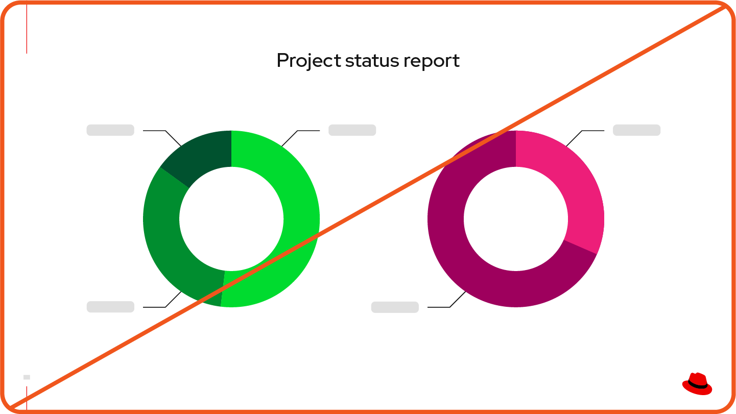
Color blindness
People with color blindness don’t perceive differences in color the way that most people do, which can make it hard to understand information distinguished solely by color, especially in graphs or interfaces. The most common forms of color blindness are red-green color vision deficiency (deuteranopia or protanopia) and blue-yellow color vision deficiency (tritanopia).
When you rely on color alone to convey meaning, people with color blindness may not understand your visuals. Instead, use text or icons in addition to color and choose colors with various levels of saturation to differentiate things. Use a tool like Color Oracle to simulate how your visual might look to someone with color blindness.

Do this: Use labels in addition to colors to identify distinct sections of diagrams, charts, and interfaces.

Not this: Don't rely on color alone. A person with color blindness might not be able to tell the colors apart, making it impossible for them to discern the information.
Vibration
Saturated hues that are similar in intensity can vibrate when used together, creating fuzziness around the edges like a glowing blur. These colors can be difficult for anyone to look at and distinguish, and even painful for those with vision differences.

Do this: Combine bright colors with less saturated and neutral colors.

Not this: Don’t use colors with similar intensity in the same area.
Learn more
Accessibility fundamentals in digital design
Web Content Accessibility Guidelines (WCAG)
Visual accessibility at Red Hat
Have feedback on the Brand Standards? Submit it here.
Questions? Red Hatters can reach out via #help-brand on Slack.