Product logo guidelines
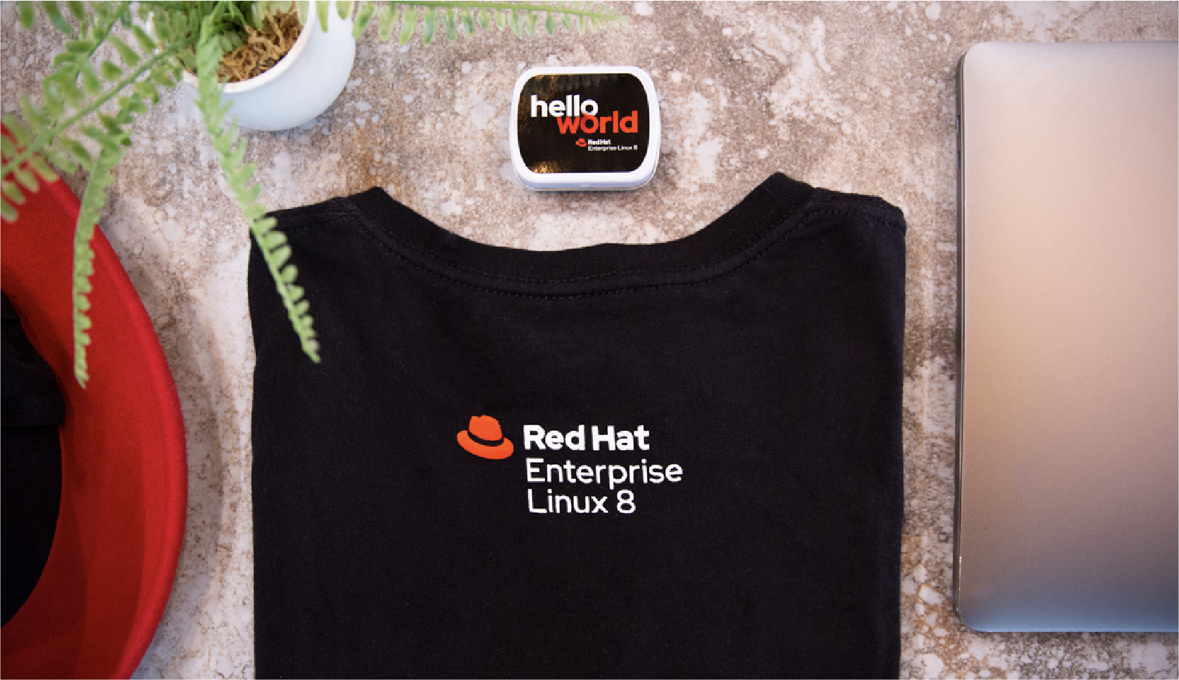
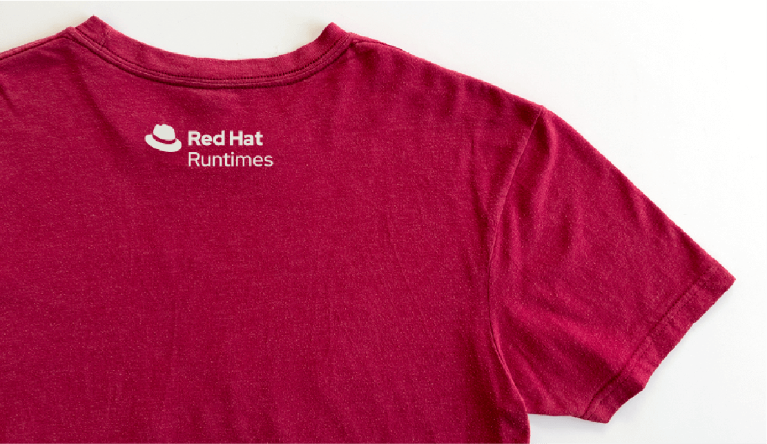
Following a parent brand strategy means we lead with the Red Hat® brand. Each product logo starts with the Red Hat logo and follows with the full product name. Their consistent format allows us to add new product logos to our portfolio without additional design or legal costs.
To make it clear to our customers what is and is not a Red Hat product that they can purchase, we only create logos for products, not for components, features, plug-ins, or operators. When referring to something that's not a product, type out the name in our font instead.
Minimum clear space for product logos is the size of the “e” in the word “Red.” Clear space is the space that should be free of other logos or distracting graphics so that the product logo is visible and stands out on its own.
When a product has more than one version under a common product name, we add a third line to the logo in a lighter weight with the name of the version.
Red Hat product logos are produced in 2 full color versions: standard and reverse. They are also produced in 3 one-color versions: red, white, and black.
Add version numbers only for major releases.
Longer product names may have horizontal and stacked logo versions. The stacked versions fit better in vertical spaces.
Only use one-line logos for product interfaces where the product logo is too tall, or if space is limited. Learn more about UI branding.
If the product logo is too tall, or space is limited, for any application aside from the product UI, write out the product name and use a Red Hat logo in a separate imprint area.
Product logos versus technology icons
Products have both a product logo and a technology icon. Which visual to use when representing the product depends on the context and the size of the space available.
Product logos
Product logos incorporate the Red Hat logo and the full name of the product. When you’re representing a single product and you have the space, use a product logo. They create instant recognition for our parent brand and the product.
Technology icons
In a space that’s too small for a product logo, or when you’re referring to multiple Red Hat products at the same time, use a technology icon. This avoids squished logos and visual clutter that might be created by using too many product logos in one layout.
Not this: Do not add version numbers for minor or "dot" releases.
Not this: Do not use legacy product or project logos to represent enterprise products.
Not this: Don’t use a product logo on a background that is too light or dark, obscuring visibility.
Not this: Don’t remove the hat icon from the product logo.
Not this: Don't generate product logos using AI.
Not this: Don’t replace the hat icon with a technology icon.
Product logos work well on web cards to identify and distinguish multiple Red Hat products.
The Red Hat logo is incorporated into product logos, so you do not need to include an additional Red Hat logo.
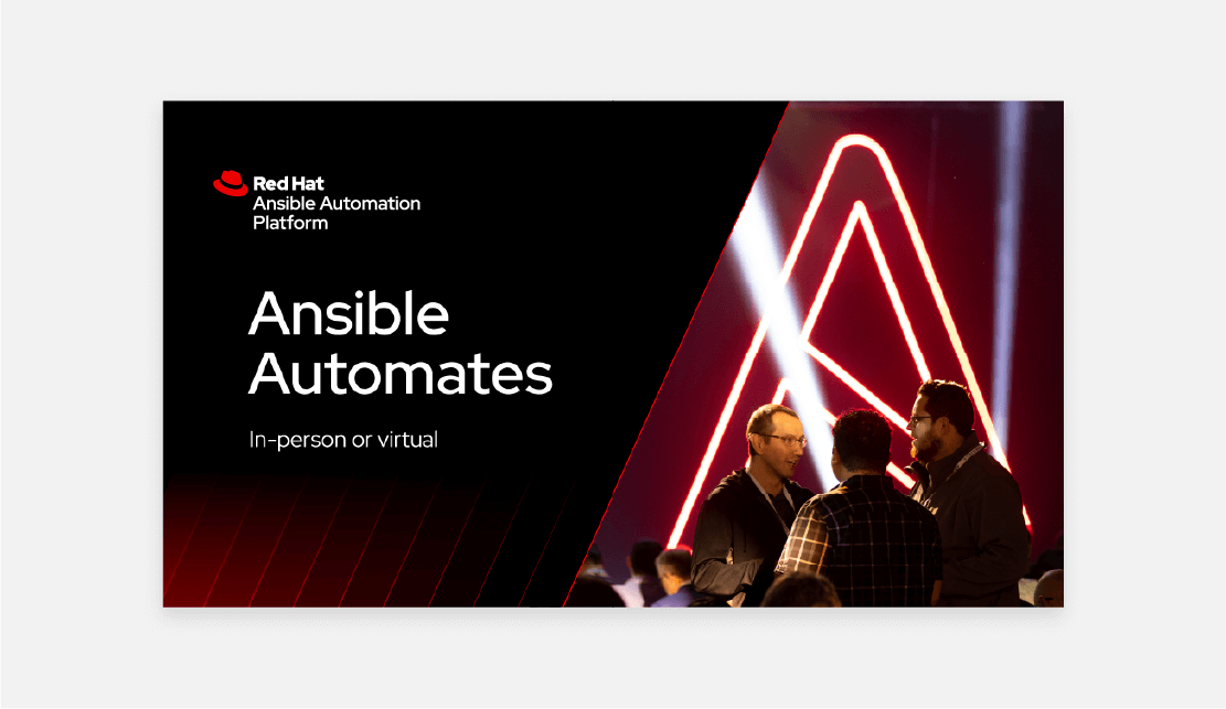
Product logos can combine with other visual elements to promote our products, like this social media post.
When you need to use a product logo on a red background, use the one-color white version of the logo.


