2D illustration
Illustrations help us to represent our global audience and explore the real technical challenges they face through visual metaphors we use across our design language. Technical concepts like “cloud computing” or values like “innovation” can’t be captured in a photo, but they can be captured through the style and metaphors we use in illustration.
Our illustration style, like our brand voice, values precision and clarity, with every line and shape serving a purpose. It balances geometric precision with a human touch that’s realistic and relatable. Technology can be cold or intimidating, but Red Hat illustrations should feel open, engaging, and approachable.
Principles
Our brand personality informs how we draw our illustrations. The overall impression of authenticity, helpfulness, and openness is just as important as the tiny details.
Representative, not arbitrary
We represent a range of concepts that go beyond traditional enterprise technology clichés.
Illustrations are based on visual metaphors we use across our design language and how we highlight the challenges real users face in their work.
Intentional, not superficial
Our style is thoughtfully designed to complement the complex nature of our products.
We highlight what matters by taking advantage of white space and applying limited, stylized color.
Active, not passive
We illustrate dimension and imply movement to ensure our illustrations are engaging.
We use shadows to create dimension and lines to create movement across our illustrations. Illustrated people are realistic and dynamic, not oversimplified or robotic.
Types of illustrations
Depending on the project, it may make sense to use one type of 2D illustration over another. Some topics may have specific 2D illustrations that center one idea and should be used consistently—like our icons or 3D object library—while others benefit from people illustrations to convey a story.

Mini illustrations (minis)
Mini illustrations convey a single, simple idea. They’re larger and more detailed than icons, but employ a similar visual approach. They have a flattened perspective, use a light source from the top left, are limited to 3 colors (white, red-50, and red-30). Our mini illustration style is structured and geometric, creating a feeling of reliability and stability.

People illustrations
Our illustrations of people are realistic and representative of Red Hatters, our customers, and our partners. They’re inspired by photos of real people and can be incorporated into collages, animations, or scenes.
Use of AI and illustrations
When representing Red Hat to customers—like in presentations, web pages, social media channels, or marketing materials—illustrations must match the illustrations in our libraries. Our illustration style does not change based on the tools we use.
Some AI tools can generate images that look similar to our illustration style, but the files they generate may not scale correctly for different applications. They may also miss the refined details that make illustrations truly feel like Red Hat, which can make a customer's experience of our brand feel disjointed or inconsistent.
If AI tools can't match our illustration style accurately, or don't provide files that work for your application, use illustrations from our library instead.
What to avoid
Not this: Don’t use illustrations that are similar to, but not quite, the style of Red Hat mini illustrations.

Not this: Don’t use illustrations that are similar to, but not quite, the style of Red Hat people illustrations.
Not this: Don't use illustrations based on other brand's illustration styles.

Not this: Don’t place AI generated illustrations in external marketing materials.
Mini illustrations
Minis use limited color and convey a single, simple idea. They use a flattened perspective with intentional details and shadows to add depth.

Single concept
Minis use our icon set as a reference: they convey a single concept with 1 or 2 objects and show the objects from the front with a flattened perspective whenever possible.

Color balance
An approximately 50:50 balance between white and red (both red-30 and red-50) creates balance.

Light source
Light should be cast from the top left, so shadows fall towards the bottom right. Use red-30 and red-50 to create shadows and imply depth.
Color in mini illustrations

Standard color
Minis are created in standard color by default: a mix of white, red-30, and red-50.

One-color
For applications where color is limited, we also create one-color versions of each mini. There’s a version for light backgrounds and a version for dark backgrounds.
Creating a mini illustration

Step 1: Start with the template
Designers should create minis using our Illustrator template. Minis are designed on a 1080 x 1080 pixel artboard, and should be either the full height or full width (or both) of the 1000 x 1000 pixel key line.

Step 2: Draw the basic shapes
Draw basic shapes to fit within the template. Base the shapes off of our icons so that our metaphors are similar across our visuals (for instance, we always use cubes to represent containers).

Step 3: Add fills
Fill basic shapes and well-lit areas with white. Fill other details and darkest shadows using red-50. Light should always be cast from the upper left corner.

Step 4: Adjust shadows
Use red-30 to add lighter shadows and contours to imply depth and texture. Consider how shadows overlap. Aim for a 50:50 balance of white to red.

Step 5: Add strokes
Use strokes to add movement and additional details.

Step 6: Share the mini with the Brand team
Send the new illustration to the Brand team for review so that we can create one-color versions and add it to our repositories.
Example mini illustrations

This mini successfully combines 2 icons and adds appropriate detail and hierarchy to create a more complex and compelling narrative than icons could alone.

This mini has a defined light source in the top left and is well balanced, with a 50:50 balance between white and red (both red-30 and red-50).

This mini illustration uses our standard icon metaphor for “IT modernization” to create a base for the illustration and adds detail while balancing light and shadow.

This mini does not have a well defined light source.

This mini uses a lot of filled elements and details making it feel heavier than other minis. Use filled elements thoughtfully to create shadows and depth.

This mini has good hierarchy and balance, but the small details are off. It’s using 2-3 different line weights and the filled elements have a rounded stroke applied.
Minis in use

Use our provided standard color or one-color minis.

Use minis independently, without additions or modifications.

Use minis at a size where all of the details are legible.

Minis can be used as a “mini collage” by being placed on top of a base shape. Learn more on the hybrid style handbook.

Not this: Don’t add additional colors to minis.

Not this: Don’t combine 2 minis to create a new concept.


Not this: Don’t use a mini at a size where the details are illegible, like in a pattern. Use icons instead.

Not this: Don’t use minis as an element in a complex collage.

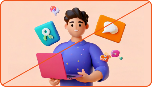
Not this: Do not generate minis. These minis may look similar to our style, but details may not be consistent.
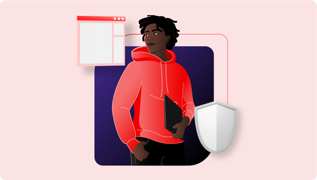
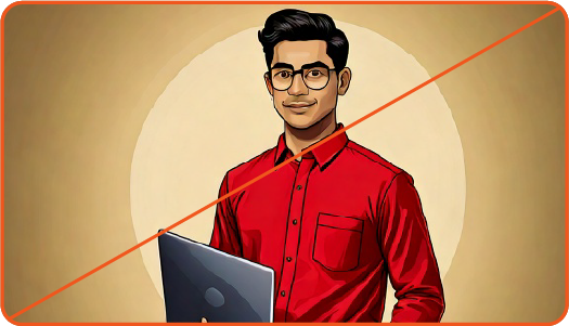
People illustrations
Real people, whether they work for Red Hat or use our software, are the core of our brand. Illustrations are an opportunity to authentically represent our global audience and tell rich stories about how they use our technology to solve real-world problems.
Our illustrations aren’t anonymous blobs or faceless robots. They have realistic body types and wear relatable, professional attire. They look like the actual IT professionals that use our software. Whenever we’re representing people, it’s vital to be respectful and deliberate about how they’re depicted. We work from photo references, are careful to check for biases and stereotypes, and make sure we’re taking the time to research and listen to our global audience so that we’re representing them as they truly are. If you’re not sure if your use of images of people meets this bar, it’s better to use something else instead.
We provide a library of illustrated characters that can be used to represent Red Hatters, partners, and customers in presentations, animations, or hybrid style collages.

Anatomy
Use natural proportions and anatomy when illustrating people. Simplify some shapes and curves to represent people authentically, but not as literal as a photograph. Reflect the natural poses and behaviors of real people.
A. True-to-reality head size. Slight simplification of shape of hair styles and detail lines of face.
B. True-to-reality upper body form with slight simplification of lines. Hands are drawn with enough detail to indicate form.
C. True-to-reality lower body form with slight simplification of lines. Natural foot size—no shrinking or enlarging for stylization purposes.
D. Rely on color, gradients, and stroke lines for more detail as needed.

Lighting
Like all Red Hat illustrations, people illustrations have a clearly-defined light source. We show light through a combination of gradients, hard shadows, and edge lighting.
A. Subtle gradients between two color values indicate light source and give a sense of depth.
B. Hard shadows, in addition to gradients, indicate deeper shadows and further emphasize the light source. Hard shadows are the same color as the darkest color value in the gradient.
C. Light colored contour lines on edges match the direction of light. Contour lines are one to two color values lighter than the lightest color value in the gradient.
cool-tone-10
cool-tone-20
cool-tone-30
cool-tone-40
cool-tone-50
cool-tone-60
cool-tone-70
warm-tone-10
warm-tone-20
warm-tone-30
warm-tone-40
warm-tone-50
warm-tone-60
warm-tone-70
Skin tone palettes
Regardless of the color palette used for the rest of the illustration, always use realistic skin tones from our people palette.
Choose one skin tone family for each person. Skin tone families are described differently than traditional colors; cool tones lean towards pinks while warm tones lean towards yellows and browns. Learn more about our color palette.

Implementing a gradient
A subtle gradient between two warm tone values or two cool tone values helps to indicate light source.

Eyes
Facial features, especially eyes, are drawn slightly larger than real life to allow for the eye white and additional details within and around the eye.
A. Eyebrows are realistically shaped and tapered. Eyebrows are a solid color that matches the hair.
B. Eyelashes are black, mono-width lines. Eyelids and any age lines are mono-width lines that are one shade darker than the lightest skin tone color value.
C. The iris of the eyes are one black dot, with a mono-width white highlight.

Noses
Noses are simplified, but maintain definition in form. The nose lines are the same width and color as the lines of the eyelids and age lines.
A. Nose is proportional to face size and other facial features.
B. Bridge of the nose is one line
C. Separate lines form more curves and definition at the nostrils

Mouths
Mouths are filled shapes, further defined by a stroke line.
A. Lips are one to two tones darker than the lightest skin tone color value.
B. Single line under the upper lip extends just past the lips.
C. When visible, teeth are a simplified representation not detailed, individual teeth.
D. Small lines around the the mouth enhance smiles or add age.

Facial expressions
Use facial expressions to show emotions. Small changes to facial features, like changing the placement of the eyebrows, can further enhance emotions.
Expressions like neutral, smiling, and thinking are authentic to our audience and capture the spirit of the subject in authentic and meaningful ways, similar to photography.
Be sure that expressions are genuine rather than exaggerating facial expressions in a way that feels inauthentic to our brand personality and tone.

Clothing
Keep clothes simple. Add just enough detail to indicate form, style, and individuality.
Lines, hard shadows, and gradients help to define details across clothing and shoes while maintaining a stylized but realistic look.
Details can vary depending on scale. Larger illustrations or tighter shots may have more detail than smaller illustrations or wider shots. When scaled down, detail lines become thinner or are removed.
Color variation
Keep each character’s clothing consistent. Use colors from our core and secondary palettes to add variety.
When using hybrid style, be mindful of the color balance between the color of clothing in a people illustration, and other elements such as the base shape and 3D objects.
People illustrations in use

Illustrated people are lifelike and dynamic, not oversimplified or static. People illustrations interact with objects in a way that feels realistic.

Illustrate people with enough detail that represents them thoughtfully and creates individuality.

Locate and use a single light source that impacts all subjects and elements in the scene or collage. Use strokes, hard shadows, and gradients thoughtfully to indicate the light source.
People illustrations should be the focus of the composition. Integrate people illustrations intentionally within a scene or collage.

Not this: Don’t oversimplify illustrations of people.

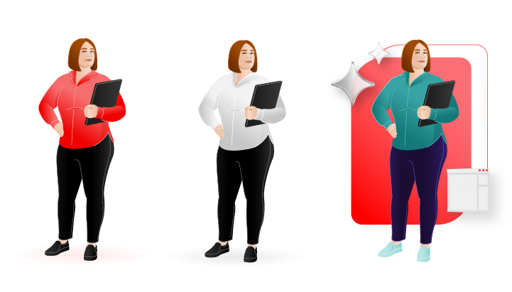
Not this: Don’t change a people illustration’s skin tone. Each illustrated person has a unique skin tone that reflects their individuality.

Not this: Don’t illustrate people with little to no facial features, or in a way that erases their individuality.
Not this: Don’t use AI to generate people illustrations. AI image generators may use artistic styles that look similar to our illustrations, but are not authentic to our brand.

Not this: Don’t combine people illustrations with other 2D assets arbitrarily. Use hybrid style instead.

Not this: Don't place people illustrations arbitrarily in existing collages or compositions where they are not needed.

Not this: Don’t arbitrarily shade subjects and elements in the scene.
Not this: Don’t use people illustrations at a small scale relative to other elements in a collage. People illustrations should be the focal point of a collage or in a scene.