Event logos
Every year, Red Hat hosts and attends hundreds of events around the world. Events are an opportunity to communicate our technology vision and connect with customers, partners, analysts, and our community. To connect the audience's event experience to their Red Hat® customer journey, we always lead with the Red Hat brand.
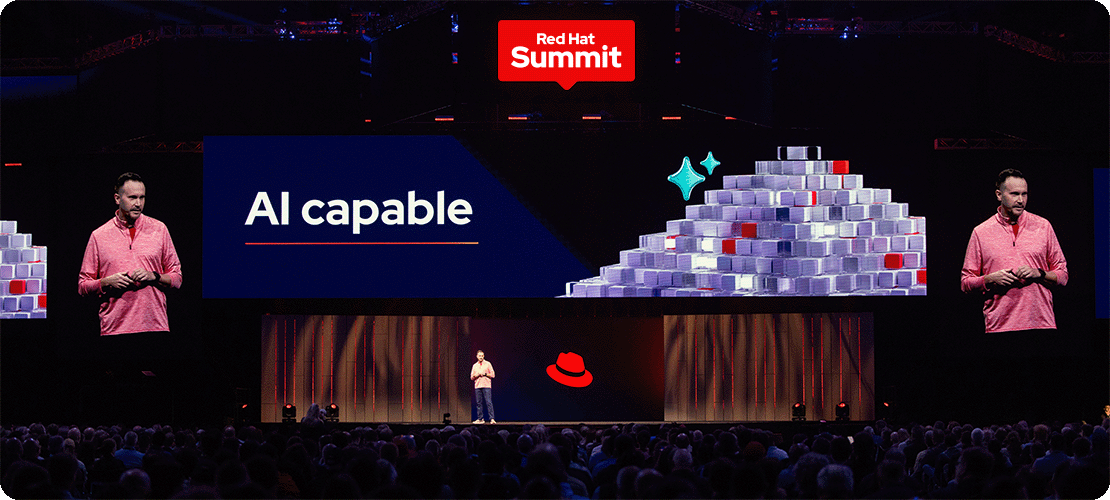
Red Hat Summit
Red Hat Summit is our annual customer event, where we share new products, technologies, and programs with thousands of IT professionals. As our largest event of the year, Red Hat Summit has its own logo and visual theme. The event theme evolves each year, but the logo remains the same.
Red Hat Summit logo
The Red Hat Summit logo is based on the shape of a navigational marker, representing the event’s role as a place for customers, partners, and the community to come together in the spirit of innovative discovery.
Clear space
Clear space is the area around the logo that should not have text, distracting graphics, or other logos. The clear space should be at least the height of the letter 'S' in the word ‘Summit,’ all the way around the logo.

Logo color versions
Use the full color logo—with a red background and white text—whenever possible. For applications with color or production constraints, use a one-color version in red, black, or white. Always use the white logo on a red background.

Using the Red Hat Summit logo and Red Hat logo together
To connect the audience's experience back to our brand, Red Hat Summit graphics should strike a balance between the annual Summit theme and the Red Hat brand. The Summit logo doesn’t include the Red Hat logo, so it’s important to make sure that the Red Hat logo is always visible somewhere nearby. Respect the clear space of both logos.

When the logos appear in the same imprint area, make sure that the space between them is at least the height of the letter ‘S’ in the word ‘Summit.’ To create visual balance while maintaining legibility, the Red Hat logo should be no larger than the width of the Summit logo, and no smaller than the width of the words ‘Red Hat’ in the Summit logo.
For on-site graphics, avoid overwhelming the audience with a sea of logos. Place them only in high-profile locations, like keynote stages or directional signage. The Red Hat logo isn’t required to be in the same imprint area as the Summit logo, but it should always be visible somewhere nearby.

Not this: Don’t add shadows, gradients, or any other effects to the logo.

Not this: Don’t stretch or distort the logo.

Not this: Don’t modify the colors in the logo. Use the one-color logo that looks best on the background.

Not this: Avoid placing the Red Hat logo too close to the Summit logo.

Not this: Don’t co-brand the logo with another logo.

Not this: Don’t generate images of the Red Hat Summit logo or the Red Hat logo using AI.
Red Hat Summit: Connect logo
Red Hat Summit: Connect takes the Summit experience around the globe to meet our customers and partners where they are. A custom lockup of the Red Hat Summit logo with the word Connect placed below it identifies the event. Follow the same clear space and sizing guidelines as the Red Hat Summit logo.


Not this: Don’t change the placement of the text.

Not this: Don’t change the size of the word ‘Connect’ or move it closer to the Red Hat Summit logo.

Not this: Don’t create other logos that mimic the Red Hat Summit: Connect logo.
Other Red Hat events
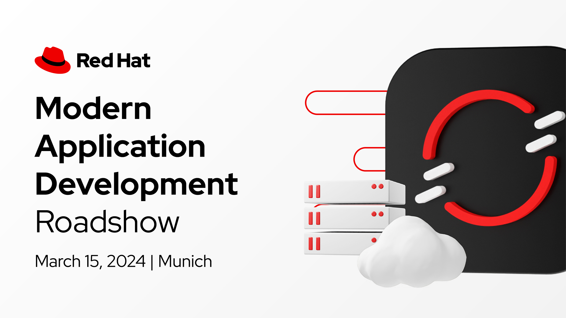
External events
Outside of Red Hat Summit, we host several large, externally-visible events like Ansible Automates, Modern Application Development Roadshow, and TechTalks. These events do not use a custom logo. Instead, use the Red Hat logo and type out the name of the event in our font.

Internal events
We also host internal events like celebrations, days of learning, or workshops. Internal events are for Red Hatters, not customers or community members. Most internal events don't need a logo of any kind and should use the Red Hat logo with the name of the event typed out in our font. If an event needs a logo image, a universal logo can be requested.
Even for internal events, promo materials that could be seen by someone outside of Red Hat are still considered externally facing; a t-shirt or event signage in a public venue could be someone’s first impression of our brand. These materials should always include the Red Hat logo and follow the Red Hat brand.

In most cases, internal events should just type of the title of the event in our font. Use existing brand assets like icons, illustrations, photography, and collages to create images for promo materials.

If a logo image is necessary, internal events can request a universal logo. Do not create a custom logo for an internal event.
What to avoid

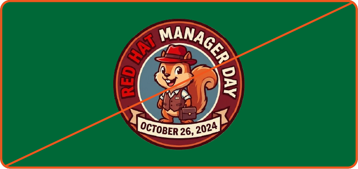
Not this: Don’t create custom logos for external or internal events.

Not this: When typing out the event name, don’t modify the text to make it appear like a custom logo.
Not this: Don’t generate new external or internal event logos using AI.
Have feedback on the Brand Standards? Submit it here.
Questions? Red Hatters can reach out via #help-brand on Slack.